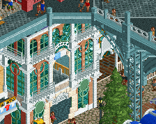
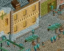
it's really safe and monotonous. nothing is exciting or atmospheric; its just 2x2 buildings and 1x1 towers themed the same way and the same boring color throughout
How am i even supposed to add colour to this? I think it works well enough with the buildings as they are right now. There's lots of colour accents around the place to make up for the light brown colours of the walls. And sure, there's a lot of 2x2 and 3x2 going on, but i think it works here. I doubt they'd look good if they were bigger.
mix a little bit of textures and colors. you have, like 5-6 easy colors in ll that could work with this and you chose to use the same pattern on everything. you could easily create better forms in the architecture as well. you're limiting yourself way too much.
thats coming along nicely! with some more colors and life you'll definitely have a winner
how to add colors?
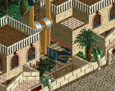
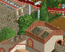
1. more lush foliage (theres a LOT of bare, brown dirt and grass/dirt in this screen. make the foliage more lush, with flowers and accents of color
2. integrate trackitecture intelligently- use some awnings and whatnot to add splashes of color.
3. the path is a bit dark, open and dreary. I love what you've done with the tiled path, maybe integrate some more of that as well as interesting path details/elements to break up the blocky brown.
4. get some rides or peeps in there for movement!
5. those big lines of that metal railing fence are doing you no good- they make it look blocky and forced, as well as dreary. do something cooler with the paths/interaction/landscaping!
 21-September 15
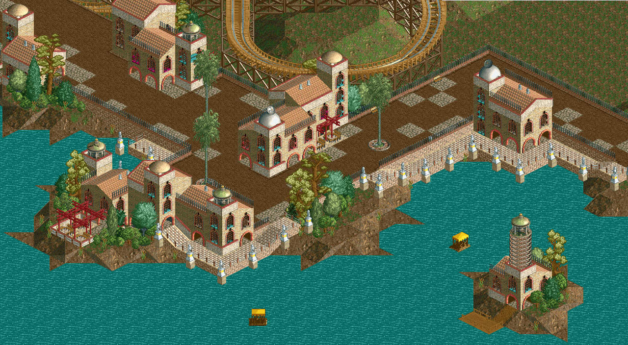
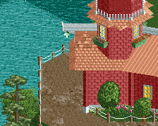
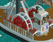
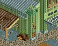
That lighthouse is my favorite part of this. Awesome.
But nice start overall!
Boring. Try and finish it more before posting a screen.
I'm quite fond of the architecture, but the whole area definitely needs more colour
i like it
i like this a lot, you've created a pretty thick atmosphere here imo
That's really quite nice. I like it too.
it's really safe and monotonous. nothing is exciting or atmospheric; its just 2x2 buildings and 1x1 towers themed the same way and the same boring color throughout
How am i even supposed to add colour to this? I think it works well enough with the buildings as they are right now. There's lots of colour accents around the place to make up for the light brown colours of the walls. And sure, there's a lot of 2x2 and 3x2 going on, but i think it works here. I doubt they'd look good if they were bigger.
mix a little bit of textures and colors. you have, like 5-6 easy colors in ll that could work with this and you chose to use the same pattern on everything. you could easily create better forms in the architecture as well. you're limiting yourself way too much.
thats coming along nicely! with some more colors and life you'll definitely have a winner
how to add colors?
1. more lush foliage (theres a LOT of bare, brown dirt and grass/dirt in this screen. make the foliage more lush, with flowers and accents of color
2. integrate trackitecture intelligently- use some awnings and whatnot to add splashes of color.
3. the path is a bit dark, open and dreary. I love what you've done with the tiled path, maybe integrate some more of that as well as interesting path details/elements to break up the blocky brown.
4. get some rides or peeps in there for movement!
5. those big lines of that metal railing fence are doing you no good- they make it look blocky and forced, as well as dreary. do something cooler with the paths/interaction/landscaping!
hope that helps
Good shit Wouter
Needs more variety and ingenuity, but it's a decent start.