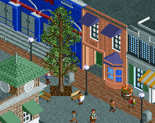
Screenshot / Main Street USA - Town Square/Center Street
-
 07-October 15
- Views 3,049
- Fans 0
- Comments 7
-
Description
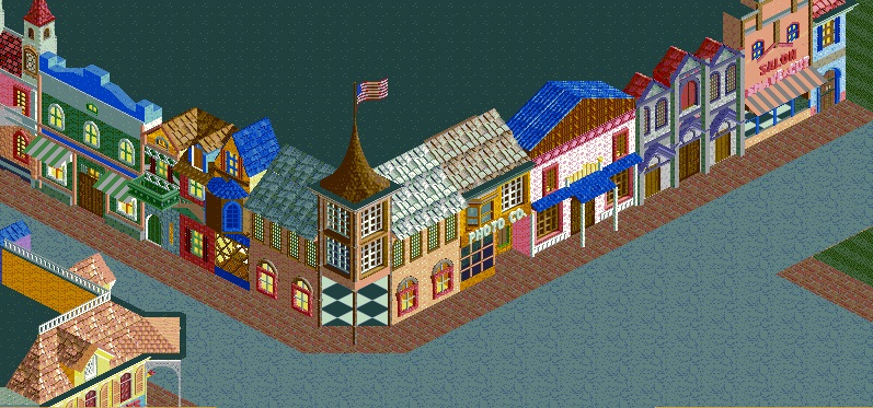
The east side of Town Square and some of the east side of Center Street. In CCW direction, Dapper Dans' Hair Salon (barbershop), Le Chapeau (hat shop), Wonderland of Wax (candle shop), Main Street Photo Co. (camera center), Main Street Sweets (candy store), Hallmark Card Shop (greeting card shop), Five & Dime (nickel and dime store), and part of the Main Street Cinema facade.
-
Full-Size
-
No fans of this screenshot
-
Tags

Some very bold choices of colour and objects. I see potential, but you need to balance everything out a bit more. Some colour combinations work really well, others don't (purple and blue??) Some buildings are full of detail, others aren't. With some refinement, this could become something.
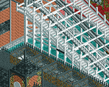
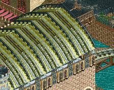
Way too much roof in my opinion. The buildings wouldn't be that deep. Needs roof elements as well. Right now the black mass is taking away from the screen for me
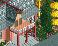
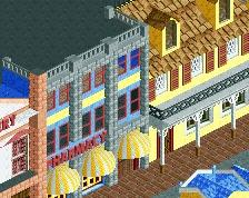
Bottom left looks great.
You have some great ideas in here. If you could vary the depth of the buildings more, perhaps having some 1/4 tile deeper into the street, the entire facade is too flat. Maybe add some archways, overhangs, flowerbeds, outside seating areas at cafes etc. See how some other members have executed this.
I'd use google maps or earth to see how the backstage roofs of structures like this look. Variance, texture and AC units are basically necessary in order to break up the void of black or grey.
Also, maybe spice up your path, add road lines to separate the textures. Maybe enhance your interiors as well with something other than the basic land texture.
Your facades are nice and varied, colorful as well. Just needs some other aspects fleshed out to complete it.
Thank you for all the comments. I've shrunken down the size of the "building" and changed the roof color to white. I've also added lamps, trashcans, flowerbeds, and benches around the facades. I'm in the process of adding detail to the roof, however I get an error trapper every time I open the scenario from the main menu.
Agree that the bottom left looks great. From what I can see of it, the overhanging awnings are good for pushing the building out and adding some depth, and the entire style of it looks solid and consistent. Some of the other buildings are less so, with jumbled styles within one structure and colours that aren't always complimentary. It's great to see so many colours and a wide variety of shapes, but I think devoting a particular style/colour scheme per building would really tidy things up.