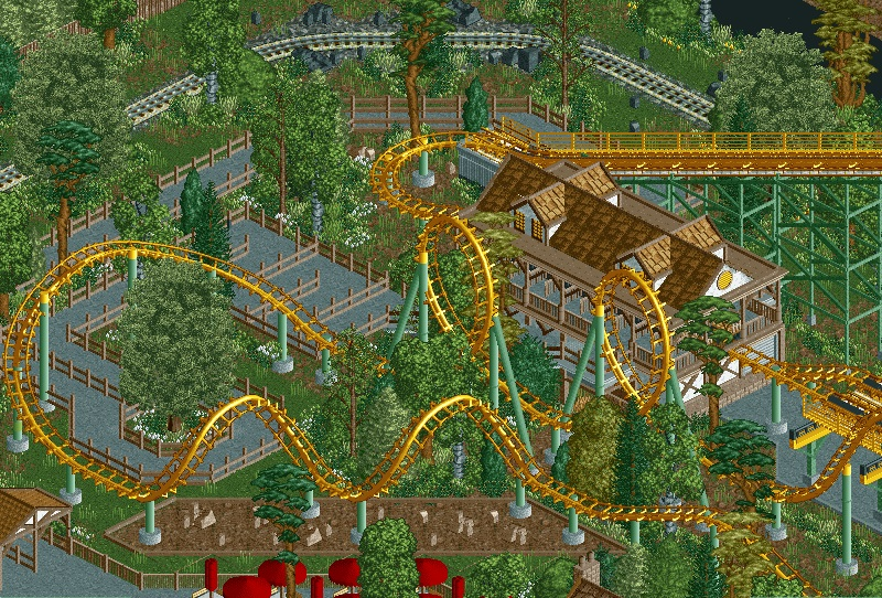
That queue would piss me off to no end. It would never be full for an old Arrow but the fences aren't movable so you'd have to walk through every switchback.
That being said it's very realistic otherwise and I'm a fan. Nice work!
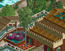
A interesting mix of Python and Starpoine. The station is phenomenal, however the queue is super dead, maybe swap out the path for the cena path or crazy path. Rest is really nice, just kind of plain, which is something you cant really have in a realistic park.
Really nice, but yeah, lacking a bit of atmosphere. I think the path is to blame. The cobblestone path could do the trick. The red brick path is great for injecting some warm atmosphere also.
I agree with Stoksy about the coaster colors but the path could change my mind. I think it's mostly the green supports. Great, classic coaster colors but in this context they seem to be a bit of a miss. Regardless of all of this though, you're onto something special and looks like you got the talent to make it great. Keep it up!
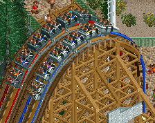
I think the colors of the coaster fit pretty well. The most Vekoma coasters have this washed out look and feel so i think its just realistic. I think the grey path looks a bit distracting from the rest. Otherwise it's a great screen.
Everything is really well done, but I agree that a little colour/texture in the path could help infuse a bit more atmosphere. The only other part I'm not sure of is the dirt under the corkscrews. I'm not sure why it's been framed, like a garden, despite not containing any man-made foliage. It's not necessarily wrong or unheard of, but just looks a little strange to me.
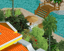
Ok I realize this is kinda late, but I've been playing a lot of Fallout 4 and so I have not had even the slightest desire to play RCT until today. So, I responded to some of the main criticisms about this screen and here it is. Let me know
I like this more, but I wish you would have kept the dirt patch under the corks. Maybe experiment with path in the station, maybe use grey or white colorable path tiles. Just seems a little lifeless at this point, as does most of your screens.
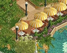
Its hard to put my finger on it, but its probably the lack of bright colors, no peeps, and no benches or lamps etc... Hour work could use some more bright and warm colors, real parks aren't quite this colorless.
Yeah I get what you're saying about colorlessness. When I first started to get serious about this project I chose a color scheme that I wanted to stick with but as I've progressed (and I've gotten better) I've kinda slid more and more towards my own brand of realism. I guess I just need some advice about how I can make my work more colorful while still staying within the general feel of the colors I've got going on. Yeah I know its unrealistic for an entire park to be all within one color scheme but it's what I want to do so I'm doing it.
 24-November 15
Looks really nice, but I dislike the stuff below the double corkscrew, but maybe that's just me.
Coaster colours look a little too washed out in this context. Otherwise, it's good.
That queue would piss me off to no end. It would never be full for an old Arrow but the fences aren't movable so you'd have to walk through every switchback.
That being said it's very realistic otherwise and I'm a fan. Nice work!
A interesting mix of Python and Starpoine. The station is phenomenal, however the queue is super dead, maybe swap out the path for the cena path or crazy path. Rest is really nice, just kind of plain, which is something you cant really have in a realistic park.
Really nice, but yeah, lacking a bit of atmosphere. I think the path is to blame. The cobblestone path could do the trick. The red brick path is great for injecting some warm atmosphere also.
I agree with Stoksy about the coaster colors but the path could change my mind. I think it's mostly the green supports. Great, classic coaster colors but in this context they seem to be a bit of a miss. Regardless of all of this though, you're onto something special and looks like you got the talent to make it great. Keep it up!
I think the colors of the coaster fit pretty well. The most Vekoma coasters have this washed out look and feel so i think its just realistic. I think the grey path looks a bit distracting from the rest. Otherwise it's a great screen.
Everything is really well done, but I agree that a little colour/texture in the path could help infuse a bit more atmosphere. The only other part I'm not sure of is the dirt under the corkscrews. I'm not sure why it's been framed, like a garden, despite not containing any man-made foliage. It's not necessarily wrong or unheard of, but just looks a little strange to me.
I like this more, but I wish you would have kept the dirt patch under the corks. Maybe experiment with path in the station, maybe use grey or white colorable path tiles. Just seems a little lifeless at this point, as does most of your screens.
I actually agree with you about the dirt patch. Don't worry, it will return. But lifeless? Why?
Yeah I get what you're saying about colorlessness. When I first started to get serious about this project I chose a color scheme that I wanted to stick with but as I've progressed (and I've gotten better) I've kinda slid more and more towards my own brand of realism. I guess I just need some advice about how I can make my work more colorful while still staying within the general feel of the colors I've got going on. Yeah I know its unrealistic for an entire park to be all within one color scheme but it's what I want to do so I'm doing it.
Much better with the changes you made. I agree with G Force, try to add some small accents of brighter and fresher colors.
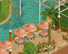
I like it, and I think peeps will add a ton of color and atmosphere.
yo finish the park dude