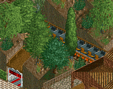
Decided to move this to a real screenshot, had enough done. Thoughts so far? is the landscaping too ridiculous/overcrowded? I'm also not so great at foliage so specific suggestions would be great. bare in mind its unfinished, esp in the center/right.
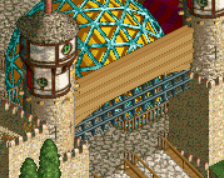
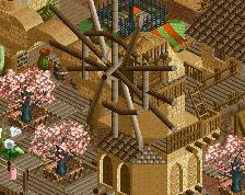
Also, big thanks to stoksy whose Extinction catwalks I absolutely ripped off. Thanks mate
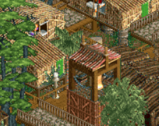
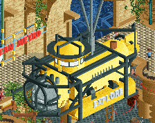
also, here's an idea I had for a take on talocan. I'm enjoying showing you guys the whole process so I expect to post here lots with new ideas/tests etc.
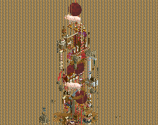
I think I'm gonna make a custom top spin though, seems like something I should learn to do and would make it much better.
Fuck dude, great to see you building again! Never thought I'd like those types of cliff-face objects but after Jonny's park and now this they're really starting to appeal to me.
Possibly too much brown (the wooden path might get a little too much if you extend it into large areas) but I adore the landscaping combination, both aesthetically and the blending of colour.
Haha, I think I probably ripped those catwalks from someone else anyway; it looks good that's what matters.
You'll make that log flume work great I'm sure, it's already looking really nice in that respect. Personally I'm not a fan of the cliff faces, not sure if it's the color or texture or both. Great Talocan too, looking forward to enjoying the Cocoa Coaster Construction Connection.
The rocks are well done and I don't mind the foliage either but together, they don't make much sense. Why have rock formations you find in a dry setting have such lush foliage? I would either play around with rock colors in greys/blacks/browns or change the foliage to match a "drier" setting.
Supports look good but messy. If you have those red supports on the coaster I would make them all that way. If you decide to keep them with the brown B&M supports also, at least make the caps on them brown instead of black.
I get what you're going for with the wooden pathways but it just adds too much business to an already busy area. Stick to clean, clear cut paths to balance everything out. I wouldn't do cobblestone but any sort of dirt path would do the trick. Try a darker one to contrast the brightness of the rocks (if you don't change them, that is!).
I think your rockwork is fantastic. I love those objects combined with the 1k ruins. The screen is maybe a way to chaotic and messy. Hopefully you are able to make it a bit cleaner.
This is the first time I've really liked those WW rock objects, nice job! I really think this is a great balance of detail and messiness. Any more and it would look cluttered and haphazard, but any less and it wouldn't seem so vibrant and full of life.
I don't think you have too much foliage, but it is too bright. I'd use paler greens, or the puke green to make it look a bit drier, and more arid to fit the setting.
looks really great. just unsure about the layout i saw in previous pics. it seems that it will be going really fast through some of the elements after the loop.
^nah it handles everything pretty well. Because it's sunk into the ground, it comes up high enough on those first turns to be alright.
Ah, some nice contradicting suggestions
Things ill do
-fuck the oak tree
-slightly paler foliage
-clean wood and use dark dirt path
-make all supports red? I'll play around with this, am unsure
People's comments made me investigate my layout intensity and I found that the first corkscrew was giving me hell with lat g's. So I scrapped it and added in a new immelman to try and lower speed. Its mostly worked but the intensity is just over 10, which worries me. But some quick research into other large/prominent inverts in rct2 tells me that they were also mostly over 10 or in the high 9s. its hard to figure out just where to change things to lower intensity so I'll leave it for now, peeps will probably complain but oh well...
as for clutter, I agree. I have a feeling it will come together more as the main mountain under the lift takes shape and the other areas balance it out though. I'll continue on for now as before and reassess when more is complete.
Gonna start some architecture today, anyone have any good examples of sort of rural-ish mexican architecture (other than phantasialand, which is my main inspiration )
A sort of cross between Big Thunder Mountain Railroad, Black Mamba, Talocan, Circus Circus, etc. Just for fun while I have some free time, and with the aim of being a bit experimental/non-conservative with scenery/rides/hacking/etc.
 25-November 15
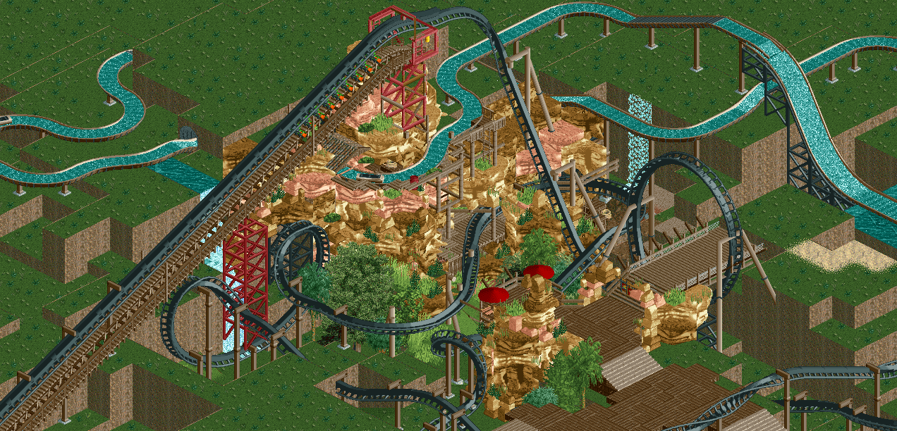
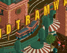
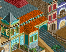
Decided to move this to a real screenshot, had enough done. Thoughts so far? is the landscaping too ridiculous/overcrowded? I'm also not so great at foliage so specific suggestions would be great. bare in mind its unfinished, esp in the center/right.
Also, big thanks to stoksy whose Extinction catwalks I absolutely ripped off. Thanks mate
also, here's an idea I had for a take on talocan. I'm enjoying showing you guys the whole process so I expect to post here lots with new ideas/tests etc.
I think I'm gonna make a custom top spin though, seems like something I should learn to do and would make it much better.
Excellent
I appreciate what you're trying to do here, but that is just waaaaaay too busy.
Fuck dude, great to see you building again! Never thought I'd like those types of cliff-face objects but after Jonny's park and now this they're really starting to appeal to me.
Possibly too much brown (the wooden path might get a little too much if you extend it into large areas) but I adore the landscaping combination, both aesthetically and the blending of colour.
Haha, I think I probably ripped those catwalks from someone else anyway; it looks good that's what matters.
Looks cool. I always like areas with all these little scaffolding scattered around. I still think that oak tree is an eyesore, though.
I like it but spatially it's a little confusing. Will look excellent when you've added more though I'm sure.
You'll make that log flume work great I'm sure, it's already looking really nice in that respect. Personally I'm not a fan of the cliff faces, not sure if it's the color or texture or both. Great Talocan too, looking forward to enjoying the Cocoa Coaster Construction Connection.
I like where this is headed! My suggestions:
The rocks are well done and I don't mind the foliage either but together, they don't make much sense. Why have rock formations you find in a dry setting have such lush foliage? I would either play around with rock colors in greys/blacks/browns or change the foliage to match a "drier" setting.
Supports look good but messy. If you have those red supports on the coaster I would make them all that way. If you decide to keep them with the brown B&M supports also, at least make the caps on them brown instead of black.
I get what you're going for with the wooden pathways but it just adds too much business to an already busy area. Stick to clean, clear cut paths to balance everything out. I wouldn't do cobblestone but any sort of dirt path would do the trick. Try a darker one to contrast the brightness of the rocks (if you don't change them, that is!).
Great job. Glad to see you building, Cocoa!
Otherwise, fantastic rock work Cocoa.
Thought those rocks were WW-objects at first. Don't like them very much, but somehow you've made them look good anyway.
Really good job.
I think your rockwork is fantastic. I love those objects combined with the 1k ruins. The screen is maybe a way to chaotic and messy. Hopefully you are able to make it a bit cleaner.
This is the first time I've really liked those WW rock objects, nice job! I really think this is a great balance of detail and messiness. Any more and it would look cluttered and haphazard, but any less and it wouldn't seem so vibrant and full of life.
I don't think you have too much foliage, but it is too bright. I'd use paler greens, or the puke green to make it look a bit drier, and more arid to fit the setting.
I like the colors of the foliage for the most part, but I would have it get more puke green as you get to the outside of the little oasis.
Ah, some nice contradicting suggestions
Things ill do
-fuck the oak tree
-slightly paler foliage
-clean wood and use dark dirt path
-make all supports red? I'll play around with this, am unsure
Thanks everybody
It looks nice but I agree it's really confusing. Too overloaded. I think you want to unclutter.
People's comments made me investigate my layout intensity and I found that the first corkscrew was giving me hell with lat g's. So I scrapped it and added in a new immelman to try and lower speed. Its mostly worked but the intensity is just over 10, which worries me. But some quick research into other large/prominent inverts in rct2 tells me that they were also mostly over 10 or in the high 9s. its hard to figure out just where to change things to lower intensity so I'll leave it for now, peeps will probably complain but oh well...
as for clutter, I agree. I have a feeling it will come together more as the main mountain under the lift takes shape and the other areas balance it out though. I'll continue on for now as before and reassess when more is complete.
Gonna start some architecture today, anyone have any good examples of sort of rural-ish mexican architecture (other than phantasialand, which is my main inspiration )
)
also, how do we feel about all red supports?