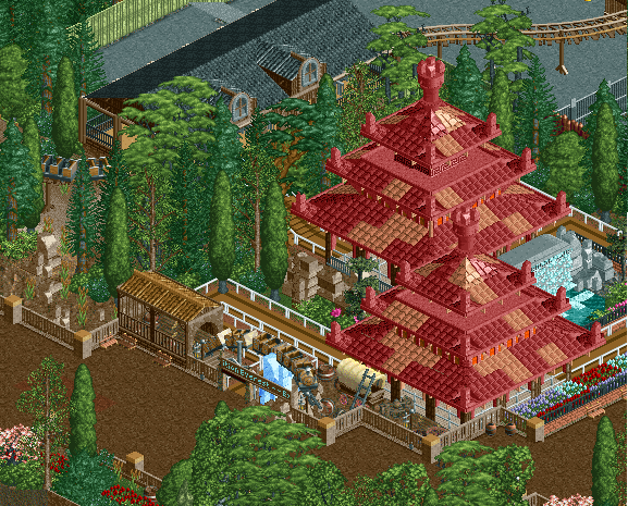
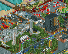
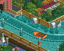
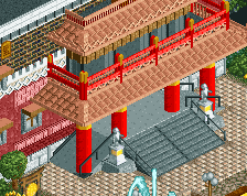
Screenshot / Expedition Everest Queue
-
 04-January 16
-
Reddit Contest [Expedition Everest]
-
2 of 5
- Views 2,092
- Fans 2
- Comments 9
Community Forum Software by IP.Board
I lvoe it!
noice!
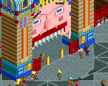
This is looking great. I would put the entrance sign one clearance higher.
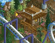
I think the queue path is jarring.
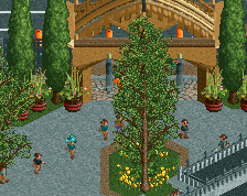
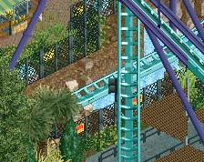
@nin: The cyprus tree is chilling so that things don't look as square/rectangle. But it's clearly distracting, so I'll try rework it.
@Sulakke: If I raise the entrance sign then the queue entrance will be visible also. I'm trying to make the 2x1 sign the actual queue sign if you get what I'm saying.
I'm pretty sure Austin and nin are referring to the path itself rather than the flow. Maybe try a mixture of the crazy and dark dirt paths.
Otherwise I think this looks pretty good!
Hide the default entrance sign behind some theming, by making the first one or two tiles of the queue regular path. With some overly complex hacking you can make it look like actual queue too, but that's probably not worth the effort. Either way, I'd raise the sign. This looks weird. Unlike the rest of screen, which is fine.
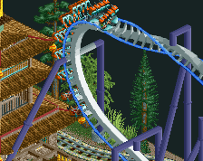
fucking YES dude. this is great work, though the main criticism i have is why would a park theme the shit out of a queue for such a kitschy station lmao