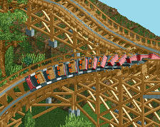
The roof on the station would probably be better black or a more muted texture. Probably one of my most anticipated parks at the moment, hopefully it doesn't take too long!
Separately both of these buildings look great but the scale is off I think. It could just be the angle but having that three story station next to a single story shop just seems off to me.
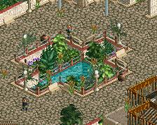
I feel like finding a way to better compose the paving patterns and planters around the buildings will go a long way in helping. At the moment, it kinda feels like you too each building as a single element and plonked them next to each other on a large flat expanse of concrete. Adding some sort of path change around them or shaping some planters could go a long way in helping it all read more as a single area.
The architecture itself, however, is some of your best. Now it's just integrating it into a more cohesive area!
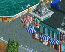
I suppose I should mention, but the building to the left is the entrance to the ride. This is set up very similarly to how Lightning Rod will be once it's finished, where there are two buildings that house the queue.
Thanks for the feedback, and keep it coming, certainly looking into making the area more cohesive.
scale and composition are terrible tbh. that station, even alone, is too big and it doesn't help to have a small ass building adjacent to it. the layering on that station is weird too.
 05-January 16
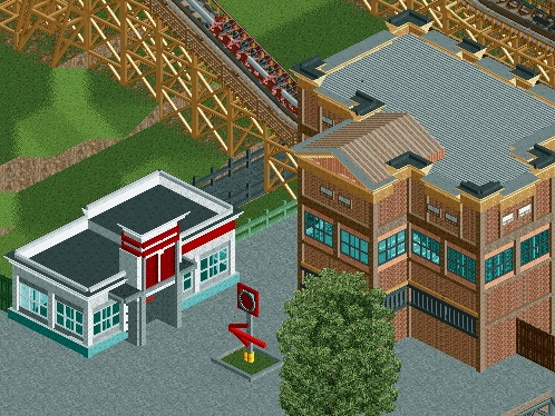
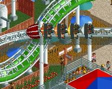
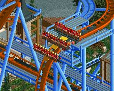
Strange texture on the station building (wouldn't the default brick look better?), otherwise very exciting to see.
2016 could shape up to be an excellent year for RCT...
The roof on the station would probably be better black or a more muted texture. Probably one of my most anticipated parks at the moment, hopefully it doesn't take too long!
I feel like finding a way to better compose the paving patterns and planters around the buildings will go a long way in helping. At the moment, it kinda feels like you too each building as a single element and plonked them next to each other on a large flat expanse of concrete. Adding some sort of path change around them or shaping some planters could go a long way in helping it all read more as a single area.
The architecture itself, however, is some of your best. Now it's just integrating it into a more cohesive area!
Disney Imagineer Fan Offline
Love it man! Doing our home park proud!
I suppose I should mention, but the building to the left is the entrance to the ride. This is set up very similarly to how Lightning Rod will be once it's finished, where there are two buildings that house the queue.
Thanks for the feedback, and keep it coming, certainly looking into making the area more cohesive.
I fully agree with Rob. The individual buildings look great, but the bigger picture is disjointed.
Disney Imagineer Fan Offline
Oh, forgot to mention -- love the park name by the way. That's hilarious. That really is what a lot of us east Tennessee folk call it. haha!
Can't wait to see more!
scale and composition are terrible tbh. that station, even alone, is too big and it doesn't help to have a small ass building adjacent to it. the layering on that station is weird too.