^It's not really going for accuracy, it's just an inspiration (unless Witches Wheel went over to Magnum and Dragster and said "fuck y'all I'm gonna go hang with Raptor and Valravn").
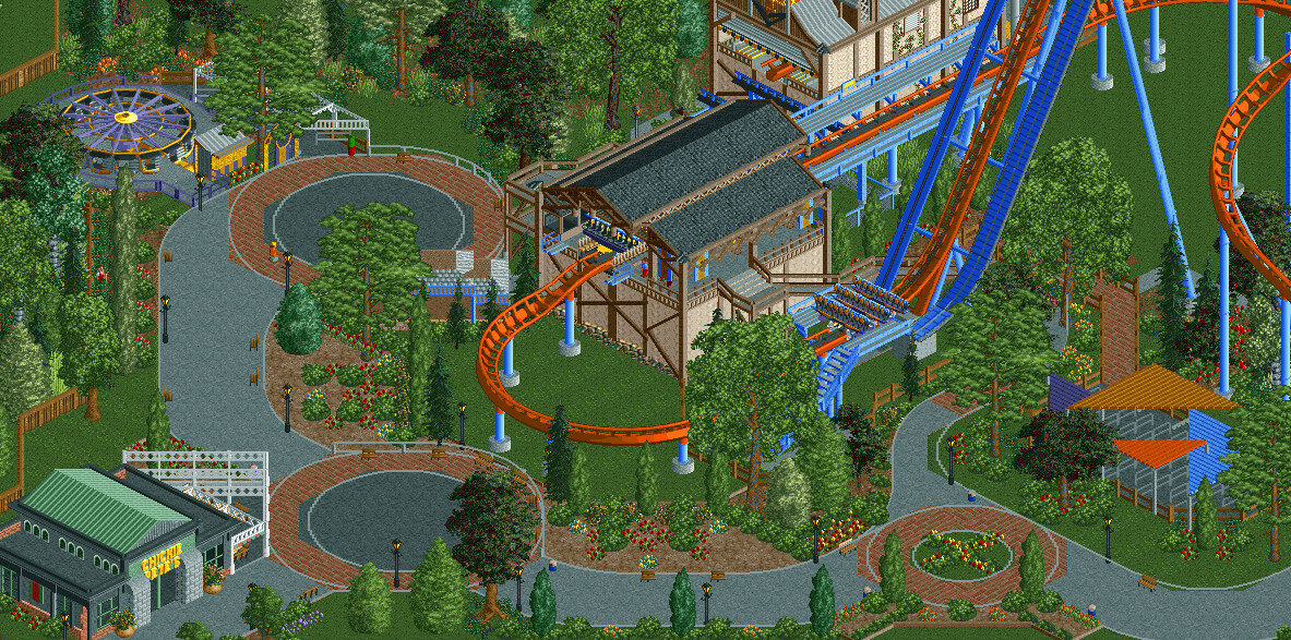
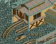
Swap those brownish path block under the foliage for the dark brown colored ones that were used in Raptor, would give more contrast and color. Also, maybe use the curved path pieces on the right side to clean it up a bit. I cant quite remember what bench they are in, but they shouldn't be too hard to find.
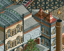
Rest is really nice, I like what you have a lot. Reminds me a bit of Louis! style, which is a good thing.
This is so nice. I think you do need to rework the path curves and stuff though. Also of course this can't be a recreation, this screen has more trees than Cedar Point does. lol
Don't worry about curved path just lose the lines man look how pixelated they are. Rest of it looks super. Flowerbeds could be a tad brighter and fuller perhaps?
Regarding the paths: Should I lose the curved road lines and just go with the diagonal ones? I cannot think of another way to get the circular pad look. The larger curves have curved path pieces but the small one and two tile curves don't (not that I know of).
The road lines look good on the two paths between the three circles, keep those. On the circles however, I would just delete them, especially the pixelated ones.
Edit: What I'm trying to say is, keep the ones at the edge of the paths, but delete the ones that are on top of the paths, if you know what I'm saying.
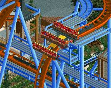
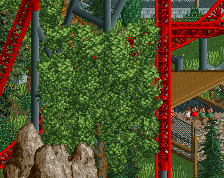
Why is one catwalk a car ride track and the other one looping coaster? Is it to simulate the elevator side and the stairs side? Idk, I think you should just do the same for both.
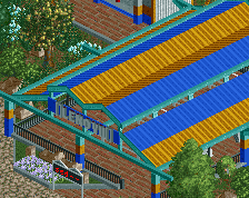
This is great. I really like the station and what you're doing with the paths is a neat idea but could be executed better. Right now, I think the main problem with it is that all the road lines are grey and they accentuate the paths in the wrong ways. Try changing the colors of the lines on the brick to brown and the lines on the tarmac to black to blend it a bit.
Here's a quick update to show some progress on my semi-recreation of Valravn. I completely updated the foliage, queue, path, and station. I am going for a Cedar Fair + Busch Gardens look.
 10-January 16
Love this. While I can't speak to how accurate it it, it's certainly lovely.
Love it.
^It's not really going for accuracy, it's just an inspiration (unless Witches Wheel went over to Magnum and Dragster and said "fuck y'all I'm gonna go hang with Raptor and Valravn").
Lovely coaster and station. The pathing with those lines looks a bit sloppy though, especially on the right side of the screen.
Rest is really nice, I like what you have a lot. Reminds me a bit of Louis! style, which is a good thing.
EDIT: Love the mowed grass effect.
Really nice pathwork here.
^ Yea I think that object exists? It'd be worth a quick parkdat for sure if it does.
This is so nice. I think you do need to rework the path curves and stuff though. Also of course this can't be a recreation, this screen has more trees than Cedar Point does. lol
Don't worry about curved path just lose the lines man look how pixelated they are. Rest of it looks super. Flowerbeds could be a tad brighter and fuller perhaps?
The road lines look good on the two paths between the three circles, keep those. On the circles however, I would just delete them, especially the pixelated ones.
Edit: What I'm trying to say is, keep the ones at the edge of the paths, but delete the ones that are on top of the paths, if you know what I'm saying.
Why is one catwalk a car ride track and the other one looping coaster? Is it to simulate the elevator side and the stairs side? Idk, I think you should just do the same for both.