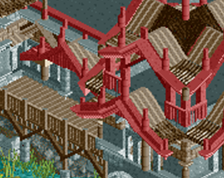
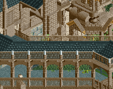
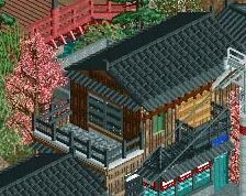
Screenshot / katakiuchi [B&M,2015] Entrance/Plaza
-
 12-January 16
-
katakiuchi
-
4 of 5
- Views 1,872
- Fans 2
- Comments 13
![screen_2651 katakiuchi [B&M,2015] Entrance/Plaza](https://www.nedesigns.com/uploads/screens/2651/2651.png)
-
Description
Many of you know my old picture from this coaster. Here is the finished product and for myself I made a big step from what it was to what it is now. Generally I could step up my game in the last time...
At first I wanted to build the hole park with katakiuchi, but this should be a Deisgn, for now. I hope you respect my work :) -
Full-Size
-
2 fans Fans of this screenshot
-
Tags
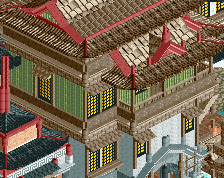
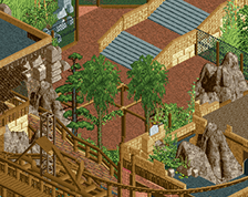

Looks great, the only thing I'm not really a big fan of is the green building near the water. It looks a bit bland compared to the other buildings.
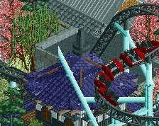
Architecture is pretty awesome man. I know I say this too often, but the steel roofs make no sense in this case. Why not wood?
They could be wooden roofs as well, don't limit your imagination by what the game tells you an object is. I think they look pretty good.
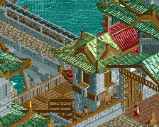
Its definitely a mess, but a very nice mess at that. The path choices and transition locations could use some work, maybe take another look at that. Great architecture though, definitely your strongest point.
Damn... that may be the best Japanese theming I've seen.
Holy shit that's good.
Love this a ton. Your style is one of my favorite among newer players. Seems like love that Japanese theme. It suits you well, but give another theme a shot in the future.
it's an unreadable, overdetailed and undercomposed pile of mediocrity.
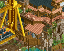
the way you layered the path makes no sense and it flows very poorly. the excess of detail also hurts readability. though there's flashes of excellence they are at maximum 2x2 squares and most are foliage/path interactions.
it's skillful for sure, but you're committing the exact same sins as i did when building poe except in an even starker in-your-face fashion.
65%
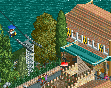
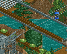
Even by your standards that's pretty harsh. Is it a mess? Maybe. Could it use more cohesion? I guess. But it's still some great work. This is at least gold quality. That skyway station alone warrants that.
Pizza, great to see you at it again. Nice work, hope to see some peeps roaming this park/design when it's released. I'd second the motion for you to try some other styles of building, you can rip up some pretty sweet architecture!
The individual structures are great, but it's not all coming together for me. The black path looks like a modern road which doesn't suit the buildings: I'd expect more cobblestone, or more overgrown pathways in between these. If you kept the "modern" road, then bring in more modern amenities like electric lights, signage, carts... something that gives this a sense of context. A sense of time.
^100%
I'd consider replacing the tarmac with grey crazy paving or something similar. Either you're a modern park themed to ancient(?) china [in which case modernise it], or a park in ancient china [in which case de-modernise it]. Can't be both.