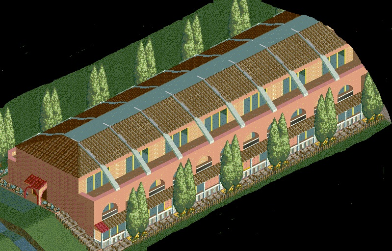
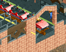
I like the arch idea, but the glitchiness is definitely a downer. If all of those glass windows access seperate rooms, there should probably be some kind of dividers between each room's balcony space and the next.
Some of the walls seem a little flat and textureless, but the overall shape is pleasing. I agree about placing some dividers to separate the balconies, but this is really quite nice.
I agree with the boys above. While the shape is really good, it needs some more details and textures to push it further. Interiors, a separation between balconies, night lights, smaller bathroom windows, ventilation units, some trims, etc.
Wow, thanks for the compliments guys. I honestly didn't expect that. I've added dividers between the balconies, tried to fix the glitchiness of the arches, and also added lights to the balconies.
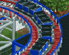
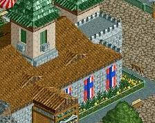
I'm liking it a lot. I'm not sure about he red roofs. Maybe try adding a few of the three colored Spanish roofs instead to make it look more natural. Another suggestion is to clean up the textures a bit. The castle and cement textures are awkwardly similar, so I'd just stick with the castle to keep with the theme. Throw in some brick with the same color (either random or organized) and you'll have a winner.
I'll echo dr dirt's thoughts. This is pretty good but the red roof kills it. Why not try painting the white ribbing brown to match the roof? It'd make it look less like.. well, like ribs.
Also, what's stopping you from making the brown roof tiles meet at the top? Why the square of white flat roof? That doesn't help much at all.
 12-February 16

I like the arch idea, but the glitchiness is definitely a downer. If all of those glass windows access seperate rooms, there should probably be some kind of dividers between each room's balcony space and the next.
Some of the walls seem a little flat and textureless, but the overall shape is pleasing. I agree about placing some dividers to separate the balconies, but this is really quite nice.
I agree with the boys above. While the shape is really good, it needs some more details and textures to push it further. Interiors, a separation between balconies, night lights, smaller bathroom windows, ventilation units, some trims, etc.
Wow, thanks for the compliments guys. I honestly didn't expect that. I've added dividers between the balconies, tried to fix the glitchiness of the arches, and also added lights to the balconies.
I'll echo dr dirt's thoughts. This is pretty good but the red roof kills it. Why not try painting the white ribbing brown to match the roof? It'd make it look less like.. well, like ribs.
Also, what's stopping you from making the brown roof tiles meet at the top? Why the square of white flat roof? That doesn't help much at all.