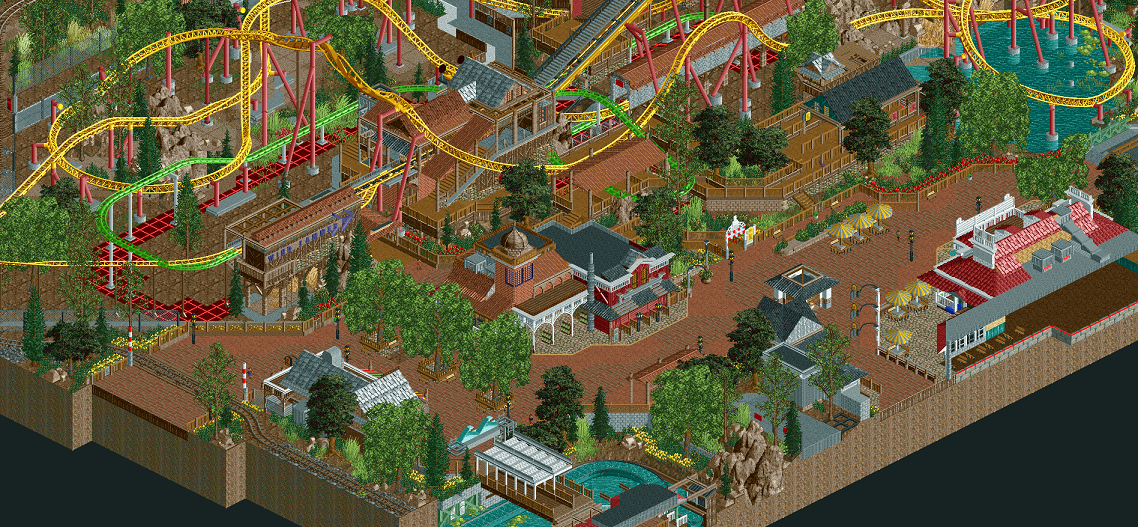
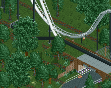
The texture of the corner building in the middle of the screen as well as the texture of the roofs above it in the screen blend in way too much with the paths. That makes this screen hard to focus on since it's all one big red/brown blob.
I really like this. It's very brown but in a warm, earthy, pleasant way. The yellow track stands out nicely against all the brown, and layout looks really nice.
I agree with Ling and Faas. Expand the map so that the last two tiles before the map edge are either foliage or path. No cut off buildings to force some interiors, looks messy as fuck.
Lovely screen, as usual. I do agree that the cut-off is kinda awkward with the building being cut in two and the forcedness of that logflume. Otherwise I absolutely love it, you make great use of vertical space, and you've got some pretty nice colour combinations going on (in particular the coaster colours), the path makes things a bit too brown for my liking though.
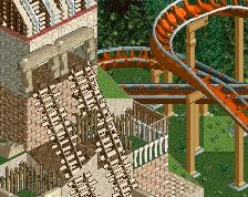
I love how you've interacted the ride with water, theming and architecture. It forms a wonderful unity that I find quite rare. I remember this was one of the aspects I loved about El Encierro, and this has a similar vibe.
Perhaps the architecture is a bit colourful and individualistic, but that may change once I get a chance to read it properly in game.
The same colourful aspect though goes for the tree. I like the dark green ones in principle, I'm just not sure they go well with the large custom ones in the middle of the path. You just have a whole range of greens in this, and I feel it's a bit patchy.
Totally looking forward to this though, and happy you're finishing something that's not H2H!
 31-March 16


i intentionally put my thumbnails into corners to make it look amazingly unfinished
The map cuts off in such an awkward spot...
needs more finish
fuck u (kyle/russ)
remember the lower you rate my screen, the more attention i get, russ and kyle.
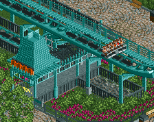
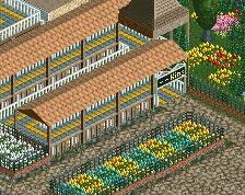
Good shit. I'd add some sort of additional support to the largest building roof though. Very flimsy atm.
The texture of the corner building in the middle of the screen as well as the texture of the roofs above it in the screen blend in way too much with the paths. That makes this screen hard to focus on since it's all one big red/brown blob.
I really like this. It's very brown but in a warm, earthy, pleasant way. The yellow track stands out nicely against all the brown, and layout looks really nice.
Lovely screen, as usual. I do agree that the cut-off is kinda awkward with the building being cut in two and the forcedness of that logflume. Otherwise I absolutely love it, you make great use of vertical space, and you've got some pretty nice colour combinations going on (in particular the coaster colours), the path makes things a bit too brown for my liking though.
I actually like this even though I hate to admit it.
ummm why is this in the 15 minute park project?
^fixed. Weirdly enough.
Scrap the interiors, doesn't look good.
Yeh just build the whole building.
I don't even remember this being posted... looks good!
Good to hear your still building, Shotguns. This looks great.