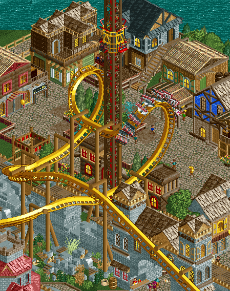
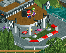
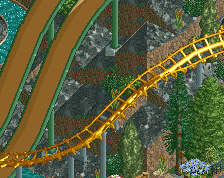
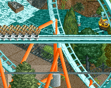
Oooh, nice! Has sort of a Sea of Sagas vibe going! I like it a lot. It looks like there might bit a tad too much brown, but I can't put my finger on it...
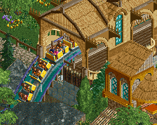
Great interaction, indeed. Fortress looks well done as well. My only concern is the "village" architecture looks a bit too random. Could definitely be cleaned up a bit. Still, you're constantly improving! Looking forward to this.
Thoug I do agree the supports could use another color, the browness in this screen doesn't disturb me really. But the coaster could stand out more with other support colors. And my god, that interaction!
I think you need to work on making your themes more distinct beyond colours and things, I also think your recent screens lacked substantial foliage, but your composition is improving rapidly. I'm getting Spellbrook Shore vibes from this park!
^ True, but once you browse around this park you'll see some areas of growth regarding themeing, though I do need to improve in that. My next projects will hopefully show this more. But for this one I've just had fun building in this older style construction, and it's coming together quite nicely.
I'm lazy when it comes to foliage and I usually leave it until the end of an area. Probably because I found vanilla created so many ghost objects with the large trees. Maybe Open will cure my laziness and conquer my foliage fears.
Liam, any chance you can make that diagonal castle wall piece for me in the near future?
It does seem quite jk'ish and Spellbrook Shores like, but it also falls into the same traps. It doesn't seem like there's much in the way the buildings are constructed to suggest what the theme is, so the theme comes from the colours and very little else.
I can't really tell what the theme is in this screen. Is it pirate? Medieval? Viking? Is it based in the tropics/Caribbean with the bright colours? Northern Europe with the foliage? Everywhere in the world based on the textures?
Try to use textures more to your advantage. Don't mix and match textures to make it more 'interesting', it's something I did and looking back, I can see why my work hit a block. Colours are an extension of texture, so again don't just throw wacky colours on there to liven it up. In one window, I can see a blue, green and yellow, while other buildings also have red, grey, brown, etc. It's too much and shows a lack of cohesion.
You obviously have the basics down, this screen shows that with it's composition and positioning. Now it's time to push harder and look at the masters; Turtle, Liampie, Artist, SA, Robbie. All of them know how to use texture, colours, foliage to their advantage and how to create immersive, atmospheric parks. If you can learn how to use them, you'll be great.
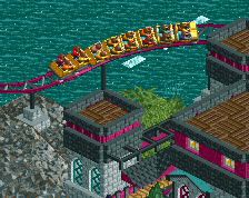
A very conceited screenshot name =). I just thought it was a slow screenshot day on NE... so it's another teaser for my upcoming park. I don't think I've posted any shots of this section of the park yet.
 04-May 16
Oooh, nice! Has sort of a Sea of Sagas vibe going! I like it a lot. It looks like there might bit a tad too much brown, but I can't put my finger on it...
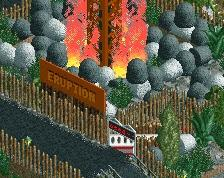
very exciting area
This is why I love your work...
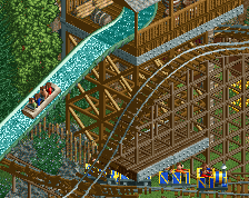
Oh but make the trains 8 cars... not that it's realism but there's no such thing as a 9 car invert train.
^ Bill, you're going to be one of my park testers!!... though I don't mind being clueless!
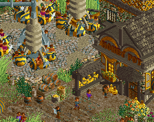
The cobra seems a bit too unsupported for me. I know it's not meant to be too realistic, but it still pretty grounded and that cobra would fall over.
I really like this. Its much more impressive and well put together/atmospheric than your past screens have been
Thoug I do agree the supports could use another color, the browness in this screen doesn't disturb me really. But the coaster could stand out more with other support colors. And my god, that interaction!
Beginning to have an eye on your stuff as of late. Nice teaser. Shows a lot while not showing a lot.
i like bigshooter bc hes bringing old school rct2 back!
^ True, but once you browse around this park you'll see some areas of growth regarding themeing, though I do need to improve in that. My next projects will hopefully show this more. But for this one I've just had fun building in this older style construction, and it's coming together quite nicely.
I'm lazy when it comes to foliage and I usually leave it until the end of an area. Probably because I found vanilla created so many ghost objects with the large trees. Maybe Open will cure my laziness and conquer my foliage fears.
Liam, any chance you can make that diagonal castle wall piece for me in the near future?
No prob, maybe I can convince someone else to assist me.
It does seem quite jk'ish and Spellbrook Shores like, but it also falls into the same traps. It doesn't seem like there's much in the way the buildings are constructed to suggest what the theme is, so the theme comes from the colours and very little else.
I can't really tell what the theme is in this screen. Is it pirate? Medieval? Viking? Is it based in the tropics/Caribbean with the bright colours? Northern Europe with the foliage? Everywhere in the world based on the textures?
Try to use textures more to your advantage. Don't mix and match textures to make it more 'interesting', it's something I did and looking back, I can see why my work hit a block. Colours are an extension of texture, so again don't just throw wacky colours on there to liven it up. In one window, I can see a blue, green and yellow, while other buildings also have red, grey, brown, etc. It's too much and shows a lack of cohesion.
You obviously have the basics down, this screen shows that with it's composition and positioning. Now it's time to push harder and look at the masters; Turtle, Liampie, Artist, SA, Robbie. All of them know how to use texture, colours, foliage to their advantage and how to create immersive, atmospheric parks. If you can learn how to use them, you'll be great.