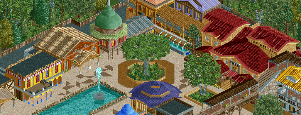
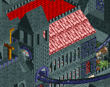
This looks a lot better than it did before but I can't help but feel like something is missing? Something that would really help pull it together.
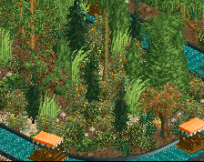
Not sure if that means more cohesive colors, or more coherent architecture (given that each building has a million contrasting textures when compared to each other, though I get what that you're going for a PoE-style entry). This may come off as odd, but maybe place foliage directly behind the buildings? Like a tree here and there, to give the illusion that the archy is backed by trees and is a bit overgrown or something. Maybe it's the backstage areas that makes this feel slightly too open for what it is.
Still tho, this is an improvement from before. The oversized trees really help.
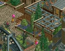
I like it, it's something different. The random colours and textures don't bother me. What does bother me are the random bits of brown path. It would look cleaner if you got rid of those.
The buildings on itself are nice. But when you look at the whole picture it doesn't work. It lacks a coherent style. It would help to stick with one or two roof types. I'd use the normal one and the Spanish one, and get rid of the other ones. The same goes for the wall textures and the color choices.
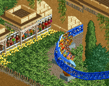
Also, I think you can get a more interesting shape in that fountain with diagonal paths!
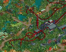
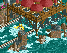
I'm going to give you some constructive crit, considering there's not much you can do with people telling you "it's a mess". I hate it when people tell me that. The main issue with this screen is that the composition is too rudimentary. When you plan out things, it's best to use geometric shapes and curved lines connecting them to get the best result. This sharp 90-degree bend isn't working. Something that could work better is to have a circular plaza with the monorail entrance in the middle, the path leading up to it, and another path leaving the plaza at a 135 degree angle from the plaza. Avoid direct 90 degree angles as much as possible, and when you need to use them, smooth them out.
Another thing you need to learn is proper spacing and scaling. That octagonal tree planter is excellent for facilitating the circular plaza that i am talking about. It;s best, then, to have the monorail station as the highest or 2nd highest structure in the screen, and make a gradual slope down to a "normal" structure height. You can break this a little, and you should actually. A tall 2x2 structure like the green domed roof would look great tall. Your base floor should be higher than 4 units (5-6) and any other stories should be the same height or less. As for spacing, an entrance needs a wider entrance than what you have, and the rectangle fountain isn't helping that situation at all. You should start wide, taper it, and open it up again for the plaza area.
The third thing is cohesion/motifs. You need them, it's the easiest way to develop themes. Use similar windows, roof styles and colors, and wall textures to bind things together. Have a variety or a contrasting element, but any more than 1 or 2 contrasting elements hurts the theme.
 26-May 16
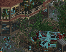
This looks a lot better than it did before but I can't help but feel like something is missing? Something that would really help pull it together.
Not sure if that means more cohesive colors, or more coherent architecture (given that each building has a million contrasting textures when compared to each other, though I get what that you're going for a PoE-style entry). This may come off as odd, but maybe place foliage directly behind the buildings? Like a tree here and there, to give the illusion that the archy is backed by trees and is a bit overgrown or something. Maybe it's the backstage areas that makes this feel slightly too open for what it is.
Still tho, this is an improvement from before. The oversized trees really help.
Needs some cohesion for sure. Colors and textures both look random.
I like it, it's something different. The random colours and textures don't bother me. What does bother me are the random bits of brown path. It would look cleaner if you got rid of those.
Not a fan of this, just seems like a mess of buildings and colors. No flow or real point to any of the buildings other than to just have buildings.
The buildings on itself are nice. But when you look at the whole picture it doesn't work. It lacks a coherent style. It would help to stick with one or two roof types. I'd use the normal one and the Spanish one, and get rid of the other ones. The same goes for the wall textures and the color choices.
Also, I think you can get a more interesting shape in that fountain with diagonal paths!
Not a bad screen, you're improving.
I'm going to give you some constructive crit, considering there's not much you can do with people telling you "it's a mess". I hate it when people tell me that. The main issue with this screen is that the composition is too rudimentary. When you plan out things, it's best to use geometric shapes and curved lines connecting them to get the best result. This sharp 90-degree bend isn't working. Something that could work better is to have a circular plaza with the monorail entrance in the middle, the path leading up to it, and another path leaving the plaza at a 135 degree angle from the plaza. Avoid direct 90 degree angles as much as possible, and when you need to use them, smooth them out.
Another thing you need to learn is proper spacing and scaling. That octagonal tree planter is excellent for facilitating the circular plaza that i am talking about. It;s best, then, to have the monorail station as the highest or 2nd highest structure in the screen, and make a gradual slope down to a "normal" structure height. You can break this a little, and you should actually. A tall 2x2 structure like the green domed roof would look great tall. Your base floor should be higher than 4 units (5-6) and any other stories should be the same height or less. As for spacing, an entrance needs a wider entrance than what you have, and the rectangle fountain isn't helping that situation at all. You should start wide, taper it, and open it up again for the plaza area.
The third thing is cohesion/motifs. You need them, it's the easiest way to develop themes. Use similar windows, roof styles and colors, and wall textures to bind things together. Have a variety or a contrasting element, but any more than 1 or 2 contrasting elements hurts the theme.
PM me if you want more crit.