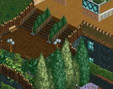
Nice. I like the wave mural. I think I would put that where the brown one is and create something else above the door.. at the moment the wave one is awkwardly placed because it's nudging up against the doorway. This would balance out the blue roof better too.
I like it, but it needs a little refinement. The building itself could be made a little more interesting. Try making the murals pop a bit more. Maybe it's not a bad idea to replace the brick behind the murals with a regular white wall to add a bit of contrast?
I'm planning on redoing the roof stuff. I just wanted a few opinions on the before hand. I will experiment with the brick wall also but I don't think I will change it all.
You forgot queue railings in the balcony. And yea, like I said, you need to fix those AC units. Maybe look at some real ones and make them a bit more realistic and simplified. Just to many objects and textures right now, its a little distracting.
Maybe swapping out some of the walls as well would help, never really been a big fan of those bricks. They don't really fit RCT texture wise in this quantity, maybe normal bricks with some added textures would be a bit better. Also, not sure what he inspiration is for the white trim, doesn't look or feel believable or realistic, but I could be wrong.
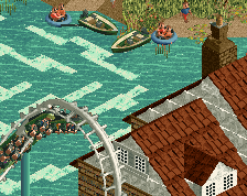
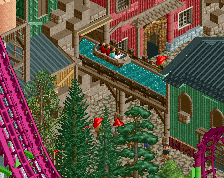
The triotech dark ride/roller coaster offers an interactive experience like no other. Blast treasures and monsters to explore what could be in the depths of the Iron Reef!!!
 08-July 16
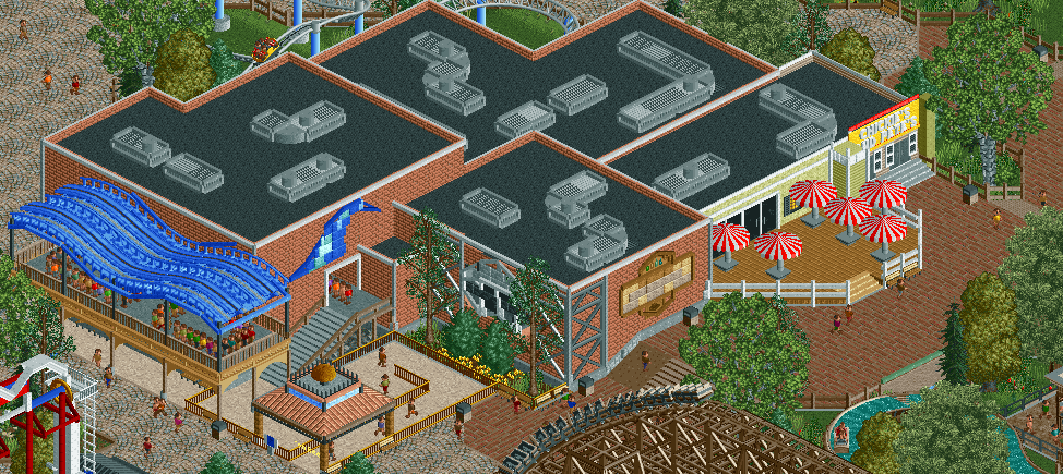


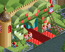
This should be a lot more objectively appealing than what it is...maybe it's the brick(?)
Nice. I like the wave mural. I think I would put that where the brown one is and create something else above the door.. at the moment the wave one is awkwardly placed because it's nudging up against the doorway. This would balance out the blue roof better too.
The ventilation units on top of the roof don't look good and use a lot of unnecessary object slots. Units made with less objects would look better.
The murals are pretty nice!
u could use some windows =p
You forgot queue railings in the balcony. And yea, like I said, you need to fix those AC units. Maybe look at some real ones and make them a bit more realistic and simplified. Just to many objects and textures right now, its a little distracting.
Maybe swapping out some of the walls as well would help, never really been a big fan of those bricks. They don't really fit RCT texture wise in this quantity, maybe normal bricks with some added textures would be a bit better. Also, not sure what he inspiration is for the white trim, doesn't look or feel believable or realistic, but I could be wrong.