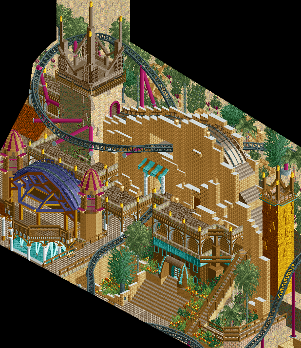
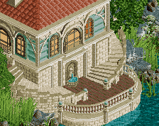
I think you can really do without the coaster track on top of the wall, the blockiness is really working for the rest of the screen (especially the bottom right with those steep stairs and the greenery..). If you can continue that feel and scale up onto the main wall, using more greenery and texture, it will help I think.
Apart from that, this is so excellent, the colour is working well and so is the setting.
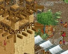
Thanks guys for the feedback! These four screens were old ones I just moved over from the AD. I will add the greenery as suggested, as well as change the white in the brick to a neutral tan.
If you check out the project page I've added more info about the sections that will be included in the park...
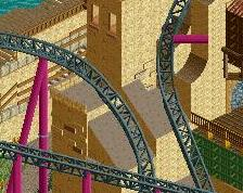
Some of the colours just don't work for me. It almost looks like youve just decided to add in random bits of colour here and there.
I don't really see how they are random, but if you have any specific examples or suggestions for improvement that would be helpful!
It's probably because there are only touches of each colour in this screen, in the whole area it may look better, but at the minute, you've got like one instance of each colour, they don't come together well as a whole.
It's not necessarily the colours I have issues with, just how they've been used in this particular screen.
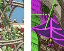
I think it's the big block of purple more than anything. You've got various bits of teal around the place, which look good, but the big block of purple is all on it's own and looks a bit out of place.
 22-October 13
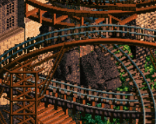

Wow, that's great!
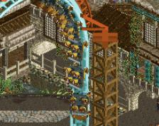
Compared to the other screen, so much more texture and detail and just pure joyous fantasy! WOO FANTASY!!!
Fantasy...incredible
Some of the colours just don't work for me. It almost looks like youve just decided to add in random bits of colour here and there.
I think you can really do without the coaster track on top of the wall, the blockiness is really working for the rest of the screen (especially the bottom right with those steep stairs and the greenery..). If you can continue that feel and scale up onto the main wall, using more greenery and texture, it will help I think.
Apart from that, this is so excellent, the colour is working well and so is the setting.
No AC! Don't listen to him! I love the colors!
I do agree with Turtle on adding some type of vegetation on the walls
Thanks guys for the feedback! These four screens were old ones I just moved over from the AD. I will add the greenery as suggested, as well as change the white in the brick to a neutral tan.
If you check out the project page I've added more info about the sections that will be included in the park...
I don't really see how they are random, but if you have any specific examples or suggestions for improvement that would be helpful!It's probably because there are only touches of each colour in this screen, in the whole area it may look better, but at the minute, you've got like one instance of each colour, they don't come together well as a whole.
It's not necessarily the colours I have issues with, just how they've been used in this particular screen.
I see what you mean, I will see if there's anything I can change to make it more cohesive.
I think it's the big block of purple more than anything. You've got various bits of teal around the place, which look good, but the big block of purple is all on it's own and looks a bit out of place.
The structure is phenomenal though.