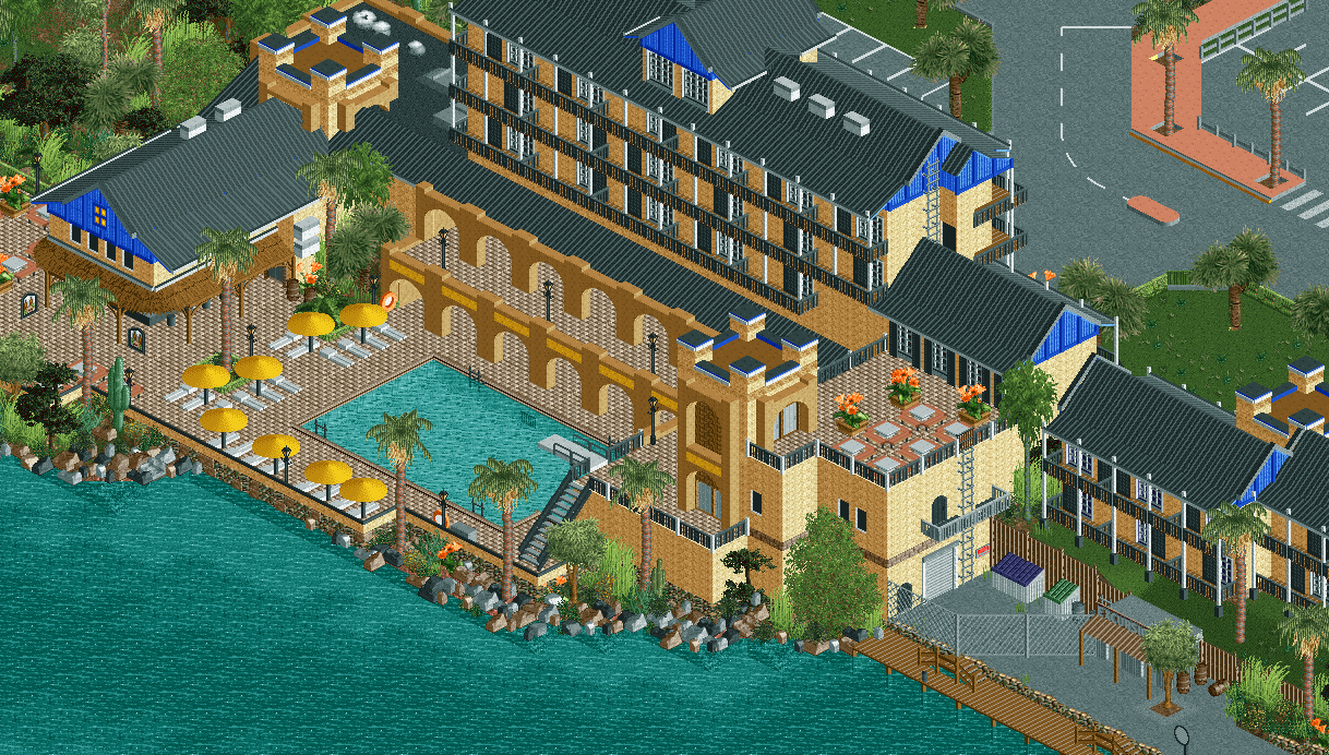
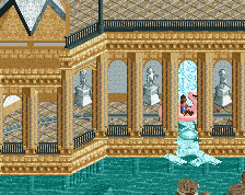
Wow.. It's so realistically post-modern - mostly neutral and utilitarian but with subtle Caribbean touches in the turrets, archways and the thatched awning. Love the blue highlights too.
One thing I would change is the path type on the 1st floor to avoid the escher effect with the ground floor.
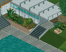
I'm afraid I'm not really liking this that much. The building is great, the rockwork and foliage is well done, but the path spoils it for me. It fits the hotel and pool theme, true, but it's quite distracting.
Apart from that, it does feel very "Liampie", so good work with that!
So good! Add a few orange flowers on the second floor, above the arches, and you'll be fine. Wonderful screen, just wish there were peeps. Looks a bit lifeless. Otherwise it's great!
Thanks for the comments! I've taken all your advice on board. Behold, v2. v1 was the rushed finished version anyway, I just wanted to be on time for the Fiesta.
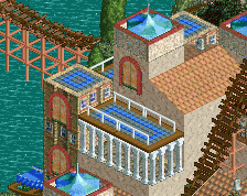
This is great structurally, however the atmosphere misses for me. It's very "dark" but maybe that's what you were going for? First thing I would fiddle with is the path, maybe something brighter, and then the 1k ruin rocks (the black on top of the already black roof might be much). I thought this was meant to be tropical and it's just not there for me yet. Still beautiful architecture.
Wonderful improvements. I don't know what it is, but some of your work really stands out from most of the realism seen on this site. It was very noticable in Budapleasure. Everything looks so real and inviting. Not sure how you do it, but I sure know I love it. Keep doing what you do.
I'll echo the "too dark for tropical" sentiment. I'd say the culprit is the railings more than anything else. Otherwise extraordinarily believable as a hotel scene. I've been checking out Dolphin Bay again recently as well - nobody has hotels nailed like you do.
 25-November 16
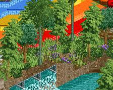
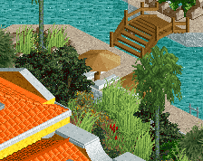
Wow.. It's so realistically post-modern - mostly neutral and utilitarian but with subtle Caribbean touches in the turrets, archways and the thatched awning. Love the blue highlights too.
One thing I would change is the path type on the 1st floor to avoid the escher effect with the ground floor.
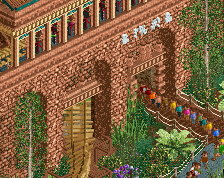
I'd also consider glass/doors behind the 1st floor archways to add just enough difference.
Agree with alex about the arches, a different path texture is one option maybe another could be canvas covers on top(?)
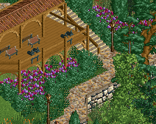
But yeah, rest is gorgeous and I adore the tropical foliage palette (especially the 'new' palm trees)
Really nicely done. Feels very real and very hotel like, unlike most people's attempts at hotels.
I'm afraid I'm not really liking this that much. The building is great, the rockwork and foliage is well done, but the path spoils it for me. It fits the hotel and pool theme, true, but it's quite distracting.
Apart from that, it does feel very "Liampie", so good work with that!
So good! Add a few orange flowers on the second floor, above the arches, and you'll be fine. Wonderful screen, just wish there were peeps. Looks a bit lifeless. Otherwise it's great!
Thanks for the comments! I've taken all your advice on board. Behold, v2. v1 was the rushed finished version anyway, I just wanted to be on time for the Fiesta.
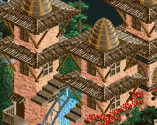
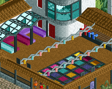
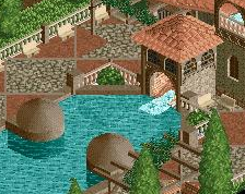
Great work, especially the buildings in the lower right corner, there's something incredibly life-like about those..
Wonderful improvements. I don't know what it is, but some of your work really stands out from most of the realism seen on this site. It was very noticable in Budapleasure. Everything looks so real and inviting. Not sure how you do it, but I sure know I love it. Keep doing what you do.
The texture of the arches is a bit distracting, the area around the balcony's above them is a bit bare as well.
Rest is fantastic.
Great work Liam. I really like the street/sidewalk details on the top right too.
I'll echo the "too dark for tropical" sentiment. I'd say the culprit is the railings more than anything else. Otherwise extraordinarily believable as a hotel scene. I've been checking out Dolphin Bay again recently as well - nobody has hotels nailed like you do.