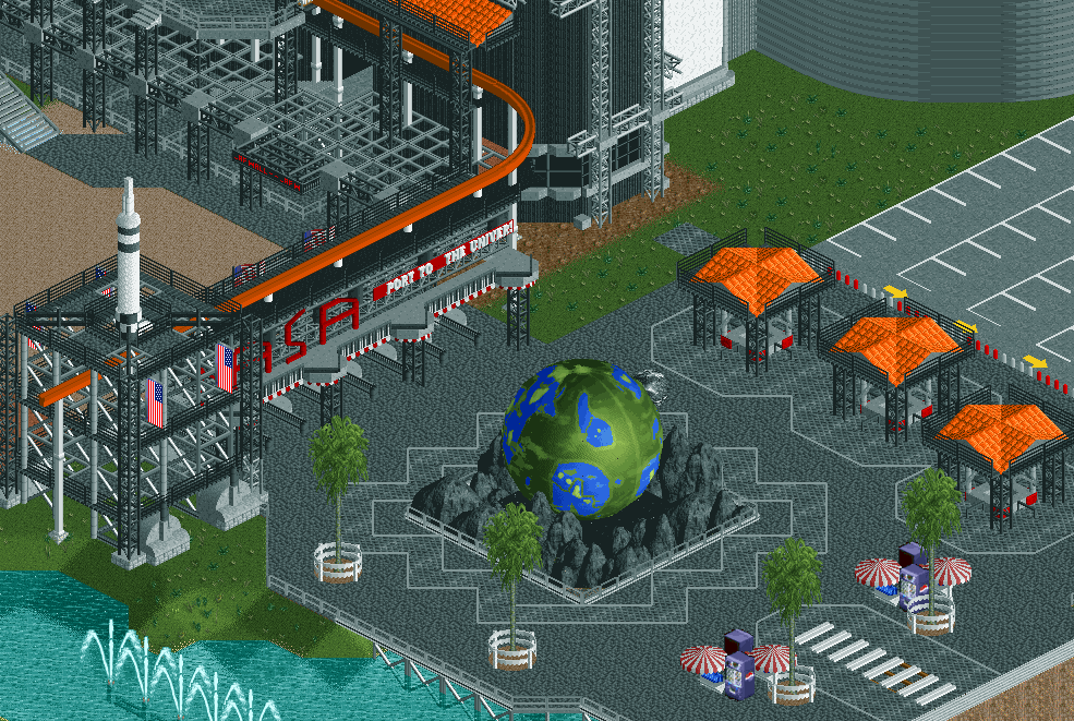
Not very much added since the streams, I see. Looks very cool and spacey. Path might become too dark if the square behind it evolves in the same way. Take a note from my book, use grey crazy path!
Not very much added since the streams, I see. Looks very cool and spacey. Path might become too dark if the square behind it evolves in the same way. Take a note from my book, use grey crazy path!
Kinda lost inspiration, but I'll take the suggestion if I continue on this.
Globe is a bit odd, but i admire the use of the mulch object as actual path - adds a very interesting texture. Perhaps ironically, given the theme, I think that there's probably a bit too much scaffolding actually, as a result you can't see any defined shapes/structures which detracts from the screen imo.
My worries is that its very similar to nin's old project, just with less refinement and detail. Maybe you need a way to really distinguish your project? Idk
 25-November 16
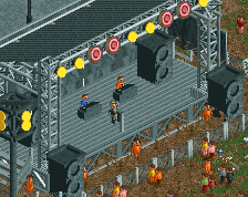
Not very much added since the streams, I see. Looks very cool and spacey. Path might become too dark if the square behind it evolves in the same way. Take a note from my book, use grey crazy path!
Kinda lost inspiration, but I'll take the suggestion if I continue on this.
Wonderful start Fred, love this! Hope you can get your ideas rolling again!
Paging kyle...
Globe is a bit odd, but i admire the use of the mulch object as actual path - adds a very interesting texture. Perhaps ironically, given the theme, I think that there's probably a bit too much scaffolding actually, as a result you can't see any defined shapes/structures which detracts from the screen imo.
I think this looks very, very good, except for that weird globe object... I do hope you find some new inspiration to continue working on this!
My worries is that its very similar to nin's old project, just with less refinement and detail. Maybe you need a way to really distinguish your project? Idk