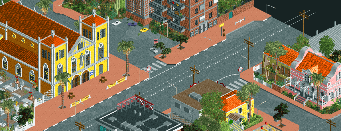
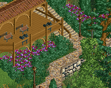
Not at all sold on the texture of the sidewalks, way to soft in my eyes. I feel the roads could use a lot more color and detail as well, some yellow road lines and just more detail in general would be nice.
Wouldn't exactly call this your best archy either, especially texture wise. The church and brown roof near the bottom are the biggest offenders in my eyes.
I'm not sure about the church, I can appreciate what you're going for but it just looks too blocky and flat right now... Maybe a different roof colour, some shade of brown, would help make it less cartoony. The large windows are nice but the ones at the top of the towers don't really work for me, they look kinda "glued on" and fake.
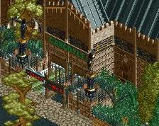
That cemetery, though! Looks really good from what we can see in the screen!
I like pretty much all of it, you've nailed the look and atmosphere. Only the sidewalk bothers me. It's just a big blob of that weird pink colour. You should look into that.
What you are going for is perfect, the scene is fantastic.
I think everything feels right, however the texture of the sidewalk isn't good. The colour is great, just the texture looks too flat and is very distracting, makes the whole screen feel very basic, when it actually isn't.
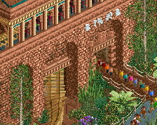
Really liking this project. The pink structure in the thumbnail is the best of them all imo, the yellow cathedral is nice but seems a bit short? Could use a tile or two of height but I can understand why you wouldn't want to do so.
 01-December 16
just lovely.
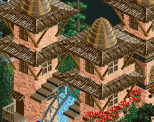
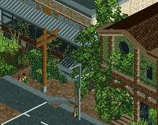
only things I'm unsure of are the palm tree objects and whatever's going on with the green+brown building on the right.
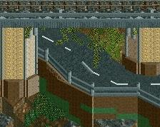
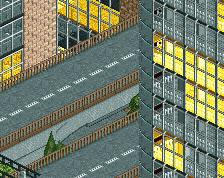
Powerlines and the road texture are fantastic. Love the architectural detail everywhere.
Not at all sold on the texture of the sidewalks, way to soft in my eyes. I feel the roads could use a lot more color and detail as well, some yellow road lines and just more detail in general would be nice.
Wouldn't exactly call this your best archy either, especially texture wise. The church and brown roof near the bottom are the biggest offenders in my eyes.
I'm not sure about the church, I can appreciate what you're going for but it just looks too blocky and flat right now... Maybe a different roof colour, some shade of brown, would help make it less cartoony. The large windows are nice but the ones at the top of the towers don't really work for me, they look kinda "glued on" and fake.
That cemetery, though! Looks really good from what we can see in the screen!
I like pretty much all of it, you've nailed the look and atmosphere. Only the sidewalk bothers me. It's just a big blob of that weird pink colour. You should look into that.
Edit: that cemetery!
What you are going for is perfect, the scene is fantastic.
I think everything feels right, however the texture of the sidewalk isn't good. The colour is great, just the texture looks too flat and is very distracting, makes the whole screen feel very basic, when it actually isn't.
Besides that, you've captured everything brilliantly.
I echo the sentiments on the sidewalk texture, it's not messy enough currently
I pretty much agree spot-on with everything Lou said
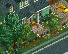
Looks like The Sims in a way. Not bad, but way too micro. Nice colours, as expected from you, just (again) doesn't look effortless enough for me.
Looks great, but a bit too clean for the setting imo.
Really liking this project. The pink structure in the thumbnail is the best of them all imo, the yellow cathedral is nice but seems a bit short? Could use a tile or two of height but I can understand why you wouldn't want to do so.
Kosherboy35 Fan Offline
Not bad at all Liam! Where did you get those awesome palms from?
are those barrels for palm trees? always love a good road!