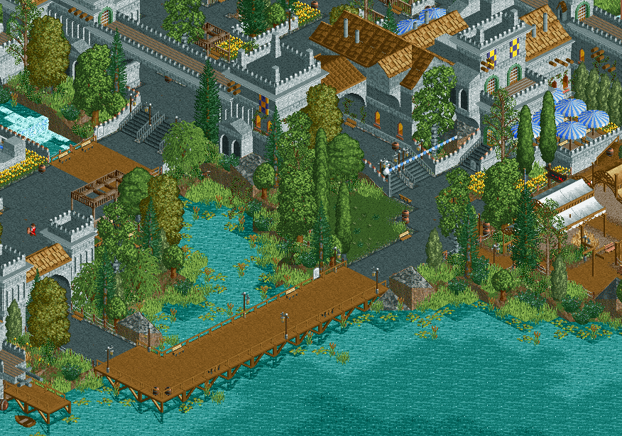
Seems RCTC has helped keep this park in the works, which needs a big thumbs up.
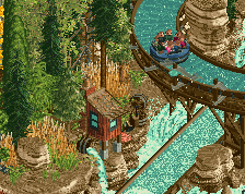
Can't think of any critique, simplistic yet wonderfully put together. Although I'm a sucker for diagonals, it would lose the nostalgic aspect if you added them. One possible addition might be underwater rockwork/foliage (but often that's something which is only relevant for making a screen better rather than the park as a whole).
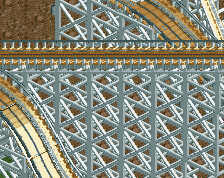
Maybe a bit overload on the grey; it's turning things into a bit of a jumble. Same color for paths + roofs isn't serving you well here. Love the scale of things and the atmosphere - I'd love to see some additional detail put into the footbridge and dock. Some pilings, dockside crane, crates...
Shit, this is good. But I agree with ][ about all the grey, maybe some more details in a contrasting colour would do good? Not bothered by same colour for path/roof though, I think it ties the different elements of the screen together in a nice way.
I think this is the first screen that I've ever bought into the Steve screen hype. Always thought your work was good but not incredible, but I love this so much. So atmospheric.
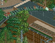
Nice foliage. I think one thing that would instantly make this much better/cleaner would be the use of path blocks and the addition of diagonal paths for the curves. Aside of that it's great in my opinion.
Seems RCTC has helped keep this park in the works, which needs a big thumbs up.
Can't think of any critique, simplistic yet wonderfully put together. Although I'm a sucker for diagonals, it would lose the nostalgic aspect if you added them. One possible addition might be underwater rockwork/foliage (but often that's something which is only relevant for making a screen better rather than the park as a whole).
Without RCTC this park would never have gotten to where it is today. I still think it's an incredibly underrated tool. If it had the capabilities Open has, the park might've been done by now.
[ntamin22' timestamp='1488511208' post='717201']
Maybe a bit overload on the grey; it's turning things into a bit of a jumble. Same color for paths + roofs isn't serving you well here. Love the scale of things and the atmosphere - I'd love to see some additional detail put into the footbridge and dock. Some pilings, dockside crane, crates...
All great suggestions. The path is something I still struggle with and will probably play around with. Thanks man.
Thanks everyone else for the kind words. Definitely motivates me to get this thing done!
I wouldn't mind some touches of additional color in the foliage, like some light pink flowers to represent water lilies or maybe yellow like goldenrod. The screen just needs a pop of subtle color somewhere for me. The composition of the little creek, though, is amazing, and instantly takes me to lake regions I'm familiar with.
Progress still trucking along on this. Thought it might be time for a new screen. Some stuff still needs touching up or revamping but for the most part everything is there. Please give any suggestions though. Cheers, dudes!
 02-March 17

Seems RCTC has helped keep this park in the works, which needs a big thumbs up.
Can't think of any critique, simplistic yet wonderfully put together. Although I'm a sucker for diagonals, it would lose the nostalgic aspect if you added them. One possible addition might be underwater rockwork/foliage (but often that's something which is only relevant for making a screen better rather than the park as a whole).
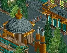
Did artist make this? Reminds me a lot of IoE.
Anyways, love the progress, the simplistic color choices really adds to the classic feel.
Maybe a bit overload on the grey; it's turning things into a bit of a jumble. Same color for paths + roofs isn't serving you well here. Love the scale of things and the atmosphere - I'd love to see some additional detail put into the footbridge and dock. Some pilings, dockside crane, crates...
Shit, this is good. But I agree with ][ about all the grey, maybe some more details in a contrasting colour would do good? Not bothered by same colour for path/roof though, I think it ties the different elements of the screen together in a nice way.
Not much to say apart from the fact that I love it. Great job! May I suggest using brown for the flat roofs?
Very beautiful. I'd smooth out the jagged edges underwater, they stand out quite a bit atm.
Just goes to show how beautiful simplicity can be. Always blown away by your work, Steve.
I think this is the first screen that I've ever bought into the Steve screen hype. Always thought your work was good but not incredible, but I love this so much. So atmospheric.
Very atmospheric indeed; love it!
I actually don't mind the gray in this case. The foliage and green space makes up for it very nicely.
Nice foliage. I think one thing that would instantly make this much better/cleaner would be the use of path blocks and the addition of diagonal paths for the curves. Aside of that it's great in my opinion.
But then again I guess the path blocks wouldn't fit the "nostalgic project" topic, so scrap that.
All great suggestions. The path is something I still struggle with and will probably play around with. Thanks man.
Thanks everyone else for the kind words. Definitely motivates me to get this thing done!
This is friggin great. Love the little inlet.
Stunning, nothing else to add! ♥
Your work is so beautifully organic. Looking is like eating a super expensive gourmet chocolate. Will always love it.
I agree the path is a bit funny. Not the colour, more the contrast with the brown, and its boxy layout.
I wouldn't mind some touches of additional color in the foliage, like some light pink flowers to represent water lilies or maybe yellow like goldenrod. The screen just needs a pop of subtle color somewhere for me. The composition of the little creek, though, is amazing, and instantly takes me to lake regions I'm familiar with.