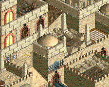
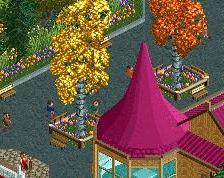
Wow, this is awesome. Just a shame about the cramped paths, which is something I notice in all of your screens. Every path is two tiles wide... The theming needs more space to breath!
Thank you guys so much for your comments! I didnt even consider to make the paths wider, but I really see what you mean and will consider this for my future work.
Take a look at Rivers of Babylon if you haven't already. So much you can learn from that park, path proportions for example. I think the park might be up your alley anyway!
I, myself, hate wide paths, but you could use a little more neutral (less busy) space on this screen. Maybe instead of whatever ride that is to the right of the fountain
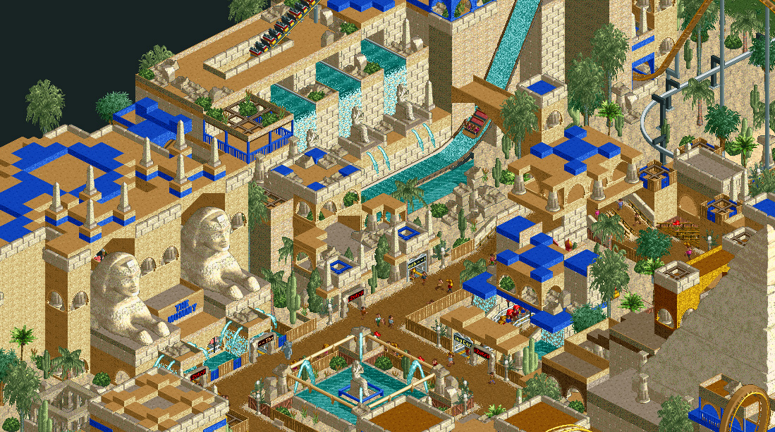
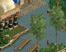
This park has all the good stuff... in this area temples, pyramids, crazy egyptian architecture. There isnt much left to build in this park, so its soon to be released :)
 11-January 14
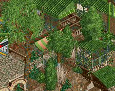
Wow, this is awesome. Just a shame about the cramped paths, which is something I notice in all of your screens. Every path is two tiles wide... The theming needs more space to breath!
I agree with Liam here. Make those paths wider!
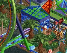
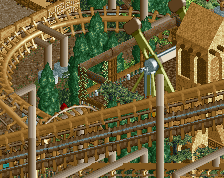
I like all the blue spots in this, although it's not really visible from a peeps perspective.
Looking forward to this!
"MFG"
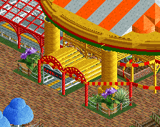
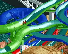
This is, by and far, my favorite screen of yours.
Cool!
Really interesting style.
Really love this. I just think the blue is possibly too harsh.
Perhaps use a lighter blue or a turquoise.
Great stuff.
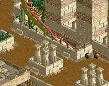
i'd add purple, adds to the egyptian theme, also i'd love some references to noteworthy faraos like narmer, anachaton and cleopathra
Take a look at Rivers of Babylon if you haven't already. So much you can learn from that park, path proportions for example. I think the park might be up your alley anyway!
I, myself, hate wide paths, but you could use a little more neutral (less busy) space on this screen. Maybe instead of whatever ride that is to the right of the fountain
^The park's already been released.