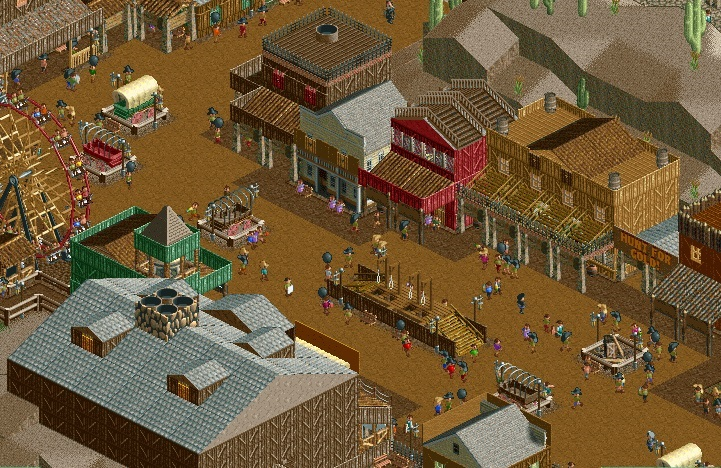
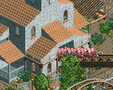
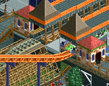
Some of the buildings look blocky and undecorated, i don't really like that. Definitely the one on the left. What is that, a grey-brown random slab with a somewhat overly-modern chimney?
The level of detail is perfect and fitting the theme.
Not sure if I like the wagons. Randomly parked across the path, boxed in by fences, they don't look very functional. Of course they shouldn't be functional, but the illusion of a good themed area is making everything appear real, right?
You don't often see really good western themes (especially with NCSO) but I think you've nailed it here. Agree with Liam and Faas, I did a similar thing in my western area and think it would look nice here; have the wagons on the path and then have barrels near it.
The big brown building in the bottom does lack detail, perhaps an off-shoot could help make it look a little less rectangle and bland (evidently you know how given the other side).
Concerning the wagons, in my Caste Project I've been creating small almost-parking lots for them, being open on the side of the path. Just me though. I am a fan.
The gallows are fantastic, and the simple, yet well executed look of the western theme is great! The only problem I have is the path on top of the red building. I think it would look just fine with the normal grey or tan roof!
I somewhat agree with BigB...a bit too much brown. Especially the building to the left of the "Hunt for Gold!", it's completely tan. I would add a few more accent colors.
 06-April 14
Lovely work. Very convincing too
Some of the buildings look blocky and undecorated, i don't really like that. Definitely the one on the left. What is that, a grey-brown random slab with a somewhat overly-modern chimney?
The level of detail is perfect and fitting the theme.
Not sure if I like the wagons. Randomly parked across the path, boxed in by fences, they don't look very functional. Of course they shouldn't be functional, but the illusion of a good themed area is making everything appear real, right?
Yeah just put the wagons on the path without fences. It's allright if people can reach it and maybe even climb on it. Very cool screen though!
Will do! Thanks guys. Wouter, it's actually a station for a mine train coaster I'm gonna build.
Okay, but it definitely doesn't look appealing.
You don't often see really good western themes (especially with NCSO) but I think you've nailed it here. Agree with Liam and Faas, I did a similar thing in my western area and think it would look nice here; have the wagons on the path and then have barrels near it.
The big brown building in the bottom does lack detail, perhaps an off-shoot could help make it look a little less rectangle and bland (evidently you know how given the other side).
Concerning the wagons, in my Caste Project I've been creating small almost-parking lots for them, being open on the side of the path. Just me though. I am a fan.
It's amazing how much the gallows make this screen (for me). I like it!
The gallows are fantastic, and the simple, yet well executed look of the western theme is great! The only problem I have is the path on top of the red building. I think it would look just fine with the normal grey or tan roof!
BigB Offline
To be honest, I'm not confinced that much.
Don't get me wrong it looks good but I don't have this "wow this is outstanding"-feel which others seem to have when I read their comments.
I somewhat agree with BigB...a bit too much brown. Especially the building to the left of the "Hunt for Gold!", it's completely tan. I would add a few more accent colors.
Great job on the buildings in the upper right part of the screen (on the right side of the path), those are all very nice.