Screenshot / Year 100 Update- NCSO project
-
 06-April 14
-
Blue Oak Amusement Park
-
4 of 13
- Views 2,962
- Fans 1
- Comments 21
Community Forum Software by IP.Board


I don't think the orange works in my opinion.
Maybe orange and grey-red? Looks very nice by the way.
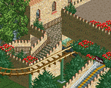
I like the green building in the bottom, but the station needs some more work/refinement.
i second what poke said, but i think that's because of the colours of the station. it works with everything else for me. so i'd try to change the colours of the station if that doesn't disturb that area's theme
*Third.
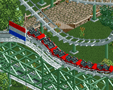
i changed the coaster's colors to red and it looks far better and works with station
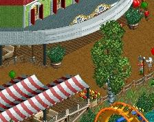
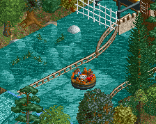
I think you should make that tile of path in between the two rapids stairs full tile. Just build a 9x9 and sink all of it around the middle.
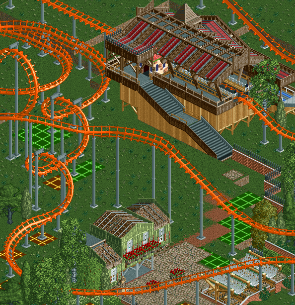
I think the station is very creatively done, but I'm not overly keen on the base section of it. The green building is nice too and certainly gives of a cottage charm.
That station is everything...
__________________________________________________________________________
@regarding the color of the coaster/station: the coaster color is changed to a deep red that works well with the highlight color of the station. to me, i prefer the station to be two-toned instead of completely brown or something of that nature
__________________________________________________________________________
@the station in general: what do you find about the station that needs some refining, particularly the base? i changed the base of the stairs which made it a good deal better, but what other qualm do you have with the station? also, for you guys who liked it, thanks
__________________________________________________________________________
@nin: i'd like it if you explained it to me on aim what exactly you're saying, if you can.
I love the station but I can see the problem some have with the base. The roof + slanted supports are very clean and look well detailed, while the base is blocky and looks unconsidered. Perhaps if the base matched the top it would look better?
^ I agree. Everything above the tan walls on the station could itself look good as a station on the ground. Like a train station or something.
nah, then it wouldn't seem as structurally sound as it is now