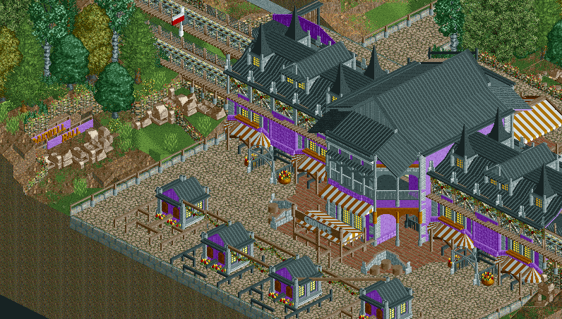
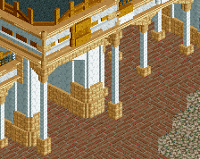
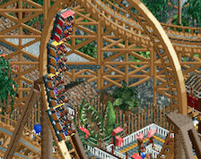
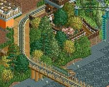
The diagonal square roof things make the building look strange. Have them just follow the footprint of the building instead of overhanging like that. The rest is brilliant.
The diagonal was pretty difficult for me to figure out what to do with. First of all, there's not too many blocks that can be used for detailing the actual diagonal blocks, but I managed to find enough to scrape by while still making it look decent.
The roofing was more of a problem though. I originally wanted a simple overhang, as with the rest of the roof, but quickly realised I didn't have any objects which I could achieve something like this with, so instead I started to add larger overhangs onto the diagonals, and this is the best one that I could find.
In essence, the diagonal overhangs are the 'best of a bad bunch', but I think that they actually add to it. I don't agree that they look boxier, I'd say the building looked much boxier without any sort of overhang there because the diagonal side was just completely flat, with no sort of level definition. The overhang at least adds a small amount of difference and depth.
Thanks for all the comments though, nice to see people like the colours, the whole of the Main Street type area uses these sort of pastel unusual colours, so hopefully that gets a similar response!
There's a trapezodal deco block, and an accompanying triangle that're only half a block high that I've used in a similar situation, and I think it looks a lot better. But hey, it's your park, and this looks nice anyways. Just trying to point out what room for improvement I saw.
I think I had a look at those items but because the diagonal is 2 wide, it meant that the overhang using those items came out a bit too far to look right, especially when compared to the overhang I've got on the rest of the building where it came out twice as far. I might be thinking of the wrong item, but it sounds pretty similar.
The diagonal square roof things make the building look strange. Have them just follow the footprint of the building instead of overhanging like that. The rest is brilliant.
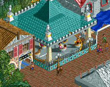
The screen is really well detailed and the purple building is magnificent. I am really enjoying this! Just wondering, if it's no secret, what was your old username? This is really quality work and since you are an old member it would be nice to connect this stuff to your old persona.
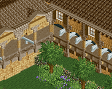
you've got some really nice detail going for you here, rawry, but i think if the purple wall was raised a tile on the sides, it would look better and more spaced out. really good, captivating work here otherwise
 08-April 14
unique and promising, two things that rarely happen in a screen of an entrance
I actually really like this a lot.
Oh my god, this is fantastic. I love the purple.
awesome ... nice colours in my opinion
This is really nice.
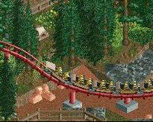
I'm on the fence about the diagonal beams connecting the ticket booths on the far left and right but that's the only minor nitpick I have. Great job!
The diagonal square roof things make the building look strange. Have them just follow the footprint of the building instead of overhanging like that. The rest is brilliant.
i like that those diagonal roofs don't follow the footprint, this is really good
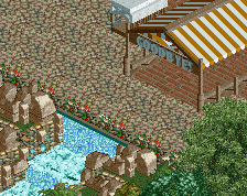
on the other hand everyone seems to lave having a choo choo going above the entrance lately
I agree with Ling. The roofs make the building look boxier than it really is, and they seem somehow dangerous like that to me.
The diagonal was pretty difficult for me to figure out what to do with. First of all, there's not too many blocks that can be used for detailing the actual diagonal blocks, but I managed to find enough to scrape by while still making it look decent.
The roofing was more of a problem though. I originally wanted a simple overhang, as with the rest of the roof, but quickly realised I didn't have any objects which I could achieve something like this with, so instead I started to add larger overhangs onto the diagonals, and this is the best one that I could find.
In essence, the diagonal overhangs are the 'best of a bad bunch', but I think that they actually add to it. I don't agree that they look boxier, I'd say the building looked much boxier without any sort of overhang there because the diagonal side was just completely flat, with no sort of level definition. The overhang at least adds a small amount of difference and depth.
Thanks for all the comments though, nice to see people like the colours, the whole of the Main Street type area uses these sort of pastel unusual colours, so hopefully that gets a similar response!
There's a trapezodal deco block, and an accompanying triangle that're only half a block high that I've used in a similar situation, and I think it looks a lot better. But hey, it's your park, and this looks nice anyways. Just trying to point out what room for improvement I saw.
I think I had a look at those items but because the diagonal is 2 wide, it meant that the overhang using those items came out a bit too far to look right, especially when compared to the overhang I've got on the rest of the building where it came out twice as far. I might be thinking of the wrong item, but it sounds pretty similar.
Like I told you before, fantastic screen. The colour is great and the structure really nice.
Just a shame the ticket booths are right on the edge of the map.
You really have improved since your last presence here.
They go out just a pixel or two further than the planks you're using. I have both on the same building. It's not a huge deal.
Also, when do we get to find out who you used to be?
The screen is really well detailed and the purple building is magnificent. I am really enjoying this! Just wondering, if it's no secret, what was your old username? This is really quality work and since you are an old member it would be nice to connect this stuff to your old persona.
This is ace.
I'm digging the purple! Keep going! This is unique and amazing!
Very nice colors, very cocoa-eque! Its a shame its all so close to the edge. Looking forward to the rest!