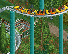
Screenshot / Coffee Corner
-
 11-April 14
-
Oakwell Hall
-
3 of 4
- Views 1,851
- Fans 1
- Comments 13
-
Description
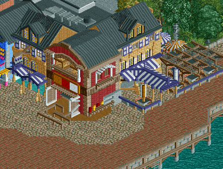
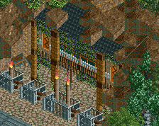
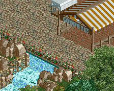
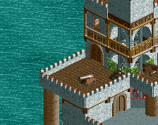
I couldn't find a way to update my project without uploading a screenshot, so I'll upload a very small one just to say that I've finished the main street (bar a few zero clearances that need to go in, such as the pillars extending underwater and the ropes around the bail of hay) and am now looking towards building 2 areas next. I'll build them at a similar time but I'll only show screenshots of one area, so you guys can decide between screenshots of the Creepy Hollow or the Oakwell Farm kids area.
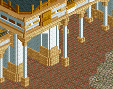
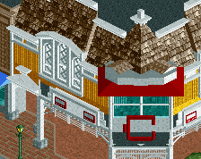
As for the screenshot here, I hope it gives a general feel for the area without giving too much away. The buildings you can see in the screenshot are the Coffee Corner (Not actually on a corner, yolo) the Oakwell Fried Chicken shop and a little bit of the Shakeaway Shake Shack. -
Full-Size
-
1 fan Fans of this screenshot
-
Tags
This is adorable. Keep up the great work!
nice atmosphere i just like it
This is pretty cool. The colors work really well. I think the barn facade could be a bit stronger, but that's my only complaint.
Try navigating to your project's page, then clicking "edit project" in the top right.
I may be in the minority here, but this feels overworked and overdetailed. All the details work and make sense and are skillfully placed - the barn doors and condiment station are great - but for my eye it is very busy. Don't be afraid to leave a blank wall, or to give your structures some breathing room.
I'm excited to see what your Creepy Hollow looks like.
I'd agree with ][22. Even something as simple as recoloring the shutters to be one single color could clean things up a bit.
It's beautiful. Love the detailing here!
I also agree with intamin22 about having more breathing room.
I'm still curious as to who you are
Maybe add some planters or trees on the pathway to break that up a bit. More trees would look great.
@Cocoa The two tan buildings are the same building, they just go behind the red building
As for everyone else, I'll have a play around with the details on the buildings to make it seem a little less cluttered. And the path here has some smaller details that I purposely deleted from the screen so that I didn't give too much away, because I believe that what makes a park great are those little details. It'd be nice to keep them a surprise for once
In some places you're adding too many details and the overall picture gets distorted in the process, especially with that red corner building. It's too protruding and way out of style with the other bits, as well as having far too many superfluous details. The atmosphere I think will really kick in once you get the finishing details (planters, benches, peeps) into play. 75%