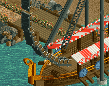
That's a nice station structure, but I imagine you're going to get some criticism for magenta not being a particularly "norse" color. You can definitely run with what you've got, but it looks like you aren't too far in to consider a color change. I rather like the grey rockwork, but the fenceposts on the stairs seem to be out of scale with everything else.
There is so much awesome going on in this screen, but U have to agree with Intamin, the magenta isn't exactly fitting in with the theme. Maybe a red color would fit better. However, if you didn't change it, you wouldn't hear me complain because it all just looks so damn goood! (loving that rock work)
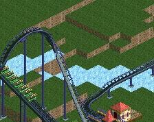
I have a few issues with the scale of the structure. Looking at the mechanic on the right, the top of the fence is at the same height as his head. I'd drop the posts two clearances and the rails one. Also, the opening that the train comes out of appears to only be two or possibly three units tall, it looks strange. I'd go for at least three but ideally four clearances. I don't have a problem with the magenta (it's one of my favorite colors in RCT), but I think you will need to make sure you add lots of other colors to the surrounding buildings to not make it feel out-of-place - light blues and greens, which I think will be well-offset by the snow/ice you appear to be going for.
I just asked all of Iceland. They agree that magenta color is best color!! Really though it is my most often used color in RCT2.
Although I am not sure what true Norse colors are. I looked up a lot of Scandinavian archy and it all looked brown with a hint of brown.
I think it looks alot like dimi's [NEDC2 #2] Marrons Chauds. I like it though
I did use Dimi's Marrons Chauds station house heavily as the launching point for this. I even directly copied it a good bit. I am just trying to get a handle on archy, as I am really bad at it. I tried to give him credit with the tag system, but I am not sure how else.
 16-April 14
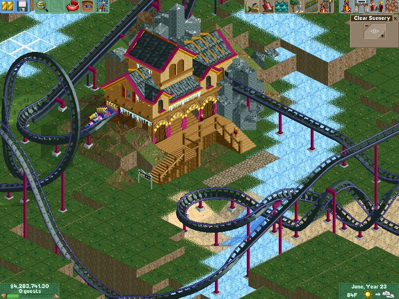
love the colors. Such a nice looking building.
That's a nice station structure, but I imagine you're going to get some criticism for magenta not being a particularly "norse" color. You can definitely run with what you've got, but it looks like you aren't too far in to consider a color change. I rather like the grey rockwork, but the fenceposts on the stairs seem to be out of scale with everything else.
There is so much awesome going on in this screen, but U have to agree with Intamin, the magenta isn't exactly fitting in with the theme. Maybe a red color would fit better. However, if you didn't change it, you wouldn't hear me complain because it all just looks so damn goood! (loving that rock work)
I have a few issues with the scale of the structure. Looking at the mechanic on the right, the top of the fence is at the same height as his head. I'd drop the posts two clearances and the rails one. Also, the opening that the train comes out of appears to only be two or possibly three units tall, it looks strange. I'd go for at least three but ideally four clearances. I don't have a problem with the magenta (it's one of my favorite colors in RCT), but I think you will need to make sure you add lots of other colors to the surrounding buildings to not make it feel out-of-place - light blues and greens, which I think will be well-offset by the snow/ice you appear to be going for.
I think it looks alot like dimi's [NEDC2 #2] Marrons Chauds. I like it though
Hypertwist Offline
Thanks for the help everybody!
@ling
I just asked all of Iceland. They agree that magenta color is best color!! Really though it is my most often used color in RCT2.
Although I am not sure what true Norse colors are. I looked up a lot of Scandinavian archy and it all looked brown with a hint of brown.
I did use Dimi's Marrons Chauds station house heavily as the launching point for this. I even directly copied it a good bit. I am just trying to get a handle on archy, as I am really bad at it. I tried to give him credit with the tag system, but I am not sure how else.
Thanks for the scale advice I will fix that.