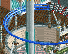
^^You could avoid that by using a diagonal bank to the left and then immediately to the right after the first one and that could smoothly transition into a helix in the opposite direction.
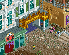
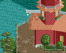
Try changing the brick colour from red (why?) to gray. This means you will have to change the gray path to the one you've already used but that's not a problem.
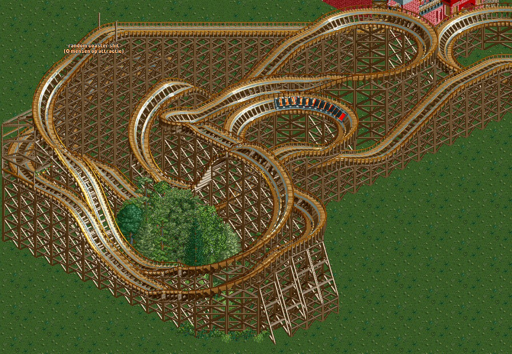
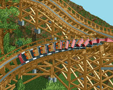
I'd like to see a few more airtime hills in the first part of the layout. This would spread it out a bit more and vary up the knot-like layout you have now. Keep building and you'll get better
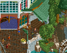
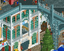
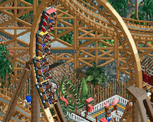
Coaster aside, there's some nice little details on those buildings. In particular, the wooden beams on the jutting out part of the centre building look good to me.
The colours are better, but I preferred the structure you had on the previous screen. It looked more like a castle. Now it's a random mix of architecture.
 05-May 14
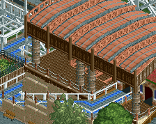
The layout without scenery and supports.
Would be cool if one of your helixes at the end went the other way. Now it's just two of the same elements after each other.
I don't really like the empty space that would create, to be honest.
You are the one to decide if the space would be empty or not.
^^You could avoid that by using a diagonal bank to the left and then immediately to the right after the first one and that could smoothly transition into a helix in the opposite direction.
Its not bad, It just doesn't flow right for me. The elements seem forced, and the foliage is wayyyy to dense in that one spot.
@coaster
Good idea, i'll try doing something with it.
@matt
I'd like to make it very dense and put some castle buildings inbetween it.
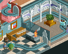
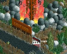
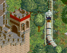
Station + new helix. What should i do with the buildings? I honestly find the one for the coaster ugly, but i don't know what else to do with it.
Try changing the brick colour from red (why?) to gray. This means you will have to change the gray path to the one you've already used but that's not a problem.
That red/peach isn't a great color scheme, and Faas is probably right about changing the brick color. The tan building looks quite nice!
I'd like to see a few more airtime hills in the first part of the layout. This would spread it out a bit more and vary up the knot-like layout you have now. Keep building and you'll get better
Coaster aside, there's some nice little details on those buildings. In particular, the wooden beams on the jutting out part of the centre building look good to me.
good improvement, and nice work on the roof.
The colours are better, but I preferred the structure you had on the previous screen. It looked more like a castle. Now it's a random mix of architecture.
Yeah, but it looked too plain and random, thats why i changed it. It's still not finished though, i'm still adding more to the roof.