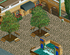
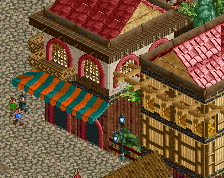
I really like it, and fair play for starting again - that's a tough choice to make sometimes. I think this is off to a great start again, and the fountain and buildings look good. My only quibble is with the shade of green you're using. I don't think it fits with the other colours too well.
agreed, tried a darker green. if only on the walls and roofs. The post detail stuff is probably fine. I certainly wouldn't say it is too closed off, since this is essentially a vestibule space to move the guests inwards. Keeping the park entrance proper low and funneling guests in is a widely-used design tool; see Disneyland, King's Island, etc. It makes for a big "reveal" moment when you step out and get your first real look at the park. I also really like that this is reminiscent of the kind of public space very common in, say, Boston's North End. The only thing missing is a bunch of old shade trees.
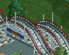
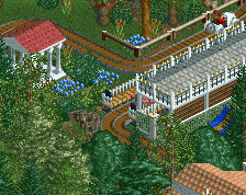
Restarted on my American "Disney's America" type park. I didn't like how everything was turning out so I just began again fro a blank slate, but kept many of the ideas!
 07-May 14
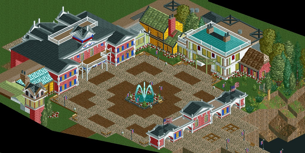
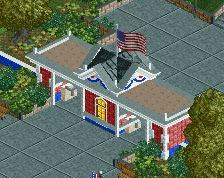
Still feels really "closed-off" for an entrance area.
I really like it, and fair play for starting again - that's a tough choice to make sometimes. I think this is off to a great start again, and the fountain and buildings look good. My only quibble is with the shade of green you're using. I don't think it fits with the other colours too well.
agreed, tried a darker green. if only on the walls and roofs. The post detail stuff is probably fine. I certainly wouldn't say it is too closed off, since this is essentially a vestibule space to move the guests inwards. Keeping the park entrance proper low and funneling guests in is a widely-used design tool; see Disneyland, King's Island, etc. It makes for a big "reveal" moment when you step out and get your first real look at the park. I also really like that this is reminiscent of the kind of public space very common in, say, Boston's North End. The only thing missing is a bunch of old shade trees.