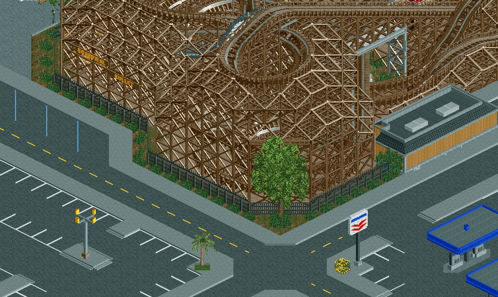
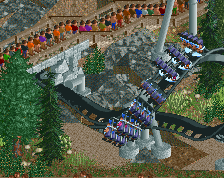
I love how ridiculous that coaster looks. The rest of the screen is not op to par.
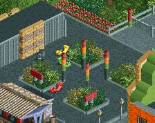
The large tree, the palm and the yellow flowers all look horribly out of place. Remove all of them, though you can get away with the palm if you add more of them around the parking. A row of palm trees every x tiles would create some sort of visual barrier between the parking and road too. By removing the custom tree, you'd emphasize the size of the coaster. The flowers just aren't justifiable in any way.
The sidewalks are way too sterile, yet there's so much detail you could add. Signs, lamp posts, trash bins, road signs...
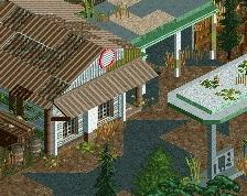
The tan building is very ugly and glitchy. You can fix the glitches, and I assume it isn't finished yet. Be sure to make clear what the purpose of the building is.
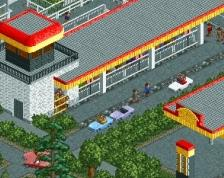
The petrol station has the dullest colours ever. I'd make the roof supports white instead of grey and black. And I don't know if the blue represents some real franchise or not, but you could add another colour like yellow. In my experience petrol stations tend to stick out with crazy colours.
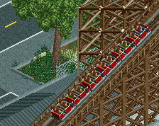
I really love this screen BUT my issue is the support work.
I feel that you've over supported and because of this, the coaster has lost it's curves and become a bit boxy and square. The supports make the coaster twice the size it actually is and overpower it as well.
I think you can take off that second layer of supporting, I think it would be more realistic, and also reduce the boxiness.
Also consider lowering the support start height on the first layer after removing the second.
I hope what I said makes sense, let me know if it doesn't
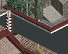
I agree with Louis, supports are a bit overwhelming. I don't like the black fence either... The screen has atmosphere, but there are several things you could improve. There's an overwhelming amount of asphalt and those sidewalks would look better smaller.
So great to see you back dj! Tend to agree with everything that was said above^.
The signs and gas station are really quite nice (although as Liam said a little dull) and that is one of the better custom trees that I've seen - finally someone that uses more objects than just the trunk and Liam's leaves - regardless as to whether or not it 'fits'.
It's a little unfortunate that the fence is the best thing in this screen in my opinion, but nonetheless it's wonderful to see you active again. Evidently still dusting off the cobwebs .
 03-June 14
I love how ridiculous that coaster looks. The rest of the screen is not op to par.
The large tree, the palm and the yellow flowers all look horribly out of place. Remove all of them, though you can get away with the palm if you add more of them around the parking. A row of palm trees every x tiles would create some sort of visual barrier between the parking and road too. By removing the custom tree, you'd emphasize the size of the coaster. The flowers just aren't justifiable in any way.
The sidewalks are way too sterile, yet there's so much detail you could add. Signs, lamp posts, trash bins, road signs...
The tan building is very ugly and glitchy. You can fix the glitches, and I assume it isn't finished yet. Be sure to make clear what the purpose of the building is.
The petrol station has the dullest colours ever. I'd make the roof supports white instead of grey and black. And I don't know if the blue represents some real franchise or not, but you could add another colour like yellow. In my experience petrol stations tend to stick out with crazy colours.
I really love this screen BUT my issue is the support work.
I feel that you've over supported and because of this, the coaster has lost it's curves and become a bit boxy and square. The supports make the coaster twice the size it actually is and overpower it as well.
I think you can take off that second layer of supporting, I think it would be more realistic, and also reduce the boxiness.
Also consider lowering the support start height on the first layer after removing the second.
I hope what I said makes sense, let me know if it doesn't
I agree with Louis, supports are a bit overwhelming. I don't like the black fence either... The screen has atmosphere, but there are several things you could improve. There's an overwhelming amount of asphalt and those sidewalks would look better smaller.
65%
So great to see you back dj! Tend to agree with everything that was said above^.
The signs and gas station are really quite nice (although as Liam said a little dull) and that is one of the better custom trees that I've seen - finally someone that uses more objects than just the trunk and Liam's leaves - regardless as to whether or not it 'fits'.
It's a little unfortunate that the fence is the best thing in this screen in my opinion, but nonetheless it's wonderful to see you active again. Evidently still dusting off the cobwebs .
.
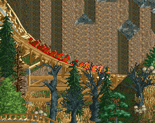
Looking really good.