Park / Raindrop Riviera
-
 02-August 03
- Views 6,827
- Downloads 2,872
- Fans 4
- Comments 36
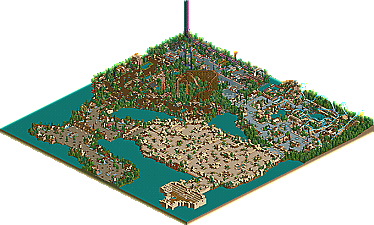
-

-
 76.67%(required: none)
 Spotlight

Cocoa 85% Poke 85% G Force 80% Jaguar 80% Liampie 80% alex 75% csw 75% Scoop 75% 5dave 70% chorkiel 70% Xeccah 70% 76.67% -
4 fans
 Fans of this park
-
 Download Park
2,872
-
 Tags
Tags
![park_3185 [MM2014 R2] Sands of Time](https://www.nedesigns.com/uploads/parks/3185/aerialt2821.png)
![park_4114 [H2H8 R3] Forum Caeleste](https://www.nedesigns.com/uploads/parks/4114/aerialt3853.png)
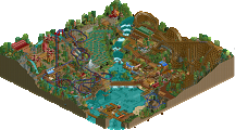
This will be a very hit or miss park for many. I'll give it an 8 of 10.
However, the park looks good and I may just have to reinstall RCT 1...
Well done.
And yes, it looks planned.
I love the layout of the woodie and the looper, they are great, but the rest of the park is boring I think.
I don't like the style of architecture very much, it works well maybe in the Market and possibly the entrance but I got very bored of it. Especially in the entrance, which has a very good atmosphere but not much else. It's too big and sprawling I think.
I also think the paths are too wide throughout the majority of the park but mainly in the market place which is the worst part of the park in my opinion. Don’t get me wrong, it looks nice and it's been made very well but it's fucking huge! If I were in the park I'd avoid it like the plague for fear of getting lost or dying of boredom. Seriously, it's one of the biggest areas in the park and it has no major rides what so ever, this is just too boring for my liking.
Maybe if you made the market along the water line - up to the show arena. Then had another smaller area between it and the looper I would like the park a lot more. But as it is, 1/4 of the park is very boring to me, which makes me like the park as a whole a lot less.
As I said earlier though the two main coasters layouts are fantastic, I especially like the woodie, which reminded a lot of the layout of a woodie in The Station Park. It's a pretty old park now that was made back at the Station by the moderators there. I think Kai made the woodie. I'm not 100% sure though. Anyway, it's really nice and both coasters have perfect pacing.
I didn't like the station to the B&M looper though; it was very blocky and too symmetrical. It reminded me of something I would have been making this time last year.
The studios part was hideous, sorry but the pink flowers didn't mix at all with the blacks, greys and all the bright colours on the rides. I also hate the racing launched freefalls, sorry, but how bland.
I don't think this park is a lot, if even at all, better than Atlas Infinitum. Although it is hard to compare the two as they are two very different styles of parkmaking. I personally preferred your old style and would like to see you revert back to making parks in the same way you made Horseman Laboratories and AI.
Although this is a great effort at making an 'old school' type park, I find it too boring and not in the same league as parks such as TH and SWA. Congratulations on winning spotlight though, a lot of people will think you deserve it. But as Mike said it will be a very hit or miss park and unfortunately for me it's a miss.
The river rapids were very good though!
The market itself was too big IMO and the paths were very wide but i enjoyed the stadium, that was well made. This was my least favourite area of the park, i feel the music made it what it is.
Whereas TPM said he disliked the studios i enjoyed it, i thought it was well done and a bit different.
Coaster layouts were great and worthy of spotlight although not as good as many of the other spotlights.
well done
Twisted Offline
It's awesome.
Pahlavi Rainforest is the best area with a great woodie although I feel the fountians are maybe a lil out of place.
The worst area is the market place imo, as others said it is just too big. I was hoping to find atleast one ride out in the open to look at. If it was smaller it'd be great.
Apart from the market place and maybe Raex Studios looking a little out of place it was all incredible.
Well done and maybe I could make a little River Rapids, yours looks great!
Entrance - Fantastic. very JS and SAC
Pahlavi Rainforest- probably my fav area. Woodie is great, lovely layout and a nice colour scheme. The area has a very nice look to it the brown paths with the black path over hangs look great (i didn't think it would but it does) The architectures cute, lovely and sexy hehe
Radex Studios - I love this area as well I personally think it does fit in with the rest of the park and its gives this modern feel to the park mixed with the classic. The area reminds me of JS marvel area in IOAH but alot better as the area has more/exciting colours in it. the bright pink flowers work well with the rest of the area and all the colours look lovely I especially like Starcatch's colours
Herculaneum - Mercury is nice and has a great realistic layout imo. This areas architecture is awesome. Great colours lovely layout. the only thing I'm not sure about is the orange on Cybele's Whirl
Arabian Market Square - I might have to agree its a tiny bit large but hey its still a great area so I'm not going to let that bother me I love it I think its the architecture that makes me love it as thats so good.
Now I see why you couldn't work on 5HiNE hehe
Great park posix and congrats on your first spotlight.
Aérôglòbe
Posix had proven himself worthy of a parkmaker spot, and released the brilliant Atlas Infinitum, which is a Top 30 park for me. Still, I couldn't even imagine him taking #1. Well, he has. And how!
Ebbsfleet Village: Okay, you know IOAH isn't my favourite park ever, to put it lightly. However I did love the entrance, and Ebbsfleet Villagre is obviously heavily influenced by it. From the strong atmosphere to even the tiniest details like the fences, this is pretty much THE IOAH entrance. Yet it's not. Posix manages to make a wonderful inspired yet unique entrancem, if that makes sense. The architecture ant theming are top notch. I just can't choose my favourite building or anything. If I was heading into Raindrop Riviera, I'd probably turn around, thinking I've run into some historic site. The detail, is also of very high quality. The tree variation is excellent, no banners or rides (even those used as theming) are unnamed.
10/10
Arabian Marketplace: At first look, you'll probably think this section sucks. Well, it doesn't. YES, it is too big, but the quality is as good as any other section in RR. The architecture is well detailed, and very interesting. No more boring 2x2 structures. The shapes he has used are extremely unique, but that is because most parkmakers don't even dare doing something so crazy. Yet Posix manages to turn what would be eyesores in any of my parks, into some of the best architecture I have seen. The theming here is pretty good, too. It's good to see a few breaks in the pathing, and Posix fills these with pleasing rocks, flowers, trees, shrubs, and other assorted pieces of theming. Very cool. The show stage could use a few small improvements, and the area as a whole could be a bit smaller, but it still gets a solid rating.
8/10
Herculaneum: Yet another amazing and original area. This shows how a Roman area should be done. Featured here is the excellent B&M floorless, Mercury. The layout is great, a little different from the average floorless. The speed could be better, particularly at the cobra roll, but no major complaints. Theming on Mercury is realistic, yet pleasing. The way he did the rock around Mercury are perfect. I love the underground tunnels, too. There's not much else that can be said. There's a wonderful rapids ride located in Herculaneum with great theming. The archy and detail are up to par with the other areas.
10/10
Radex Studios: This section is really hit or miss. I for one, love it! At first, I wasn't all too sure about the colour mixing, but I found it really fits in with the radical theme. This is perhaps the architectural weak spot in the park, but it was still nice. The theming is very original, and like I said before, hit or miss, though it's definitely a hit with me. The choice for pathing is another wacky detail here, and I can look at this for hours and still keep finding cool, new details. The coaster Stratosphere, is a pretty simple Intamin LIM tower coaster, but it still has a cool colour scheme and station.
9/10
Pahlavi Rainforest: The tropical theme. Definitely not an original theme, but a good one. Pahlavi features the giant woodie Avesta, which has a good layout and speed, but the theming could be a bit better, as it's mostly treed. This is another good spot for archy, though it's hard to spot at first as everything blends in so well. The theming is good, but could use a few original little details found in the other sections. The naming of rides here are excellent, but I think that goes for the whole park. Very cool, as that's something most makers struggle with. Also, check out some of the banners, for a "lovely" surprise from Posix.
9/10
Simply amazing. Thank you for this great park Posix, and I look forward to seeing more from you! Especially if you keep up the amazing quality!
RAINDROP RIVIERA: 10/10
Brilliant. congrats posix. although i tend to agree the future section was a bit out of place and maybe the market was a little too big but i havn't enjoyed a park like that for a long time
9/10
Posix you had a tought act to follow after SWA and Euroscape but you did a real good job.
The Good - i love the rainforest area very nice archy and themeing, the parks entrance used castle themeing very well and the B&M had a grate layout like the woodie.
The Bad - That market was just to big and almost square shaped, that modern area was ok but did not look good compared to the rest of the park.
i give it a..... 8.8
----------
on another note
i guess Nirvana (Project 28) did not win i cant really compare it to RR coz its a diffreant game, i do wonder if it had to do with this park haveing a controversial win? i know of a few parks in this round that could have put up a good fight (Project Crypt by mort and GoD by Junya Boy)
who knows maybe if im lucky iris still cant find his RCT2 disk and my park gos into the next spotlight round along with junya boy's being he cant jugde them
Crypto wasnt sent in, legendary tales by 3 members in rctu was.
On subject:
Posix, even though I hate you for beating me, great work man, excellent excellent excellent park. I love feeling like I'm back in the old days of Danimation when rct was in its beginnings. Atmospheres were great as was architecture, though the B&M sure did remind me way to much of Legends West. Great work once again.
~Prince Ashitaka~
the woodie wasn´t bad, in some ways it was amazing, but i don´t like it all the same =P. The beemer had the sense of nothing is wrong with it, but nothing to downright amazing.
the theming went from downright amazing, to downright repititous and boring in the market square, sorry. That area made the park drop in amazement, a lot.
The area by the beemer is downright amazing. It even looks like the area in LER by that weird chap. (pink flowers, white walls, beemer)
The rainforest area was the second best (with the woodie)
bit too much flowers, but kickass theming. Lovely Tropico Cove look-a-like trees =D.
The entrance area was a bit of a boring Moonlight Magic wannabe area, i´m sorry (that would be my opinion..
The high tech area is as horrible as it is nice. Tho the horrible blocks out the nice in too many ways. Nice try, but it could really been pulled better off, i really like the pathing, however.
A general thing i did not like was the multicolored paths, not brainlessly done, but too much there still in my opinion.
i didn´t quite like the stadium.
overall very spotlight worthy, ¨possible in my top 10 (just to the fact i don´t know how much it will grow on me, and i still don´t like certain parts) still a great park!
$Hevydevy