Park / The Time Machine
-
 03-March 06
- Views 9,958
- Downloads 979
- Fans 3
- Comments 58
-

-
 75.50%(required: 70%) Gold
Jaguar 85% Cocoa 80% csw 80% G Force 80% RWE 80% Scoop 80% Camcorder22 75% bigshootergill 70% CoasterCreator9 70% Faas 70% posix 70% saxman1089 70% 75.50% -
3 fans Fans of this park
-
Download Park
979
-
Tags
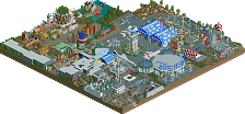
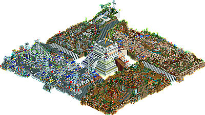
The Time Machine by X250
It’s not easy following the legendary cBass. For someone still relatively new as a parkmaker, such as X250, it makes it even more impossible. Regardless, that’s what X250 has in front of him, placing just ahead of last year’s winner with his outstanding entry. Easily one of the more hit-or-miss entries of the year (as evident by our judges scores, ranging from 11’s and 12’s to 6’s and 7’s), X took the conventional four-corner park idea and expanded it with a gigantic time machine sitting in the center of the park. What makes this park so special though is the quality of each area, each ride idea, each everything as X really takes himself to the next tier of parkmaker with this entry. The park starts off in “The Bone Yard” area, a prehistoric dinosaur themed area featuring the dueling Dive Machines, “Bone Collector”, as well as a unique rapids ride in “Ichthyosaurus”. Then there’s the Kingdom of Zeus, which features my personal favorite ride in the park, the compact Intamin Looper “Sphinxinator” and speedy launched wooden coaster “Dionysus”. The War Zone’s name says it all, a chaotic aftermath of an area, featuring some of the most creative stuff in the park. From the “Journey Through the Mine Fields” to the rare “Trench Drill”, and most fun of all, the free-flying micro-plane ride, “SpitFyre”. Finally is the Rialto Digita area, the most futuristic of all the chronological areas, featuring one of the most imposing coasters in the park, “DigiFace” to go along with the awesome set of bumper cars (yes, I said awesome bumper cars) the “Anti-Gravity Dodgems”. Aside from all the great rides in the park, the theming and architecture is top notch. And while X may not have the name value of say cBass, he’s still got the talent to compete with anyone here at NE.
Corkscrewed Offline
I'll provide comments later, but congrats, Simon, on a #6 finish!
i suppose a younger me would have adored it, but, now that i'm 87 years old, or something like that, i've gotten dull, i suppose, and just kind of want something pretty to look at, or, at the very least, something that seems like it was made with some consideration for the audience. this isn't that.
Edited by cg?, 04 March 2006 - 12:24 AM.
Each theme was awsome, I liked the war one so much, it was one of the greatest themes I have ever seen with the war plane, the landmines, the blood killing chopper thing, the mormorial, ect... I loved that area, id even put it up with Erwindale.
The future kinda theme was nuts, that invert was fantasic, its nice when you use less then 3 loops! The bummper cars was the best custom ride I have ever seen, then you did another great one with the hacked rodo-drop, it was a small detail but the steps down to load on were awsome.
The Dino area was great, the dule was was with the 4 way drop you timed so well. The rapids were nice aswell. I also liked the archy being mostly 1/4 blocks with the bricks tossed in randomly to give it a ruined look.
The roman/egyptain area was probabply the weakest imo, but consitering the other areas thats not to bad. I enjoyed the maze, the woodie and the mine train greatly, but the archy and look did not do much for me, the area had the fewest creative details and the path made it to disorderly with the 2 mixed textures.
I don't count whatever that thing is in the center as a theme coz it was just weird. It totaly sucked whatever it was, it was way below the other areas in the park and being at the center only made it worse. If you did something like any of the other areas this park would have been a 10 in my book, but this brings it down to a 9.
Amazing work Simon, I will be enjoying this park for a long time.
Kumba
I loved cBass's park. This blows it out of the water. The war theme... hell, I'm not even going to try to pick out the things I like.
I will say, though: the Spitfyre was the coolest shit I've seen in RCT2. Ever.
Though, the lag sucked...
-ACE
EDIT: Oh, and I found the keys... two of the links are broken.
Edited by ACEfanatic02, 04 March 2006 - 12:38 AM.
Corkscrewed Offline
It was just trying too hard to 'wow' us with too many things going on.. I agree with Toon and cg, too.. There was too much architecture, too many rides and too many animations to fully enjoy your park.. It could've used a lot more landscaping like toon said..
Also, I feel you used too many 'inspirations' to be original with some things.. The pipes and park set up (BOMB) the warzone (Kumba's last pt) and that lighthouse in Dionysus' turnaround (Steve's pt2 screen) just remind a bit too much of it.. I was just like 'hey, where did I see that before?'.. I can be wrong tho..
Now the positives..
I thought the architecture was lovely.. Sometimes a bit too cluttered, but that seems to be your style kinda.. The colour schemes are well chosen, really refreshing... And the themeing was top-notch (that's your strongest point imo).. Everything fitted its theme, and was clearly different than the other themes...
The rides were well chosen, greatly executed and (once again) brilliantly themed.. My favourite has to be Digiface, although it had that weird brake near the end where it ended up being too slow in those last corkscrews..
(-> I first deleted all guests and scenery to be able to smoothly follow the coasters)
Also, MAJOR props on the Ride Guide... It beats emergo as the best read-me ever imo.. It just adds that much extra quality to your park, and explains the little details of each ride a bit more.. Like the Minotaur idea on the 'Labyrinth'.. That's really clever and fun to read..
I also like the bonus game you added in the park.. Really original, although I haven't found the keys yet!
All in all, a great effort, although it was more of a miss than a hit for me..
SF
Edited by Six Frags, 04 March 2006 - 03:24 AM.
NOTE: This park came out at the perfect time for me this give in-depth analysis. I stayed up almost all night on this, so I hope you realize just how cool this park was for me X.
-------------------------------
The overall park concept seemed interesting, yet overly-complicated at the same time. I see you included a bonus game in the readme, which was really cool. I did find a few of the hidden websites. I didnt' go to any of the links, but might later. Just one of the many gimmicks to come with this park....hehe
Realma Digital
I might as well start with my favorite area, which also happen to be the entrance to the park. There was so much to see in this dense, excitement-filled cityscape. The feature ride, Digiface, was a nice compact SLC layout that had some good moments mixed with some less-average ones, but held as a good feature ride for me. The best coaster in the park if you ask me. It did spend a lot of time buried in architecture, which removed some focus imo though. This area, like all four, had tons of secondary flat and unique side attractions to keep it exciting. Most note-worthy were the "Upper/Lower Anti-Gravity Rings". A truly brilliant circular stacked bumper cars contraption that served as a perfect transition for excitement in this area. I think the architecture in the area as whole, was well, average and did appear to be held together only by color changes and not really depth. Some of the buildings had some real nifty facades and textures, but the major upper portion of the city didn't really grab me. Another mentionable detail here were the the blue crystals around "The Void" , just wonderful. So, overall the best area in the park.
Pros:
-great theming
-good color use
-great attraction choices
-good secondary rides
Cons:
-pathing seemed flat
-buildings too tall
-minimal entrance building
-coaster not the focus
Overall
9/10
Warzone
This area brought weariness about me. Its filled with tons of motion and some highly intricate rides, based on what appears to be a WWII-inspired futuristic warzone. It actually had me looking for awhile and therefore #2 area of the park for me. It had a highly-refined theme containing many ideas that were all brought across with skilled presentation. While it didn't really have a defining ride, it did have some rides, most noteable was "Spitfyre". A nice little hacked airplane swinger that swooped around the military zone as if scouting for the enemy. The other freature ride, "Journey Through the Minefields", another hacked Hum-v tour kind of creation also brought home the military message. But theres much more depth to this area. there's the dynamite factory and trackitectured blade with the mixing chemicals. Hi-tech buildings, some with built-in searchlights. A Japanese plane swooping overhead a cemetary with an enemy tank approaching. Yeah, maybe its not the most desirable or visionable theme, but the area was still executed with great skill and did fit in with the park concept. I really had a lot fun de-layering this one, X, and again shows what kind of theming talent you can bring to the table.
Pros:
-great theming/theme refinement
-good rides
-intense atmosphere
Cons:
-lacked one defining ride
-too many ideas for such a small area
-too much animated scenery
Overall
8/10
Bone Yard
A nice dinosaur theme, but not really the standout area of the park imo. This was probably built earlier in construction based on your teaser, who knows. Still, I felt quality lacked. The E-ticket ride, an illusionary-quad set of vertical drop duelers, named "Bone Collector", had their faults. The layouts did have some nicely-timed inversions, but that was about it. I wasn't overly impressed by these designs. Luckily, there was "Ichyiusaurus", which was a nifty little rapids ride that carved its way through the largest raw landscaping element in the park. I loved the wood-tiered effect on the side of the hill you created here. there were some great smaller water features here too, like the fountain pirate skull. The row boats boosted the atmosphere and it ended there. I felt a little trapped by architecture in the other half. The buildings were confusing in spots and somewhat distracting in others. Still not a terrible, but not great chunk of the park.
Pros:
-some good smaller details
-nice use of water features
-a good, dense prehistoric atmosphere
Cons:
-confusing architecture
-coaster designs
-quad-dueler was gimmicky
-confusing path layout
Overall
7/10
Zues / Osiris
Definitely the most disppointing area of the park because of the "woodie that wouldn't go". After I had the park open for over an hour, the woodie train came to rolling halt on the turn going over the open section of water. I reset the ride and watched the circuit. Really nothing special imo, just some random meandereing thru some decorative buildings. I also didn't like that it was launched. I felt a towering traditional hill lift would have been awesome here, but that wasn't so. It gets worse. By the time I got over to the ultra-compact mine train "Shinxantor" (poor name choice, imo), it had crashed just before the hacked loop and I could't get it running again. I did reload the park to watch in operation, but wasn't overly impressed by this design. The rest of this area was just kind of stale imo. A couple under-themed flats and a lot of average architecture didn't really keep me wanting to look around too much. The indoor tiered-log flume "Neptune's Caves" was kinda cool, but still felt like I seen this done elsewhere. One other thing that bothered me was how the roof textures totally blended with the paths. Overall, not your best work X and the only disappointing area of the park for me.
Pros:
-nice indoor log flume
-plenty of substance
Cons:
-too many generic flat rides
-both coaster layouts had operational problems
-didn't like the launched woodie idea
-buildings blended with path
-only average architecture
Overall:
4/10
----------------------------
Another let down of this park was the Time Machine itself. I liked the hacked observation towers. I didn't, however, like the bulky white building that seemed way underdetailed compared to the rest of the park park. It did tie in the theme, but like toon said, seemed neglected for being such an key structure in overall park theme. Another gimmick imo were the grey voids, which also seemed unnessecary. Also, The park gave me a sense of urgency in certain areas.
A hit or miss park? half miss, half hit for me. I feel the pros do outweigh the cons but it is easy to say some parts way more memorable than others. I'm more impressed that with the effort than anything. You obviously have an incredible love of the game and intend to pursue it as far as your talent will allow. Thats something a lot of players don't have today and you give us hope. Great park man. good night now.....whew.
In future, i'd like to see you run with maybe one or two of your ideas for a section, and really do them credit.
The comments somewhat confuse me, probably because there is a huge range of opinions, from the 'omg i love this' to the 'wtf were you thinking...?' I suppose the park is very hit or miss, and it all goes down to the judges personal preferences. I always aim to build colourful, interesting parks crammed with ideas, I guess that is not some peoples taste.
Here is a little mini-guide to each of the areas and the shit behind them:
The Bone Yard
When creating this area, i had an image in my head of a huge mountain, surrounded by many rides with lots to look at and see, with a very rustic wooden look to it. I built the vertical coaster first and its stations, then built down the mountain, i had planned to have the rapids ride etched further up into the mountain, but the queue line for 'Bone Collector' meant this wasn't to be, and i had to dig down into the back of the mountain to get some space for it. This area took, by far, the longest to complete. Just trying to perfect all the landscaping so its fits in with the rides, and paths.. wasnt easy.
Kingdom Of Zeus
This area was not planned at all to be perfectly honest, i tried my old method of 'impulse building' and i think it paid off, its probably my favourite area in the park. It is my favourite because i never thought it would come out as good as it did, my fav bit being the viewing area just over the launch for Dionysus. I felt a full area with the peachy architecture would have been a bit boring, so i thought i would give it a bit of ancient variation by creating a small egyptian area. The Sphinxinator coaster came out far better than i expected it too, i based it on the 'Klondike' coaster that used to be at my home theme park, Drayton Manor. Basically, a purposly compact mangulation of wood and steel, with a tight little loop as a feature.
Warzone
If anyone has every tried a war theme before, they will have found out it is very hard to create. I envisioned it to look really drab and dark, almost haunted in a way. The atmosphere would play a huge role in this theme, i think it was done okay, this area is probably the most 'hit-or-missy'. The spitfyre plane was a bugger to hack, and the giant aeroplane was also hell (btw jkay, its not a japanese plane its a Spitfire
Rialto Digita
The first area i made, i did not really have any ideas what to do as a park at this point, i just thought i would test out the new bench by building a vekoma SLC coaster and its station. I actually quite liked it and built around it, this is probably my least favourite area, probably because it does not have as many ideas as the other areas. I loved how them dodgems came out though, and the crystals on 'Void'.
Time Machine
This structure came out exactly how i wanted it to, a huge, clean, modern structure. I understand that the contemporary theme is hard to create in rct, but i had a lot of fun doing this- i wanted it to look 'efficient' and clean (hard to explain), and i really liked how it came out. I know some people may disagree lol.
I wanted to make a park with so many ideas and 'little things' to look at that it would keep the viewer looking for a long time, but, i guess that kind of backfired.
Thanks everyone, well done to all in the top 5. (Nice logo cork).
I look forward to hearing peoples views.
-X-
Corkscrewed Offline
The rides were a tale of "almosts." By dividing your park into five zones, you don't leave enough space for any real major coasters, save the SLC, which was pretty darn good except for those painfully crawling double corkscrews at the end. Your woodie was nice but seemed to want to be bigger and grander. The quad duelers looked a LOT more impressive in the screen Iris showed me. Sphinxator was pretty neat, though. It looks like my Indiana Jones ride in WDE, except this one has custom scenery.
The theming and architecture show that you definitely have parkmaker skill. You've done four diverse styles and done them well, but they did sort of feel like copies in a way. I'm pretty sure this was unintentionally, but I look at Warzone and see a lot of Kumba inspirations. Bone Yard features a sampling of Evil WME, Kumba, and even a bit of artist. Rialto Digita was JKay-ish. Kingdom of Zeus feels sorta like the standard "nice grandeur" style that you, artist, and Turtle have done so damn well. To me, it's not necessarily a bad thing, but this could be why some people feel the park "tries too hard." Except that they can't pinpoint exactly why.
The time machine in the middle definitely does NOT feel "clean" to me. It's huge, and it's... sorta modern. But it definitely doesn't evoke any sort of contemporary sleek and neat design. It's bulky, viscously detailed, and looks like a huge pile someone dropped. So I will have to disagree with you and respectfully say that you failed your objective with your park's central "weenie" (that's Disneyspeak).
HOWEVER, the fact that I've picked on these details should tell you that overall, your park was pretty solid. The closest thing to a "major" problem that I can see is that it definitely lacks synergy: the parts do not add up to the whole at all, and there's an overall lack of flow. In other words, rather than a park with four lands, it feels like four lands in the space of a park.
Still, a wonderful little park to explore, and placed generally in the right area, I'd say. Congrats for the finish; everyone likes to finish high, but you shouldn't be disappointed in yourself at all.
MY RANKINGS SO FAR:
14. Old Red [5.0]
13. Kumba [6.2]
12. Six Frags [6.6]
11. Jazz [7.6]
10. Magnus [7.7]
9. Dark Janus [7.9]
8. X250 - The Time Machine [8.3]
7. JKay - Ecstasy Summit [8.4]
6. cBass - Zodiac Thrills [8.6]
this park is deffinetly a bit hit and miss for me. im a massive fan of you work X and i loved the mine train and the cars. Very clever. like everyone else i didnt really like the time machine but i can see what you were going for..
A well thought out park with some stunning ideas
If HandyAndyG judged:(rankings)
cBass: 6
JKay: 7
D4rkJ4nu5: 8
X250: 9
Kumba: 10
Jazz: 11
Old Red: 12
Six Frags: 13
Magnus: 14
Edited by HandyAndyG, 04 March 2006 - 11:02 AM.
RMM Offline
I agree 100%. Thats how I felt about a lot of the entries so far.
I know its hard to get a good size and flowing park in a 100x100 bench or whatever it was, but it doesn't look like many people care. I'd rather see a park that has less ideas and flows than a park with great ideas being ruined by being crammed.
Anyway, after some time to form further opinions, I'm in agreement more and more with the judges. Hit or miss is a good summation. The park just had too much shoved into it and tried too hard to impress; something I've been accused of before too (AWW). Many of you're ideas were great X, there were simply too many of them which kind of ended up causing the park to derail. I ranked the park 8th place just behind cbass right now.
Iris, You weren't foolin' when you said quality was up this year. I'm ready to fall out of my chair for these top 5 now.
I was dissapointed by the time machine, as toon said, was ugly... even though it was the main point of the park.
I wish you would have expanded the egyptian area... which was my favorite of the whole park. It was perfectly done! Sphixnator was amazing!
The war area, was fantastic. Pulled off extremely well. Architecture, foliage, colors... it all worked so perfectly.
I also enjoyed the futuristic area a lot. Those bumper cars were awesome. You really have a way of compact rides, which works.
All in all, what a wonderful park. There was so much to look at. So many improvments. You crack out ideas like Kumba, but have a more refined and beautiful quality to your work.
KEEP IT UP!
OMG, ride6, steve, and xcoaster are up for the parkmaker spots.
Good luck guys!
Edited by Geoff, 04 March 2006 - 11:31 AM.
well. i don't know what to think. the skill was all there, but maybe a little too much. very cluttered and busy, like what others have said before, but it wasn't as bad as i had been let on to believe by reading everyone's comments. it was a very fun park and it was evident you had fun with it. i don't know, i think i would have placed this below jkay's. but i still liked it a lot, it was just too busy.
congrats opn such a high finish, though, despite the controversy.
Edited by tracidEdge, 04 March 2006 - 01:55 PM.