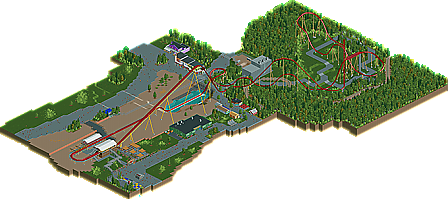
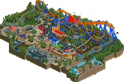
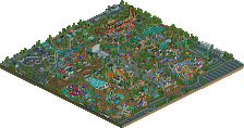
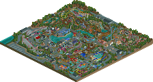
Park / Diamondback

29 Comments

  • Comment System%s's Photo
  • djbrcace1234%s's Photo
    You really left a lot of areas bare, I mean that one whole side on the other side just seems like it should just be omitted, or you could of at least put in part of the Stunt coaster as that is on that side too. The layout is what of course sells it. Spot on for the limitations I think. Well done.
  • Midnight Aurora%s's Photo
    I'm going to have to respectfully disagree with the panel on this one. I'll give it to Goliath that there's not really anything wrong with this submission, but that's an easy thing to accomplish when there's not really anything in the submission.
  • Goliath123%s's Photo
    In regards to Italian job:
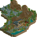
    If i put that in i thought well then i may as well go on creating Ki as then it wouldnt be a Diamondback creation, it would be Diamondback And Italian Job, so for the sake of keeping it as Diamondback i skipped the option of including backlot.

    Also to the calling thing-Cyder Hill 80%
  • SSSammy%s's Photo
    the atmosphere was dead. well done on the design, though.
  • scarywaffles%s's Photo
    Actually the ride is very well made and the structures are good and really resembles the true buildings ( if not perfect ) but just like SSSammy said, the atmosphere is lifeless.
  • J K%s's Photo
    Everything was very well crafted and due to your problem with not wanting to include T.I.J the map did seem slightly bare to no fault of your own. I'd of done what Kumba did with the river rapids he added to Kumba. In that case you would only have a had a small portion of The Italian Job showing yet it would of created something more for you to theme and breathe a bit of life into the design. After that your foliage was good as always and the architecture while not revolutionary created some nice amusement park charm. Can't wait for Cyder as you're a great player.
  • JoeZia%s's Photo
    This park isn't doing it for me. That void of trees is boring.
  • That Guy%s's Photo
    If you had went with RCT heights instead of accurate heights, this would have been entirely different...much less blank space for one, but more appealing overall.

    I gave you a lot of advice (both in the topic and through pm) of the mistakes and pieces you were missing, but you barely took any of it, even the significant details like how the exit path went right into the giftshop, you didn't change it.
    I realize that is your park(design) in the end, but this is a recreation, and I feel that a lot of the details I told you about would have scored it much higher.

    That being said, that's exactly what it was missing, the "perfections", that's what makes a recreation go from good to great, and this didn't have it, and those imperfections just kept adding up and adding up until it just didn't feel at all like the real thing. Of course Kumba also set very high standards for recreations so maybe the contrast between these two makes it seem worse then it actually is.

    I suppose by itself it's pretty good, but as a recreation it didn't do it for me.
  • disneylanddude%s's Photo
    wow harsh i enjoyed it but ive never seen the ride good work none the less
  • tdub96%s's Photo
    I thought it wasnt too shabby for a recreation, but i'm with TG in that i think you shoulda gone with RCT heights. It woulda put everything into better proportions, and leave less open space [which is the biggest flaw i see here].

    Its good enough for design, I just woulda tweaked it a bit and you'dve scored higher.
  • nin%s's Photo
    I see this as 'close'. Yes, it's pretty good and shows skill, but imo it was just a step below what makes a design.. a design.
  • Dotrobot%s's Photo
    It's 'meh'.

    As a recreation it's OK.
    The archy is missing some potential details it could've had. The supporting and the layout was done well.

    But end in end. There was not much to make this a design. Big size with lots of empty portions wasn't doing it for me.
  • Goliath123%s's Photo
    Scary: Thanks man
    JK: Thanks, hopefully CH with live up to the expectations!
    That Guy: The only real problem i saw was the gift shop, and i couldn't find any pictures of it online but i knew that there was a path where mine was so i kinda fenced it off.
    Dotrobot: Perhaps you could expand on the details i was missing to make it better for next time?
  • Fizzix%s's Photo
    Congrats on the win, Goliath. I take back what I said in your thread about not having enough foliage. I think you have too much now that I've taken a look at it. As others have said, the buildings are lacking some details, but nothing extremely bland and boring. Congrats afain, and hopefully your next won't be as boring for me. :mantis:
  • Austin55%s's Photo
    Ehh, I thought this was pretty mehhh. Still though congrats on the design, Im excited to see what you can do if you put some more time into your next project(s)
  • Goliath123%s's Photo
    To everyone who thinks its boring and meh tell Cedar Fair and B&M not me
  • Wanted%s's Photo
    But why recreate this...?
  • robbie92%s's Photo
    ^^The boredom wasn't from B&M or Kings Island. It was from your design flaws, mainly the large open areas flanking the lift hill and splashdown. The open spaces disrupted flow and threw off scale, making your design very sterile and "boring." Don't use a "recreation" to hide from criticism. Blame the builder for their creation, not their inspiration.
  • Goliath123%s's Photo
    Well then, anyone have a suitable option for removing the large open spaces with out changing the scale?