Park / Värmland Park
-
 20-March 11
-
 Varmland Park
- Views 9,222
- Downloads 1,587
- Fans 5
- Comments 15
-
-
 66.15%(required: 60%)
 Silver

Liampie 75% robbie92 75% 5dave 70% Casimir 70% K0NG 70% Kumba 70% prodigy 70% Maverix 65% RCTNW 65% turbin3 65% BelgianGuy 60% CedarPoint6 60% nin 60% posix 60% Wicksteed 60% 66.15% -
5 fans
 Fans of this park
-
 Full-Size Map
-
 Download Park
1,587
-
 Objects
354
-
 Tags
Tags
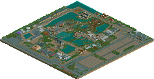
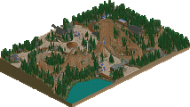
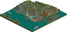
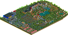
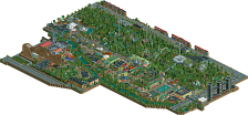
Great park, lovely architecture and coaster designs and some great ideas throughout!
The lakefront water slides are my favorite.
Excellent work buddy!
Pros and cons!
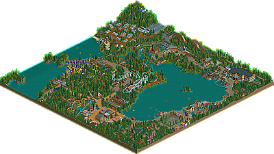
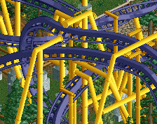
+ The rides were mostly awesome. The suspended coaster still looks great of course, and I just loved the B&M flyer; very believable as one of B&M's smaller coasters, yet unique. It characterises the park as daring and progressive. The water rides weren't as good as the coasters however... The rapids were too short (great otherwise) and the logflume and splashboats were slightly outdated (not saying they're bad though).
+ Very impressive landscaping. Not because of impressive quantity, detail or unique features, but because of the perfect tranquil atmosphere you created, even better than Turtle's last release! The tree selection in most parts was just perfect; the bright greens, but also the grayish trees that really worked with the occasional rocks here and there. With water, you have a very strong colour scheme with bright green-gray and blue. Literally cool and calm, as I expect of a forested Scandinavian area, but not cold or dull. My favourite area in the whole park was the landscaping between the topspin and the rapids, really amazing atmosphere. Award nomination please!
+ The architecture was quite basic and in places blocky, but it has the Dimi signature! I love how clean everything is, and you make it look colourful although actually brown is the dominant colour.
- I didn't like the outdated entrance area... Compared to the newer areas it was very poorly designed. Blocky and undetailed architecture. Yes, this is really the only con worth mentioning.
The front area was bronze quality I guess. The back areas were gold quality, easily. I can even image voting spotlight for this stuff if everything (rides, landscaping, archicture, map) was slightly bigger. This is very much like North of the Border, although more modern and much more realistic. You beat Butterfinger.
A few things I'd love to see you try with your next releases to get you a higher score you deserve . . .
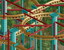
-A big coaster, the park had great layouts but something needed to dominate the area, the flyer didn't have the large pretzel loop that I was hoping for, yet it still looked fantastic. The woodie was quite small for what it was. It does seem to me however that this was meant to be a smaller park without the big coasters in, so if that is the case I completely understand.
- A greater depth of themes, the wild west theme stuck out as your best work for me so apply your style to other genres.
- More memorable rides for the guests to enjoy.
All in all, a beautiful park. The landscaping looks stunning and I don't think you have a bad aspect of your game. I seriously love Belgium players as you, Kenneth and BG are amazing at the game. I hope you can get some more projects going soon to build upon this great park.
This is so much better than I thought it would be when you first started advertising, and I agree I would have voted Gold. Still take it as an achievement that nobody voted it lower than Silver though, that's impressive
After looking through it the only things I didn't like were how the paddle boats weren't roped off from the rest of the lake and I think the woodie could've been a little longer with how tall it was. Other than that and a few queues being too short it was perfect
Congrats
tdub96 Offline
Anyway, great classical park dimi, congrats!
Goliath123: Cheers! I think silver fits better, I hope my next project will win gold though.
In:Cities: Exactly how I wanted it to be. Thanks!
ParadiseCoaster: Wow that's a long time ago. I remember you gave me advice on Swedish foliage and houses!
Liampie: I'm so happy it's finally released, I'm very with the silver too. The landscaping between the topspin an the rapids was actually very rushed, so that's a nice compliment. I also like the idea of a Dimi-signature. I know you don't like the entrance area, but I kept it this way for nostalgic reasons.
J K: It's an honour to hear you love my work. As you stated yourself, the park was ment from the beginning not to have big coasters, detailled theming areas or loads of other attractions. I'll prove I can handle big coasters and sophisticated theming areas in the near future!
Chorkiel: I agree, thank you.
Steve: The flyer was actually my least favourite coaster but I'm glad you like it, thanks!
Comet: Thank you! I was also surprised by the consequently high votes. You're right that I had better roped off the boats and made most of the queue lines longer, I'm happy with the wooden coaster layout though.
tdub96: I'm very happy to hear you recognize the RCT-Guide style!
dr dirt: My favourite part of the park too. I'm glad geewhzz chose this banner.
And finally, thanks pierrot!
It's interesting how players from different countries will often use a style of ride found in their country for inspiration. For example here you have the suspended which is very similar to Dream Catcher. While British players often use a half buried inverted like Nemesis.
Just an observation.
Cheers
Dave
Your ride choice was really good. I think the flyer was the stand out layout for me. Very flowing. I think the paths going around it could have done with a bit higher/more robust fencing as it looks like the guests could easily hop under or over the fences and into areas where the flyer is.
The suspend was nice as well, though I wasn't a particular fan of the support work on it to be honest.
The woodie wasn't very appealing to me. It didn't really interact with itself if that makes sense. No crossovers or fly bys.
I liked the arrow, that was cool.
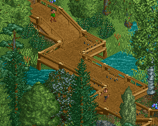
The lake was utilised very well, gave a nice atmosphere with all the boats and small walkways jutting out into it. It really added to the park.
I felt you could have done a little more with the flat rides to make them a bit more individual, rather than just filling space, but I guess for the kind of park you were going for, they were fine.
The architecture was a little uninspiring for me. They were formed over very basic 2X2 or 2X3 shapes and the facades failed to capture my interest for long. I very much liked the wild west show you had though, that was really well implemented.
Overall, a very nice park, and congratulations on the silver, probably the accolade I would award it.