Park / Voyager
-
 19-May 11
- Views 9,324
- Downloads 1,124
- Fans 5
- Comments 31
-

-
 79.62%(required: 65%) Design
Maverix 95% Steve 95% geewhzz 90% 5dave 85% Metropole 85% prodigy 85% Casimir 80% CedarPoint6 80% Milo 80% inVersed 75% turbin3 75% Louis! 70% Wicksteed 70% BelgianGuy 65% Levis 65% 79.62% -
Description
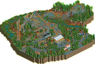
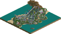
RRP made the coaster, 99% of the supports, and 75% of the station and the transfer area. I made 99% of the landscaping (though heavilty inspired by RRP) and everything else.
-
5 fans Fans of this park
-
Full-Size Map
-
Download Park
1,124
-
Objects
206
-
Tags
Similar Parks
-
[H2H7 R1] Circus Circus & Adventuredome Atlantic City
![park_3324 [H2H7 R1] Circus Circus & Adventuredome Atlantic City](https://www.nedesigns.com/uploads/parks/3324/aerialt2970.png)
-
Crimson Mountain Park
-
Six Shooter
-
Crimson Brink: Heart of Darkness
-
X
-
Volcanis
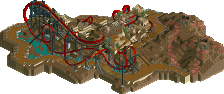
The foliage, lay out, landscaping and the support were just phenomenal.
I felt it could have used some extra architecture, but I guess that wouldn't fit the theme.
Overall a very solid design.
OMG..
As for the coaster, it was solid. I felt the pacing was a bit too fast before the first tunnel, and too slow around the last tunnel. The middle segment of the ride was great with moments supplying great air time and the turn after the mcbd (which was placed well) looked nice. The mcbr actually reminded me of the way Ghost Rider's (KBF) mcbr is set up, and with GG basically taking over where CCI left off, it felt very realistic.
Overall guys, really good stuff here and would love to see you both team up again.
Great job guys
-JDP
Having seen the coaster in-game a wile ago when RRP "released" it, I LOVED it. The supports were perfect, I loved the layout, and I loved the start of the landscaping he did do. That being said, I don't know how I feel about your contributions, Liam. I guess w/ RRP's work I expect to see his masterful subtlety at work and his use of really light, delicate touches, with a sense of the nitty-gritty of real life. Here, I think that, as SSSammy said, the foliage looks overpowering, and I don't see anything that really launches it into the same echelon of realism as RRP's work usually is in.I guess I just missed those little touches that RRP has in his work. Still, congrats on another design.
Congratulations!
Also props to verti for an excellent logo
it's pretty small but there's a lot to discover.
I especially liked that logo on the lift hill!
again, Congratulations !
I did not try to imitate him of course... And even if I tried, I can't! So it makes sense that it doesn't have the 'nitty-gritty sense' and stuff. I just figured an adorned layout (that's all it is; unimportant filler to hide the bare land) would be more fun to view and would get more attention than a bare layout! It's a tribute to RRP in a way.
The 'adornments' are not entirely unimportant of course... The lightbulb replacing mechanic (pierrot's screen) and the heavily hacked enterprise (I love how the ride base is a donut, and not a 4x4 square) are hacks I could've saved for a hypothetical strong solo release. In my opinion they're great touches.
I know! I just thought the coaster was brilliant and it would be a waste to leave it unfinished forever. I tried to finish it as basic as possible. I copypasted the tiny bit of landscaping you did on the rest of the map and I took inspiration from your foliage. The architecture couldn't get much more generic from me.
It's weird how we both have realistic styles with a similar approach (focus on identity, credibility and imperfection), yet I can't get our styles to work together. I think our styles clashed in Calypso Quay (also because I had no idea where it was going) and it was a struggle to come up with something that looked good here as well. I want to try it a third time nonetheless...
Thanks for the replies, by the way. For 60% of them.
Congratulations RRP & Liampie.
Points of note that I loved:
The Supports
The logo and flags on the lift hill
The first tunnel
Points of note that I thought could be improved:
I would have liked to see more architecture or something a bit more immersive. I get that you didn't want to detract from the coaster, but it just didn't immerse the viewer in.
I still don't like the station roof
Well done guys.
I also think the reason why your styles rarely mix is that you actually have different approaches. RRP has a much lighter touch than you in terms of his construction techniques. Also, while you sometimes focus on imperfections, I'd still see you as a semi-realist or pseudo-realist at heart, much in the tradition of most Dutch builders in making something realistic, but more w/ focus on theming and beauty than the absolute nitty-gritty. RRP, on the other hand, is completely committed to making something that could perceived as ugly or basic to make his park feel completely real. while you seem apprehensive to go that step further.
Oh, and reading through the comments I found this, which pretty much sums up what I was saying: