Park / Steel
-
 27-June 11
- Views 8,582
- Downloads 832
- Fans 2
- Comments 13
-

-
 65.38%(required: 65%) Design
JDP 80% BelgianGuy 70% robbie92 70% Roomie 70% That Guy 70% Levis 65% Liampie 65% Metropole 65% prodigy 65% wheres_walto 65% Wicksteed 65% geewhzz 60% Loopy 60% posix 60% turbin3 60% 65.38% -
2 fans Fans of this park
-
Full-Size Map
-
Download Park
832
-
Objects
250
-
Tags
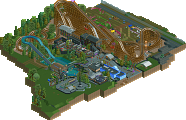
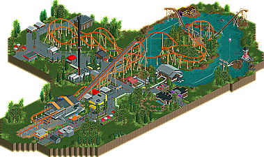
![park_2096 [NEDC] Vesper Island - #3/9](https://www.nedesigns.com/uploads/parks/2096/aerialt1888.png)
The architecture and details were good, the foliage was decent, but the layout was fucking brilliant. Great job with that, I really liked the combination of Millennium Force's overbanks with GeForce's drop and airtime
One note on the release page: I don't think the write-ups should be in first person. I know they have been, and will continue to be, but this is my opinion, so just hold tight. Park release pages are strictly about the park, yes? Then why have an opinionated description of the park/coaster?
I do like the colour scheme, so there's a plus.
this is a step up from oak creek, good job... you're getting better
-JDP
The lay-out was definitely the strongest aspect of this release. The pacing was good, it had a nice flow and the elements were really nice. It was enjoyable to watch from the beginning until the ending. The queue was decent, as was the station. I only think the station's roof was just a tad too high. The supports were nice, although in some places I felt there were way too many, but this might also be because of the RCT graphics.
The surroundings were nice as well. The architecture was good and it was nice to see that this time all the buildings did have a purpose, instead of just filling up. The foliage was also a lot better than in your previous park, it gave off the perfect atmosphere.
You really have improved since Oak Creek, good job.
Foliage: Not bad, but again it looks like mould. Side friction track for the flowerbed was pointless and looked horrible.
Architecture: not bad, just very generic and it didn't contribute anything to the design. I disliked how all these little 2x2 buildings were scattered throughout the map, showing little thought behind it.
Cohesion: none
Park layout: could've been worse... The area around the lifthill was good.
Sorry for sounding so negative... I did enjoy it, which is why I voted 65%. Could've been 60% too. The coaster was strong enough to compensate the flaws in this, but just barely.
Congratulations and keep up the good work! And PLEASE work on your foliage!
I did have two issues with the layout itself though. One was that there was never a place of rest where riders can catch their breath. In MF, this place happens on the top of those hills where there actually isn't that much airtime, and on EGF it happens on that straight section of track with the very visible trim break on it; it doesn't always have to be a slow part of the ride but something where g-forces are pretty much constant and speed isn't changing too rapidly at the moment.
Another issue was that the ride felt a little too long in terms of the sheer number of elements. I mean you have essentially kept all the elements of EGF while just adding some from MF, and while the train does maintain a good amount of momentum towards the end, it seems like it can realistically be a little too much for riders, especially with no resting moments.
I also think that putting a straight piece of track (or two depending on the train's speed at that point) at the top of bunny hills can help better symbolize track curvature, with exception to like Arrow hyper coaster bunny hills.
However, I can't help but feel that this was a bit uninspired. I feel like you've found a formula that will get you an accolade so you've been sticking to it. Venture outside the box, man. You've got your own style, but in this case, I'm not sure that's a positive. It's kind of the same old song and dance over and over with the foliage in clumps and the sort of boxy/simple buildings. That one yellow-trimmed building by the station for the coaster was kick-ass, though. There was obvious inspiration there, but I'm not sure I can say the same for other parts of the park. The river boats, for instance, would be a complete nap-inducer of a ride. There's really not much going on. You could have gone all out on something like that, but it felt like you just chose not to because you knew you already had the accolade on lock.
Now, I know this is two times I've come off negative when commenting on your accolades. Take it as a compliment, though, because you have tremendous potential. I like how your new Kraken project seems to have some inspiration and direction. Keep it up with things like that and always aim to go above and beyond. One or two incredible accolades is better than a dozen forgettable ones on any day of the week. Keep it up man. Overall, I'd be more than willing to nominate this as a steel coaster of the year. I'd just like to see you do some more with the rest of the map. Keep it up!
Thanks Comet. The layout was the main focus of this (as I believe should be the focus of every design) and I'm glad you like it so much.
Thanks nin! Glad you like it!
Thanks MA! Foliage is still a work in progress for me ATM as I'm trying to make it seem not so repetitive because I know it is. I've been experimenting in my more recent work so we'll see how it goes.
Thanks JDP! That s-bend is probably my least favorite part of the ride, I don't like how it had to be cramped in there, but it was the best I could do as doing diagonals didn't allow for a realistic or smooth looking buckle, like Expedition GeForce's.
Glad you like it Luigi! I was trying to make each building have a purpose like you said and I think I did that a lot better than OPC.
Thanks Liampie! I kinda see what you mean about the layout being repetitive but I don't think there was much I could do at the end without dragging it out. The foliage, as I said to MA, is a work in progress. It's not nearly up to your standards so any criticism is appreciated
Thanks Phatage! I know what you're talking about with there not being a place for the riders to 'rest' but that was the point, that it would be thrills from start to end. The thing I don't like about Millie is those two hills crossing to and from the island have almost no airtime and that is sort of a buzzkill for me. I realize it may not be 'suitable for all guests' but it was meant to be for thrill seekers. As far as it being to long/ repetitive, see what I said to Liampie.
Thanks burns! Don't worry, I'd rather have two comments of 'coming off negative' and giving me good advice for my next project than ten comments saying 'nice!' I am trying to mix it up a bit with future projects and this was an 'attempt' at that but it turned into my same old stuff I guess. Thanks for the advice though!!
Thanks Fisch! As I've said before I didn't think there was any other way to finish the layout without dragging it out to much but it's something I'll keep it in mind in the future.
Thanks man!
I love this !
It's a tad simple but what there is, is amazing !
congratz!
tdub96 Offline
The surroundings fit well, but I think foliage is still the weakest point of your game. Even then, its not that bad at all. The coaster and its surroundings gave off the "section of a park" feel, and thats how it should be when you submit a realistic design.
Congrats man! I think this was much stronger than how it appears to barely have won the accolade. 75% from me, and thanks to JDP for saving this one.