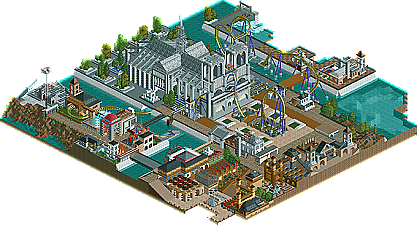
Park / The Hunchback of Notre Dame
-
 09-June 07
- Views 19,442
- Downloads 637
- Fans 0
- Comments 64
-
 61.88%(required: none) Design
5dave 70% geewhzz 70% MCI 70% Cocoa 65% Stoksy 65% Fisch 60% csw 55% inthemanual 55% Liampie 55% nin 55% 61.88% -
No fans of this park
-
Full-Size Map
-
Download Park
637
-
Objects
311
-
Tags
We have 3 brand spanking new designs for you guys. They are all... well I am pretty low on superlatives after writing 3 pages, but they are all great coasters and well worthy of NE Design. Also since they were all won by non-NE Parkmakers during the PT3 prelims Jazz, egg_Head & disneylhand are all now invited to compete in the PT3 Finals!
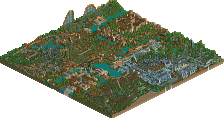
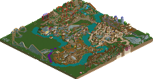
Quest of the Forbidden Mountain by Jazz
This Jazz guy is not much, he just builds in boring 2x2 forms and picks fights with other members... right? Well he did manage to place 9th in the PT2 Finals with Mossflower Wood, but we all know that was due to Fatha' and natelox smoking crack. Next he put out a couple of "just nice" H2H4 parks. So there is no way this Jazz guy caps of this great round of NE Designs with Quest of the Forbidden Mountain one of the best wooden coasters RCT2 has ever seen... right?
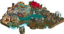
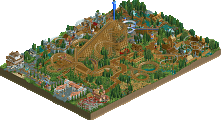
Formula-1 by egg_Head
egg_Head remind you of anyone? Well he's starting to remind me of this RRP guy we once had around here dominating LL. Like RRP egg seems to be able to build incredible pieces of parks when he wants, be creative as hell and get board with a park thats nearly done and quit on it! Well I guess the good news is now thx to Formula-1 your in the PT3 Finals, I think even you can finish a bench in the 80x80's range?
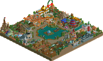
The Hunchback of Notre Dame by disneylhand
In my short time as owner of this site, this may be the best surprise I have gotten. I had seen some of disneylhand's work in the advertising district, but it's nothing compared to the design he just won with his outstandingly themed B&M Vertical coaster The Hunchback of Notre Dame.
Also a major thank you to hpg for help with the logos (other then F1 which egg did himself) and screens.
Time to get downloading and view them!
WOOT
1000th post
from the screens they look fine all 3
Quest of the Forbidden Mountain: this really needed a killer drop. The last woodie I properly looked at was the Toon/Kumba effort in the last spotlight and I'm afraid to say I much preferred that one. I spotted a "cheat" hack where a track crossed over and I suppose it was obviously more family orientated based, but it just didn't really do anything to stand out. Kind of bland, that's a good word to describe it. It's clear there's ability there, I think it needs more thought though. Although (though though) it's kind of obvious this ride served a single purpose of PT qualification.
Finally, Hunchback was my favourite, I loved the overgrown inside of the cathedral - little details like that are what make or break borderline parks/designs, and although I think the lack of corkscrew animation was too high a price to pay for the vert drop cars given those inversions, the ride was nice enough. The water was done well and was a nice addition. The cathedral was awesome, perhaps could have done with more brown/grey constrast... The rest of the park was kind of forgettable but well done nonetheless.
Jazz; Now let's see if you're open to criticism
So in short:
(+)
-Peepfriendlyness
-Atmosphere
-Some architecture forms
(-)
-Pacing
-Layout
-Monotone colour schemes
-Foliage
Egg_head: Pretty good layout..Pacing is spot on, nice elements, supporting and flow.. I feel the coaster itself isn't heavily themed though, or goes through theming which could've made it more exciting.. I did like the path interaction, and landscaping/foliage around the coaster..
The go-karts interaction was nice and gave the coaster some extra theming.. The rest of the map was kinda boring and didn't do much for me.. Maybe it's the colour selection that gives a dull atmosphere.. There are some nice architecture forms throughout the map though, which gives it quality.. That's what really is your strong point imo..
All in all a nice design, but with more theming could've been a lot better..
(+)
-Pacing/flow design
-Architecture
-Go-Karts
(-)
-Boring surrounding
-Coaster-theming
-Colour scheme architecture
disneylhand: Haven't heard of you, but what better way to introduce yourself with a NE design and with that a spot in the PT3! I thought the pacing was pretty bad during the course of the dive machine.. It's going too slow through the first inversion and that last helix.. I also thought the layout was rather short.. Maybe even too short for NE design standards..
While your interpretation of the Notre Dame church itself was pretty accurate, maybe some smart colouring here and there would've spiced it up.. Like with some coloured glass (in Holland we call it 'glas in lood', don't know the English term for it)..
The surrounding was decent, although it didn't really remind me of Paris, or anything French.. I still love it though, when coasters are going through French churches
(+)
-Notre Dame design
-Coaster-theming/interaction
-Layout-elements/flow/no awkward parts
(-)
-Pacing
-Short layout
-Colour schemes
-French-theming
All in all, I enjoyed watching at all 3 designs although I think only egg_head was deserving..
Congrats getting in the PT3 too, as that was obviously all of you 3s main goal..
SF
Jazz-sorry to say i really wasnt that impressed. i know it may sound mean and you may not like me but i dont think your archy has really progressed any over the past year. i look at this and Mossflower from PT2 and the archy looks that same with different colors. i really didnt like the unfinishedness of the park. i know designs dont have to be perfectly filled out but that park was scattered pieces of buildings. the foliage was nice where they was some. the coaster was great, not amazing. i know you were trying to do a expedition thing but its just didnt work for me. i liked it once it got going but it took a long while. i think i wouldnt have made this a design to be very blunt. its was nice but not the ace-work that designs were made to be. i think that bar cork said he raised has be lowered here.
Egg_head- this was a nice design but i didnt like it greatly. the coaster was nice. fast and fun but its had its awkward bits here that there. it kinda looked like it was floating. the stating was nice but kinda awkward. that go karts were great. i think they were my favorite. the archy was nice here and there but it felt like you were experimenting with all there different types and got lost. it had plenty of detail here and there but it was almost alittle bland for me. i loved the signals ontop of the coaster and the supports were good. nice overall
Disneylhand-this park was good but i felt that it wasnt about the coaster. the coaster was nice and had flow but i disliked how the cars went through it due to the hack. maybe you should have used floorless instead of verticle. the rotating stationg looked like a cool idea but i dont think you pulled it well. all the grass visable underneath was kinda a set back in its affect. the sourrounding were nice. not amazing arhcy but not bad either. i really liked the gardens. although it was kinda blocky i liked the structure of Notre Dame. the splash was nice. it had some very nice details. contrary to Kumba i felt most of the archy looked better from further away. nice design.
personally i think this is the first time if questioned your judgement Kumba. these were nice parks but i think Egg_head's was the only one that was truely complet. i probably would have given it to Egg_head, Maybe Disneylhand. i think that bar has been way lowered here and if anything it should be way when a design will get you a spot in PT3
hope i didnt make anybody mad. just typing my thoughts.
FK+Coastermind
disneylhand Offline
deanosrs: Ooh, your favorite? I'm honored
Six Frags: Us qualifying for PT3 makes perfect sense to me. Had we sent any of these designs in as prelim entry, there'd be a 99% chance that it would win. Now, in this situation, PT3 hopefulls don't have to try as hard to make a winning entry. As for never seeing me before, I have a park in the advertising district. Clicky. I have heard that ShieKra crawls through its immelmann, and 18 mph isn't that slow, is it? The helix was based off of Griffon's, but I do agree that it may be a bit slow. I find it funny that you think the layout is too short, as if this were a real coaster, it would hold the record for longest dive machine... When you say that a con was the color scheme, was there anything in particular you didn't like?
Okay, don't go around assuming that that was our main goal. How is this obvious? I'm only speaking for myself here, but I started this for a competition at another site, and finished it as a design. I was building this for design before I even knew about the Pro Tour, so a place in the finals is more like icing on the cake. Also, I have other things going on right now, and I may not even participate in PT3, so keep comments like that in your head before knowing someone's true intentions...
Kumba: Thanks for the nice write-up.
hpg: Thank you so much for the logo. It's way better than anything I could have come up with.
-disneylhand
The other 2 were quite nice. Eggys dissapointed me a bit, but only because I have VERY high expectations of his work. Disneylhand, yours was surprisingly good, and the archy was very solid. Great layout too.
Congrats to all of you.
Um, the water in your park? I liked the 1/4 tile slants going into it. Ok, so I could easily say a dive machine isn't a dive machine with those inversions, as to my knowledge only 2 exist, Oblivion and a replica in Korea, and neither have inversions at all.
Oh and Six Frags - the English term is stained glass windows.
I loved eggs! It was really nice. Loved the buildings and the layout and colours and everything.
However I hated Jazz's it didn't deserve design IMO, was a bit sloppy.
The other one was alright and probably only just made design, well that's how I felt
Edited by JJ, 10 June 2007 - 02:32 PM.
Like you could ever do better, please shut the fuck up
and i never said I could do better
Edited by JJ, 10 June 2007 - 02:16 PM.