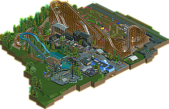
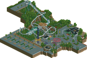
Park / Joker's Revenge
-
 23-September 11
- Views 8,901
- Downloads 798
- Fans 0
- Comments 28
-

-
 73.08%(required: 65%) Design
Louis! 90% robbie92 90% CedarPoint6 85% inVersed 85% nin 80% JDP 75% Maverix 75% Liampie 70% prodigy 70% BelgianGuy 65% posix 65% tyandor 65% wheres_walto 65% Levis 60% RMM 30% 73.08% -
No fans of this park
-
Full-Size Map
-
Download Park
798
-
Objects
330
-
Tags
![park_2080 [NEDC] City by the sea - #5/9](https://www.nedesigns.com/uploads/parks/2080/aerialt1879.png)
RRP and RMM are different people.
Full reply when I'm sober.
so yah, excellent realistic work
btw great logo! seriously nice
The layout was pretty solid, but I couldn't help but feel that it was copying off of RRP's wooden coaster layout in some parts.
Congrats on the win, I personally think you should try this theme again, and just make it a bit more extravagant.
I'm curious to see what RMM thought about this, because even if I thought this was absolutely awful, 30% would still be pretty fucking harsh.
Oh and by the way, that is the coolest fucking logo I have seen.
And yeah, that logo is absolute badass; verti is probably the best artist here.
The Design is great you two; your realistic styles work really well together.
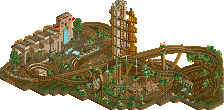
Nice figure eight segment there, those are hard to pull off and make look good at the same time.
Somehow it all looks heavily inspired by Apocalypse/Terminator: Salvation though...
Anyway,
Yet another great Design from the minds of New Element parkmakers...
I'd go with nin and give it an 80%.
Amazing logo and great write-up.
To the design;
This is easily one of my favorites! I love the references and the overall execution.
The details were great. I also loved the custom cars, police car, truck car !
What I didn't like was the crampedness, you made so much space next to that water ride but you chose to put everything together which I thougt didn't make it better.
Congrats on this wellworthy design !
inVersed Offline
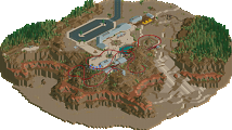
The design itself was great. It had a nice theme which was executed nicely. The lay-out was nice and the joker references were top notch. The tunnels were nice additions as well. The station and queue were very nice too.
The supporting rides and architecture fit well with the theme. The flyer was executed in a good way, the architecture was decent and the foliage was nice to look at too. The only thing I didn't like was all the junk behind the coaster.
Congrats on a well worth design
Some of the work on this website is absolutly outstanding and there are many, many talented people.
I have to say Im very impressed with this concept! I loved the water ride, and I also love the layout of 'Jokers Revenge'. I personally wouldnt have choosen a woody for it but I think you have excuted it very well indeed =D
What was there was nice, I'll admit. The park area, coaster, yeah, that was nice. I'm willing to admit this was a satisfactory Six Flags Gotham City theme, so props. I enjoy that there are people willing to believe that Batman and Six Flags can go together without the need for an inverted beemer. (Even then, I don't believe we've seen the epitome of a BTR)
I just feel like the atmosphere and theme was bare. Not the fact that there literally wasn't anything there, or that the theme wasn't convincingly Batman/SF (which tends to equate to bareness), but the fact that there simply was no atmosphere leaving a dull feel everywhere. I was just looking at a screen. I was not in it.
RMM Offline
architecture was uninspired, bland. layout wasn't bad. but as a whole, it just looks like a mess. i don't got too much time to elaborate at the moment, but yea. definitely wasn't even close to design worthy to me. maybe i could have gave it a 40% instead.
i'd like some explanations to how this was a 90% to some of you. how is this better or on par with Leviathan or Kumba?
I found this to be very nice. It felt right. I loved the layout, the details, and the overall atmosphere. I felt that the architecture served its purpose excellently; as Six Flags archy, it was more than adequate, and it straddled a fine line between realistic and cartoony, something about zburns's work that I love.
The thought put into this also warranted a 90 from me. I loved the layout, and I loved the inclusion of the original Joker coaster sitting in the infield. The custom Batwing ride was excellent, and as a Gotham area, it worked incredibly well.
I feel the opposite to you. A 30%, or even a revised 40%, is unfathomable to me for this. This shows enough quality to far exceed those terms and make this completely design-worthy. Hell, I'd consider this a contender for Design of the Year for me. I just think that a 30 is way too low for something of this caliber, just like I think you find a 90 way too high.