Park / Canyoneer
-
 28-November 11
- Views 14,020
- Downloads 1,030
- Fans 12
- Comments 30
-

-
 73.08%(required: 65%) Design
robbie92 90% BelgianGuy 85% Liampie 85% 5dave 80% Dimi 75% That Guy 75% CedarPoint6 70% JDP 70% SSSammy 70% tyandor 70% wheres_walto 70% Wicksteed 70% Airtime 65% Maverix 65% turbin3 60% 73.08% -
12 fans Fans of this park
-
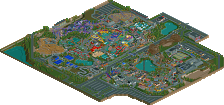
Full-Size Map
-
Download Park
1,030
-
Objects
254
-
Tags
I really loved the layout of this coaster.
The setting was really well done, too!
Congrats to this design win!
Odd, but I've heard stranger.
Moving on; The first thing I said when I saw this, was...
There's so much brown!
Seriously, Tiumba had less prevalent earth tones.
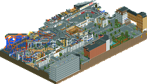
Dirt overload aside, it seems to me that the visitor center is too beige, but I suppose that's the standard uninspired, bleak (or as rob put it, "fittingly-generic") architecture you'd see in real life.
Yes, I'll admit that you've nailed the whole rest stop/visitor center theme. I'll admit that the coaster is good. Put them together and you get...meh.
I'm going to go with Yannik on this, and say 60%. It's good, but it's not quite Design worthy. I'd like to rate this higher on the scale, I really would, but as harsh as it sounds I expected better from you.
Overall, I'd have given this 55%
You've done that in that the layout is fantastic. Otherwise, you've also achieved a nice colour combination and aesthetic value. But other than that this didn't hold my attetion long enough.
Frankly, I'd like to see all the naysayers do better...
Wicksteed Offline
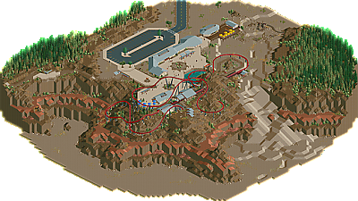
The architecture was clean and simple, yet very nice. It didn't lack detail but didn't go overboard and is incredibly realistic.
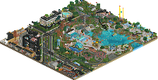
The landscaping was beautiful, and some of the ideas used were fantastic. The foliage wasn't very appealing, though, as I found some of the tree types ugly, and the colours didn't work very well.
The coaster on the other hand was brilliant! Exceptional layout, perfect support-work and some lovely colour choices to blend into the surroundings. The golf course was a great addition, too, and the mine was a really nice idea!
All-in-all an excellent design and I can't wait for your next project!
Awesome layout, awesome, details, and perfect landscaping
The hiking trails are some of my favorite details I've seen in any park and I think you perfectly pulled off an Arizona/New Mexico style National Park look. The queue and architecture were also both executed well, although I would've liked to see a little more stone in the archy. Really my only real complaint would be the mini golf course, it was too short, the holes were too similar, and it really needed some shade being out there in the middle of a tiny desert
Congrats tho, my favorite design in awhile
-JDP
LOOK AT THAT FOLIAGE. And those signs, and those steps. I can so easily image walking there. It feels so real...
The architecture was good but a little boring I admit. Also the midget golf looks a little weird there in the middle of nowhere. Also, the midget gold had no fences where I expected them. Lastly, it didn't have a fun atmosphere like Zippo's had, this was fun too but with a more serious tone. I desperately searched for the Zippo's atmosphere and in the end I found one single reference... Didn't really change my opinion of this but made me smile.
Overall great job, and it's really great to have something by you again. Congratulations and please don't let this be your last work. Anything else in the works? What about that castle you had?
FYI, the architecture was inspired by the visitor centre at the south rim of the Grand Canyon:
@Liampie: I don't have anything else in the works just now but I guess it's just a matter of time before inspiration kicks in. That castle thing sort of died, but maybe I'll resurrect it some day or maybe just release it as a micro. We'll see...