Park / Nightingale
-
 16-February 12
- Views 8,171
- Downloads 791
- Fans 0
- Comments 25
-

-
 71.54%(required: 65%) Design
Louis! 90% Airtime 85% 5dave 80% Dimi 80% Maverix 75% nin 75% prodigy 75% robbie92 75% Levis 70% CedarPoint6 65% Liampie 65% RMM 65% wheres_walto 65% JDP 55% K0NG 40% 71.54% -
No fans of this park
-
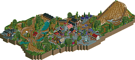
Full-Size Map
-
Download Park
791
-
Objects
277
-
Tags
![park_4075 [H2H8 R1] Durham, Knaresborough and Staithes](https://www.nedesigns.com/uploads/parks/4075/aerialt3813.png)
![park_2095 [NEDC] Archimedes - #1/9 (Winner)](https://www.nedesigns.com/uploads/parks/2095/aerialt1885.png)
![park_3371 [H2H7 R5] Universal Studios](https://www.nedesigns.com/uploads/parks/3371/aerialt3057.png)
Also, great review and very nice logo!
I'll comment on the actual work later. Peace.
Ride6
tdub96 Offline
EDIT: I just love how fresh looking it is. Its not spectacular, but extremely solid and just so clean and colorful. Loving all the fly-bys, added to the great layout you produced here. The detail in your architecture is also superb. All in all, this design award is well deserved, nice work mate!
But except for this point of critique, the design was beautiful. The foliage and the layout were good, the architecture was great, the atmosphere was happy and colourful as always. Nightingale proves to me that RCT doens't always have to be spectacular or originally themed to be perfectly satisfying.
Rhynos Offline
Also, I found a spelling error on one of the signs.
NIGHTASTISC!!!!!
it's a really nice design !
Awesome logo as well !
I wasn't a fan of the pathing...was it supposed to be brick that had broken up to reveal concrete or vice-versa? I also didn't understand the amount of 'ruins' scattered throughout the map (or burning building)while everything else was so vivid and colorful as "Nightingale" would allude to.
Most of the architecture itself was very nice though, there were nice little touches scattered about that made me wonder "what could have been?"
But, the biggest drawback to me (that I can't figure out no one else mentioning) was the "Cobra" coaster and surrounding flats that sit at the maps edge. It was the first thing I noticed when I opened the file, it grabbed my attention every time I rotated the map and no matter how hard I tried, I just could not get past why the fuck that shit was there.
I loved the surroundings, but the coaster itself wasn't the greatest. The part before the fly-through just didn't feel natural or flowing.
Anyway thanks to everyone who was involved in the release, or in inspiration, and also to all the lovely commentators, thanks for the feedback and have a good day.
As for the coaster itself, I liked it. I appreciated the flowy-ness of it, which suited the area well, rather than a more dipping and diving type. Congratulations of the design win