Park / Avenger
-
 21-April 05
- Views 9,088
- Downloads 493
- Fans 0
- Comments 25
-

-
 66.11%(required: none) Design
][ntamin22 75% Cocoa 70% inthemanual 70% Liampie 70% MCI 70% G Force 65% trav 65% trav 65% alex 60% posix 60% 5dave 55% 66.11% -
No fans of this park
-
Download Park
493
-
Objects
150
-
Tags
Similar Parks
-
Aviara Cove
-
Cape Canaveral
-
Baiht Oashyr Vel Thalloo
-
Tussaud's Boscastle Heights
-
Merlinwood
-
Busch Gardens Europe
Corkscrewed Offline
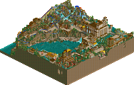
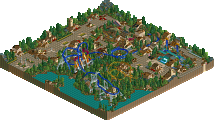
LUMERIA, by Geoff
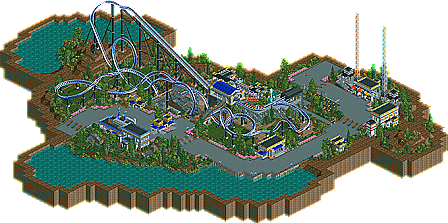
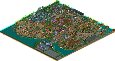
AVENGER, by Steve
We have two similar but very nice Designs from two of NE's rising stars! Avenger is an intense BeeMer from fan favorite Steve, while Geoff presents Lumeria, an Intamin multilooper. Not the flashiest or most insane designs, but they are very classy, and I personally love them. So congratulations to Geoff and Steve!
COMING UP:
- I have two more Designs to put up as well, and these are a doozie.
- RCT Olympics stuff. No, I haven't forgotten you guys, I just haven't had time to set everything up. And ride6's park has disappeared from my computer AGAIN. Can you just email it to me? This is getting absurd (on my part). Sorry!
- H2H Finals. Hurricanes vs Flying Germans
And don't forget to vote for the Fourth Annual NE Awards if you haven't already! We have some tight races right now (and some not-so-tight ones...).
avenger; i was impressed by the stalls in the buildings. very nice. the coaster itself wasn't bad but the inline twist was the wrong way round and i also didn't like how there was a little drop into the midcourse brake. usually, mid brakes are on hills. also, although it was interesting, the transfer device didn't work. how would the track get on the second storage?
the landscaping was convincing, in my opinion. didn't really lack. the architecture wasn't much for me. it seemed a bit too complex and detailed. i'm sensitive about rct2's detail when it is too forced by custom objects.
anyhow, overall, i got the impression that you have reached a more professional level, steve. the whole thing was cleaned up and tidy. no "mistakes" if you know what i mean. that made it strong.
lumeria; not bad, but the coaster really wasn't for me at all and i hate those 1/4 rocks. the theme wasn't bad and the colours worked, yet it seemed little sloppy to me in places. same problem about the transfer device steve had. it didn't work at all.
it kind of showed how you lost interest in it.
what i don't understand is why people never put music on their designs or rides nowadays. personally, i think it adds something.
anyway, i think corkscrewed put it quite well. "two rising stars". keep on going, guys.
Are you kidding ? !
Avenger: Steve is just BEGGING to find an original style, eh? I liked it! You did a really good job with the landscaping with a bunch of bushes clumped together with a rock in the middle and fences that aren't by sidewalks. The architecture was really cool too. slob would definitely not use those colors, so good call. I think the problem though, was that they didn't really complement each other. And the architecture was kind of blocky in places. But I liked the coaster. It was kind of fast and went by like THAT - but it was overall a pretty unique layout. I liked it, steve! Congratulations!
Geoff: Wow, this was really awesome too. The coaster was so fun to watch and stuff. it's a shame it wasn't finished though. I didn't think unfinished designs were accepted as designs though? But it's still good enough, anyway IMO. Architecture was unique and really 1/4 blockish. And those supports were awesome. I hope you finish that solo, Geoff - because you def. have a huge talent. One little nit-pick.. the coaster breaks down on the lift hill when you first open it. Kind of an annoyance, but as far as quality, this was top-notch!
PS: is it just me or did the Avenger logo all of a sudden change colors?
Hm. About the music, Posix. I'm sort of skeptical towards that. I like it sometimes, and constantly changed the music to see which 'song' fit best. If you ever go back to look at the design, you'll notice the Dodgem's style is picked, just wasn't turned on (if music makes you happy then turn it up and go nuts, man). The transfer track, I admit, was mostly for show. I guess one side of the track works, just not the other. My apologies on that one. And Jacko, I'm not really in search of a style, I guess I just have a varience of styles when it calls for it. lol. That's all it is, but I am glad you enjoyed it.
I really like Geoff's, too. His coaster (although a bit unorthodox for me), was pretty neat. I love your atmosphere, though. I wish more was done, because it would have been something really special. Congratulations, though, dude. Good luck on the solo!
Steve, you are truly a genious. Such a smooth and fun layout. The theme was a very cool one for you to do, and you always add such lovely details. Great stuff.
Lumeria: I loved the theme, and the atmosphere. However, the coaster didn't really flow. And the fact that it was broken down when you enter the park didn't really help either.
Great job both of you, and congrats on the designs.
Two fantastic designs, the coaster layout were both well paced and the architecture very 'minimalistic', not overdone which i think is hard to accomplish in rct. Lumeria was a spectacular ride, fast paced and very twisty. Reminded me of a mix between millenium force and colossus at Thorpe Park. I would love to ride this thing in real life!
Avenger, Steve, fantastic job. I have already given you my thoughts on this... Fantastic realism, i love the station- and the way you use them quarter-deco objects. I have co complaints or moans with it, you seem to be one of them parkmakers who strives for perfection- and achieves it. well done both of ya'll.
-X-
Lumeria
By Geoff
The influences in this seemed pretty obvious to me. The theming looked alot like a mix of Hawkeye and Peregrin. Although that isn't necesarrily a bad thing, (I personally love it) I know of some other coasters that might be looked at as "copied coasters" due to excessive use of this theme as of late. I was also a bit dissapointed in the fact that it didn't look near as professional as the aforementioned coasters; everything seemed a bit thrown together.
The coaster itself had it's flaws. I personally think that the 180 degree turn looks hideous. The use of supports as a sort of theming, although not new, was very nice. I wasn't impressed by the layout, it wasn't very flowing or really nice looking. It was more of a "if it were real it would look good" type coaster.
Anyways, well done on the Design. Can't wait to see more from you.
Avenger
By Steve
"Whoa! Is that BDK recreated in RCT2?!"
Unfortunately, it's not. But it is a very nice coaster indeed. The theming was safe yet beautiful, and I loved it. The architecture wasn't complex, but I loved it. Bla bla bla, but I loved it. Yes Steve, I LOVED IT!
The coaster itself was very nice and compact. For RCT2, the barrel roll should go that direction. If made the other way, it looks just plain bad. Besides, there are coasters that have rolls like that. I can't really say anything bad about it, save the drop before the MCBR as Posix pointed out. I think the supports added alot to the coaster, and made it alot of fun to watch. If I were to say one thing I wish every RCT coaster had, it would be realistic supports. They add so much in my opinion.
Overall, this coaster gave me a smile, and reminded me of one of my favorite coasters. Well done, I hope you continue to play RCT just to make me happy.
Avenger by steve
Finally, a long overdue official NE release from steve. First off, congrats on that. I think my favorite aspect of this design were the colors. They all blended so well. Loved the grass under the coaster too; very classy. The supports were excellent too. So much attention to detail, I love it. As for the design itself, not bad. The inversions were all perfectly placed, but I didnt like the drop into the first brake as mentioned by everyone else. I also wasnt fond of the compactness and extremely short ride time. Overall tho, a nice ride with classic steve theming and fun to look at. Can't wait for what's next....coughsolocough
Lumeria by Geoff
Didnt quite like this one as much as steve's, but it did demonstrate a lot of skill. I think what impresses me the most is how far you've come from your "dragonfly" days Geoff. You've really settled down and refined a somewhat unique signature style. Now, as far as this design goes, there were parts I liked and didnt like. I really liked the hacked loops and scattered bits of architecture amoungst the landscape. I didnt like the unfinishedness, but thats neither here nor there. Either way, a good start in the career of a budding superstar... as corky might say....
7/10
Avenger - Kinda like a more updated sorta SFWoE witch I liked, great realistic coaster with a near perfect layout only messed up by the start with the steep twist and the loop starting way to soon, it needed some more space. Great stuff not my fav style, but one I respect.
8/10
Avenger: Loved the layout, architecture and Q-line it was just excellent and very refined. Excellent work.
I'll comment more in depth when I get home and look over the layouts again.
ride6
Corkscrewed Offline
inVersed Offline
I really liked the layout of Geoffs, but it seemed a bit unfinished, going by everything else
Steves was nice and compact. It was a pretty unique layout and it had a semi-realistic feel to it
Great job both of you,
R.A.S.
geoff's looked cool in the overhead pic, but i was dissapointed after viewing it in-game. first of all, the layout was pretty unorthodox and strange to a fault, i thought. the turn right after the loop seemed really intense (if this meant to be a realistic or at least semi-realistic coaster) and as cork said, the inline twists were too slow. also, the support job was pretty inconsistent. some areas were nice, like the supports on the lift through which the first drop weaved, but the supports on the inline twists were pretty weak. i hope you don't think those supports could really hold that inline twist. and as the leading propenent of the so-called "minimalistic" style, i think this design was waaay too simplistic. it seemed like you hadn't even finished it, you had just done half of it and sent it in? it was weird. and finally, as has been said, the transfer track was completley pointless and not realistic. if you're gonna do something like that, at least make an effort. i hate it when people just make those things for the aesthetics. they should look realistic.
steve's also looked pretty cool from the overview, but upon viewing it i was yet again dissapointed. it just looked so inconsequential. i was looking at it, and thinking, "this is boring. oh, here are some bushes, here are some cliche'd pink flowers in exact lines, here's another generic cafe." i feel like i've seen all of this stuff so many times, and it isn't really cutting it anymore. and to worsen things, i thought the coaster layout was weak. it just looked awkward. the immeleman into the inline twist and then the brake run. and the loop with the helix through it. i don't know. i just didn't like it. and needless to say, those transfer tracks were hilarious. i looked at them and laughed. i just can't imagine making something like that and not realizing how pointless it is?
i'm sorry if i sound like a complete ass, but i just wasn't feeling these designs. i mean, honestly they weren't that bad but by the always-raising standards of ne and rollercoaster tycoon in general, they seemed so cliche'd and saturated. nothing really excites me anymore.
Kevin Offline
I don't mind people doing this 'minimalistic/super realistic" style. But it gets so boring after a while...especially when everyone is doing the same thing. I like to see things with a huge amount of content and detail. Not cluttered like detail, but more like when you look at one area of a park and you keep noticing more little things about it, that you didn't see there before, which makes the overall look even more impressive. I only get this effect with mala's parks. So i don't see it very often.
These designs were pretty good, and definately deserve that status, but just not what I enjoy looking at, I guess.
Good job getting a Design though.