Park / Agrabah
-
 04-August 12
- Views 2,422
- Downloads 453
- Fans 0
- Comments 9
-
 58.00%(required: 65%)
Design Submission
58.00%(required: 65%)
Design Submission
posix 70% Goliath123 65% Jonny93 65% Liampie 60% Casimir 50% Fizzix 50% geewhzz 40% 58.00% -
No fans of this park
-
Download Park
453
-
Objects
220
-
Tags

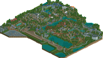
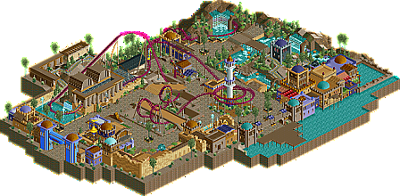
I felt you had a nice focus on realising an actual theme which people are not doing enough these days. You had a couple of ideas you realised pretty well and that was great to see (eg Top Spin). I think your parkmaking could reach the next level if you guide the viewers eyes a bit more carefully with your next project. You have the substance, now you need some more flow and easier arrangements. Try to make out stronger guiding lines the eyes can follow when viewing your work. Usually these are the main paths, which in your case could become a bit more dominant I think. They can be broken up of course, but I feel it's better when it's done so that it happens only in little areas that are then closed to one again. Here, you have a lot of paths pretty much everywhere and it makes it harder to walk through the park.
An example where you've already done what I mean though is the eating area with all the tables. It's a little secluded, so to speak and has its own little corner. I think that's wonderfully done. Also liked the rapids. The little platform for water pistols was a good idea to fill the center of the ride with something that makes sense and not just jagged rocks and a bit of foliage. Very nice also how you integrated the queue here. People can observe the ride from above as they queue.
Lastly, perhaps Mission Cleopatra's layout wasn't the strongest. A bit too slow near the end and the helix earlier was a bit strange to have there I felt. The nice theming and good park interactions make up for it though.
Overall, I'm very excited to see your next project on the horizon.
The layout wasnt the best but still okay.
I hope you can continue your good work and i am sure you can win an accolade with your next submission.
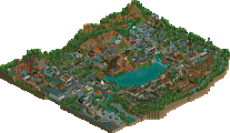
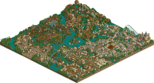
For everybody who has no TT, i have a bigger screen of the park here, which i made during the map-job:
Was this an old project or...? It feels like part of it is highly outdated/below standard, whereas another part of it looks pretty sweet from the overview. Hope to see a new (non-LL/TT!) release that has that level of skill/detail throughout the map soon!