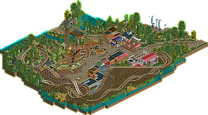
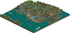
Park / Crazy Mine
-
 22-July 13
- Views 1,874
- Downloads 505
- Fans 0
- Comments 10
-
 58.85%(required: 65%)
Design Submission
58.85%(required: 65%)
Design Submission
chorkiel 70% tyandor 70% Maverix 65% posix 65% Wanted 65% Arjan v l 60% geewhzz 60% Pacificoaster 60% zburns999 60% ][ntamin22 60% Jonny93 55% Liampie 55% CedarPoint6 50% Airtime 40% prodigy 40% 58.85% -
No fans of this park
-
Download Park
505
-
Objects
1
-
Tags
Similar Parks
-
Terra Della Torre
-
[MM2014 R1] Thompson's Pier
![park_3164 [MM2014 R1] Thompson's Pier](https://www.nedesigns.com/uploads/parks/3164/aerialt2724.png)
-
Fort Anachronism
-
Rapa Nui
-
Gröna Lund
-
Whispering Cliffs Valparaiso
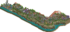
The layout was a bit strange I thought but kept good pace throughout and was surprisingly long. I think when doing a design you should make it the centerpiece. Here, the coaster was "behind" the park. You've created some nice exposure moments like the tables near the track and a good entrance, but otherwise there are no real track elements that receive too much attention.
You've polished your style well. The next step I think may be to make it clearer by making it more to-the-point, which is difficult. An example for lack of clarity for me is the large turnaround where the coaster goes through jagged rocks. They don't look bad, but they look a bit insecure and random. So try to have a good idea of what you want to create as you build, so you can build it with dedication. If you notice you're searching too long on something and can't find the right look, remove it and start over. Although it looks as though this doesn't happen to you too frequently.
Looking forward to seeing new stuff from you. Feel free to PM me with intermediate stages of your projects if you want advice.
I really like the idea of doing less-orthodox designs, but to be good enough to stand alone as a design that kind of ride needs to be played up a little. The Crazy Mine layout is a stock small-park mouse, which isn't new or exciting, even though it is very, very nicely themed. I would definitely argue it is better than Disney's mouse implementations (suck it, primeval whirl), but it is obviously a second-tier attraction next to the rest of the park. I might be more sold on this being a headline attraction if it were the main coaster for a small park or the only one in an area, if it had a custom layout, and if the entrance were more suggestive that the ride was a big deal; there's not really any queue, as cool as the building is. It isn't a big deal to me in particular, but catwalks and a transfer mechanism wouldn't hurt.
I think the park atmosphere is very nice, and that this would definitely do much better in the park category than the design category. <3 the train depot.
Auf Wiedersehen
The woodie's layout wasn't bad, but it wasn't amazing, which when the focus is on this main layout, it's pretty important to get it spot on. The surroundings were really nice, this is your best work yet, and I hope to see you continue to improve.
As I already said, that wild mouse was lovely.
@Louis!: I'm very glad that you enjoyed the Mouse, since you call yourself the godfather of flow
@][ntamin: You are absolutely right! The Crazy Mine is the designs namesake. I really wanted to go for a less-orthodox design. I'm glad that you consider it solid. I understand your point - it could've been more special but (since many people go for the realism mantra) I didn't take that risk. Though I think, that you might have missed the queue? It leads from the smaller building on the righthand side under the whole layout into the station building, and I had considered it very interactive and that it'd be fun to wait in line and watching people getting shaken around the curves above and hear little girls screaming while the cars ride downhills. I am also glad that you liked the parks atmosphere. I think I'll extend the design into a large park and hopefully won't loose motivation along the way.
@Louis! and ][ntamin: I always though that a park submission should be something like a real park, with an badass entrance (which I'm totally incapable to create) and so forth... That's why didn't submit this one as a "park", because I thought it'd be considered unfinished... Well, since I know this now, maybe I'll choose this road more often in the future...
Overall I've to say that the many votes in the 70s - 60s area really motivated me! Thank you Guys! I'd also appreciate some further comments from you.
Be good everybody and Auf Wiedersehen
one more and you'll get there. just put a tiny bit more thought into the actual centerpiece ride and the scope, I think.
@Cocoa: Thanks a lot, man! Why weren't you a panelist again?
also, I'm not a panelist because I've always loved the surprise of seeing things pop up on the home screen.