Park / Attractiepark Kirkland
-
 02-November 14
- Views 6,748
- Downloads 989
- Fans 4
- Comments 10
-
 71.88%(required: 70%) Gold
Liampie 85% Faas 80% Poke 80% ][ntamin22 80% robbie92 75% inthemanual 70% FredD 65% MCI 65% Ling 60% tyandor 60% 71.88% -
Description
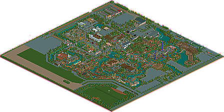
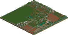
This park was built for 'De concurrenten'. This was a timeline competition of Holland which then went up to the year 2006. A few months ago I decided to build further with all my old parks of the competition. The park has now been built up to the year 2016.
The first builder off the park was DHTsoldier he built until 1995 at the park. The next builder was Sven who sold the park in 2004 to the Paul Parks group. The park has grown enormously since 2005 and have now a full range of attractions. Whit 12 roller coasters, and very unique attractions. The new rides for the year 2016 are Pilot Gibbous, a Vekoma Big Air coaster and Mina de Carbón a B&M Dive coaster.
If you love Dutch park making, I invite you to take a look!
Note by Liampie: the 2006 version was originally also included in this download, but since it already has it's own release at NE I removed it. Definitely check the 2006 version as well though, to see the amazing progress! -
4 fans Fans of this park
-
Full-Size Map
-
Download Park
989
-
Tags
Similar Parks
-
De Vliegende Hollander
-
Walibi Holland
-
Attractiepark Gelderwal
-
De Efteling Drunen
-
Resort Heusenhout
-
Attractiepark Kirkland
The 2006 version was originally also included in this download, but since it already has it's own release at NE I removed it. Definitely check the 2006 version as well though, to see the amazing progress!
http://www.nedesigns...epark-kirkland/
This was awesome! Why hasn't anyone replied yet? It takes a lot of dedication to finish a park like this, and you did well! Some parts were bad (flight zone) but the most parts were really cool. I loved all the little restaurants and stores spread throughout the park.
I liked this park a lot. It had a great atmosphere and a very unique style that was really a blend of old and new.
I actually really enjoyed the flyer but I enjoyed all of the coasters. Very cool, unique park that's worth checking out.
Am I missing something? I didn't think ti was very good. It was ok, but not spectacular.
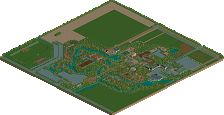
Quite immense; but more because of the size rather than the details of the park itself. Massive respect for finishing a park so large, but I think that the coasters really let this down. Especially the floorless coaster, which was too big for it's own good. I loved the steeplechase because no-one builds them anymore, and it was executed really well I thought.
Some of the architecture was quality stuff, and massive commendations for taking into consideration the outskirts of the park as well. A beautiful combination of classic Dutch parkmaking subtleties and usage of more modern objects.
This will probably be a park that I open in a while and suddenly notice a tonne of really cool details that I missed on the first viewing. But as it stands; 75% in my opinion. Would love to see more time taken to get the layouts right because that was the only major thing that really brought this park down for me.
I have to agree with Stoksy on the coaster designs. Kumba is massively out of scale, Del Aguila, Power Launch, and JSF Flight Academy are both just the most popular real-life versions of their respective coaster types (although they are very good recreations), and Street Racer's own block system keeps the trains from ever racing each other.
Sawmill's block brakes are set up brilliantly, although the layout is a little on the slow side for each train. The station building is also quite boring. The two kiddie coasters, Manic Miner and Boomerang are both more than serviceable. Steeplechase is great, of course.
Architecture was great in parts (like by Street Racer) but very lacking in others, like most station buildings and the larger stuff close to Kraken.
Another thing that was annoying, although quite small, was that a lot of the rides had bottomed-out reliability and long inspection times, so everything was breaking down constantly. Obviously a trainer was used for zero clearances in places, so I'm not sure why not take the extra few seconds to make sure everything is running smoothly at the end. I'm also not as crazy about the surroundings as everyone else seems to be - it seems to be mostly a collection of random buildings and fields.
The park's scale is admirable, and there's a lot going on with a modest amount of atmosphere (although I can't actually tell whether or not there are supposed to be themed areas), so this gets a 60% from me. I genuinely don't understand the near-spotlight voting currently.
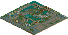
At last - my review! Since this is definitely one of my favourite parks of the year, I wanted to take my time. I'll go through the areas one by one.


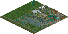
Entrance area and old Kirkland: at first I was afraid that you would delete too much of the old stuff. While Ivo was definitely no RCT god, I really liked some stuff he did and I like it for nostalgic reasons also. I think you did really well with the entrance area and the main street, looks like a nice mix of the both of you. The two coasters in the old Kirkland part are great - both the quirky but cool looking powered coaster, and of course on of the highlights in the park, the steeplechase! It's a blast to watch the horse go around the track. The open landscape is a bold choice, but it pays off. Minimal, but great area! The back half of the area obviously isn't very good, but I'm glad you left it there. Nostalgia overload!
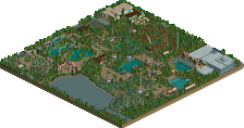
Industrial area: I really like this area, something different from you, while still recognizable! Mr Freeze is awesome, Sawmill doesn't flow very well but has an amazing queue, the architecture is dark and chaotic, but atmospheric, and the path layout is brilliant. I refer to the main plaza. A very large path surface, which you broke up in a really interesting way: the tarmac route guides the guests from A to B, but it takes an unusal route... Most people would simply connect all the paths in the middle, but you avoided the middle, which you used for a ride and a games stall. Aside from that you took the less than obvious route (literally), I think the mix of two crazy pavings just works here. Again, a simple solution to disguise the large path surface.
Urban area: probably the best area in the park. The Cop Car Chase by Sven is really good looking, and the Secret Bookshelves is yet another new theme for you that works out great. Paulism meets NE here.
[b]African/Wilderness (?) area[/u]: more Ivo stuff! The indoor hall has always looked cool in my opinion, good thing that you didn't touch it. The darkride is alright I guess. Kumba has a weird layout, some parts are too stretched out, but I like the diagonal lift, how awesome the view from the parking must be, and the flawless landscaping. The landscaping saved this coaster in 2006 and you made it even better with the supports in 2014. Not sure if I like the new rail colours more than the old colours though. No big deal though. Overall not the best area, but enough to like. Oh, and I wanted to highlight the restaurant in this area. The pots in the wall. Love it. Subtle!
Mexican area: I still think this area needed more architecture to define the theme, but it has some really nice stuff nonetheless. Los Pollos Hermanos looks awesome. I must learn how to make compact, thin buildings like that work... The SLC is possibly the best SLC clone I've seen in RCT apart from the colours, the rapids are really cool conceptually, and the B&M diver is nice as well, although it could've used more colour and more detailed landscaping... Really interesting station though.
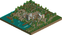
Back entrance area: your Efteling roots are obvious here. It's a bit out of place in this park, it's obvious that you couldn't hold onto some Efteling inspiration... Which is fortunate for us, because this area is beautiful. The train ride is one of my favourite rides in the park in fact. And the landscaping around the pond is flawless, yet again. Proves that you don't need hundreds of different small bushes to get an atmosphere going...
Near the Mexican border is the best building in the park. 10/10:
The first half of the spinning coaster is looking great and the theatre stands actually look really modern. Everything else inbetween the coaster and the theatre isn't too interesting, but it works.
Flight base area: my least favourite area, it's too bare and cold. The charming subtlety and detail from the rest of the park is largely absent here, though you did redeem that a bit with the Hammerhead Stall. The Flying Dutchman coaster is actually really good looking despite being so minimal. I dig the lifthill supports.
All in all, a very good park with some masterful features, as well as some less than stellar bits. But overall a great effort. There's so much content! I only now realise how small the original Kirkland was.
Can't wait for Groezelen.
I'm not sure what people mean by 'completing a park this big' when I'd say a good forty percent of the map is unbroken paving..? Am I missing something?
If you forget the paving, the park is still much bigger than most parks nowadays. And the paving and outskirts aren't even worthless. I think this map might very well be 256x256?
Anyway, it just won gold! Congratulations Paul!
I love this park. Congrats on the gold.