Park / The Caverns of Carter's Beach
-
 12-January 15
-
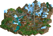
The Caverns of Carter's Beach
- Views 3,834
- Downloads 625
- Fans 1
- Comments 17
-
-
 56.88%(required: 50%) Bronze
Poke 65% ][ntamin22 65% FredD 60% Liampie 60% Cocoa 55% geewhzz 55% Maverix 55% MCI 55% inthemanual 50% Ling 50% 56.88% -
Description
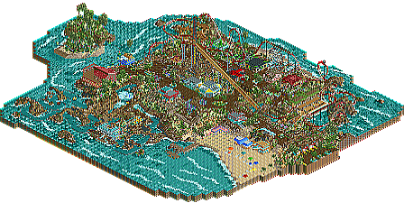
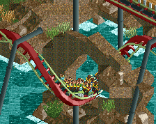
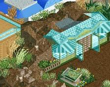
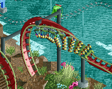
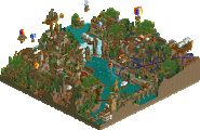
This little park is constructed around the beautiful sands and rock archways of Carter's Beach. The main attraction is the Cavern Clipper, giving guests a speedy tour of the landscape, diving in and out of caves, over the fresh ocean water, ducking and spinning through the rock formations scattered throughout the park.
If you'd like more detail, I've included a "readme" file in the download -
1 fan Fans of this park
-
Full-Size Map
-
Download Park
625
-
Objects
311
-
Tags
Similar Parks
-
Corsair Veredian
-
[H2H7 R4] The Wild West
![park_3367 [H2H7 R4] The Wild West](https://www.nedesigns.com/uploads/parks/3367/aerialt3772.png)
-
Lijiang
-
[MM2014 R2] Turtle Rescue and Discovery Center
![park_3200 [MM2014 R2] Turtle Rescue and Discovery Center](https://www.nedesigns.com/uploads/parks/3200/aerialt2812.png)
-
Valken
-
Arch Angel
Whoa! Got my first park map completed. Thank you very much for putting this together. Since I'm still a newer member, I don't know all the logistics of how this site runs, but I appreciate the work that went into getting this map ready! Thanks a million!
I'm looking forward to hearing some thoughts on the "good" and the "bad" of my park.
Regarding Intamin22's post: Yeah, I was (and still am) getting the feel for what makes a good coaster, I think the parks I'm working on now are showing some improvement in the coaster dept. As well, I'm trying to integrate more color on my buildings. I haven't got a ton of feedback on them yet as I haven't posted many pictures of my buildings, but at least, for what it's worth, I'm seeing some improvement. I'll keep at it though!
When I first opened this my first thought was "I hope this was submitted in the spotlight category and not the design category" and I'm happy to hear that it was. The reason for this is because I really liked everything about it. The atmosphere was great, the buildings were nice... I loved the beach area, the chopper ride, the breakers in the water... everything. The colors are fun, there are a ton of peeps... it's all great. Then there's that coaster which I'm sorry to say I'm not a fan of but this deserves an accolade and shouldn't miss out just because of one weird coaster design when everything else is so good.
As far as the coaster goes the layout isn't believable at all for a B&M which is okay since this didn't scream "hyper realism" to me but it didn't have much flow and took some elements way too fast. Both barrel rolls are way too fast and then the train absolutely crawls into the mid course making the brake run completely unnecessary because if it slowed down any more it would be totally stopped (it's unnecessary anyway really since the ride only runs 2 trains but that's not a big deal). I like everything after the mid course except the zip zagging brake run and station (with no transfer track).
Everything else was great though, especially the beach area and I really hope you win something for this. 60% from me. Great atmosphere!
^ Thanks for the review coasterbill, glad you liked it. I'm pretty happy with how the atmosphere turned out as well, as I was still in learning mode a lot during this park. I had to make some adjustments to the buildings as I went, but the finished product was pleasing enough to me.
To be honest, I'm not a frequent visitor of theme parks like a lot of the members of NE, so I'm a 100% total greenhorn when it comes to realism, what a B&M is, how fast each coater should travel, how many cars should be on a certain track, where to build transfer tracks etc, I'm just an RCT2 player, so as much as I'd like to make 'Real Coasters', I'm kind of in the dark. I'm sure in future parks you'll continue to see that aspect of my coaster designs glaring through. I'll try to keep improving where I can, taking the little bits of constructive criticism from fellow players into account, and keep having fun playing the game.
As a side note, I did have multiple members have a look at the park and no one really mentioned to me about the pacing of the ride, or the inappropriate speed at which many of the coaster's elements were taken.
I enjoyed this quite a bit. Full of vibrancy and life and I adored the setting. That rapids ride was brilliant in my opinion; the rockwork was really effective. The coaster was definitely the weakest part, it was too fast through the inversions.
I think my main point of criticism is cohesiveness. Each building was as strange as it sounds, too individual in terms in colour and style and the shapes were too square in some cases. I also think you need to expand your scale in terms of architecture, some of your buildings are too small.
Not bad by any means. I just thought that it lacked a little...omph. In that the coaster layout, as everyone has said, is really quite weak in my opinion. Unless people specifically request it, I'm not really that bothered when it comes to critiquing layouts/pacing/car numbers but the reason that coasters erring on the side of realism are so much better [predominantly, not in all cases] are because aesthetics and functionality go hand-in-hand in RCT in my opinion. The pacing through the barrel roll [after the cobra roll] was way too fast, but the transition into that element also lacked any aesthetic niceties. Getting the right pacing on coasters takes practice, but generally I like to think that the peeps need time to experience the element - not so slow that there's a fear of the train stopping but you don't want to rush through one too quickly either. Finding that balance will help in pacing. Getting 'flow' [as coined by Louis] is a little more difficult, but can be related to the pacing as well. You don't want any jagged turns or unnecessarily abrupt hills/drops, the ride itself should be as smooth as possible whilst still retaining exciting elements. For example, the small up hill after the immelmann is something that doesn't help the layout flow very much. Additionally, the 270degree turn after the immelmann kind of meanders the layout a little - generally I think that key coaster elements are more effective if the transitions between them are efficient. Which is why real-life coasters are more easily translated into nice-looking and flowing layouts in-game.
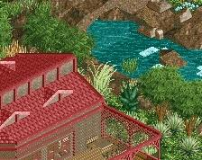
The architecture, whilst probably a little too small for my tastes was decent. I definitely agree that the colours were off though. Especially if you continue building with the smaller scale, I think that you're better off relying on clusters of buildings rather than individual ones in most contexts. The buildings on the beach were quite good I thought, and you could get away with those colours much better than throughout the rest of the park. The contrast between the oddly chosen colours [in that you seemed more focused on adding colour to the building itself rather than features of the building which works a lot better in my opinion - eg awnings, signs, umbrellas etc] and how spread out they were contextually they just seemed out of place. Subtlety is your friend! Accents of colour are an awful lot more effective than boldly coloured rooves/walls. [unless your Cocoa]
This was in the awkward middle ground between a park and a design I thought - the coaster wasn't good enough for a design in my opinion, but I think that the ride line-up wasn't that interesting even by small park standards. Landscaping was really well done though, and I think that there was enough in the architecture to warrant a bronze, so 55% from me. Would love to see you up the scale a little, it would give the building details more room to breathe and complemented by such brilliant landscaping could make for a very interesting release. Just work on your coaster layouts a little more
Some of the things I brought up were really just me being a coaster dork and they don't really matter (like the mid course dictating the amount of trains... hell my invert in Sunset Vista should probably have 3 trains since it has a mid course but it doesn't so I'm not a stickler for that. A lot of people ignore transfer tracks too and if they're not going for hyper realism it's not a big deal. Those things don't hold you back at all, I was just mentioning them incase you did intend to be hyper realistic.
Stoksy's feedback is something you should take into account though (about the pacing and order of elements). And I do want to re-iterate that despite the criticisms I still really enjoyed this and it easily deserves bronze or maybe even a low silver. I'd rather someone build a park with great atmosphere and oversights like I mentioned than a park that's technically perfect but totally lifeless. The fact is that this park was a lot of fun and that's what this game is all about.
Thanks cb, we'll see if it even goes to accolade voting
Of course it will... speaking of which, why is this still at 8 votes? Come on people.
Hm, my big problem with this one is the coaster itself.
I´m not into the hyper-realistic coaster thing, but a good coaster (in reality as well as in rct) must be fun, surprising and should look somewhat aesthetic (at least to me). While the layout had some surprising elements, like the roll after the cobraroll, those didn´t look that fun to me. The whole aesthetic aspect of the coaster was more or less ruined by the supports, wich were just not good. And I thought the coaster missed some flow. To make a long story short: I dont like the layout and the supports.
The theming itself was solid though, I think Stoksy summed it up pretty well.
I really liked the rapids, those looked extremly good in my opinion!
A 55% from me!
The system is telling me I need to vote on it but there is no option. I'm not sure what is wrong.
As others have noted, the coaster is quite weak. It's under-supported, the pacing in the first half is too fast, and I don't like the color scheme.
Structures are mostly too simplistic with too heavy of a reliance on the art deco pieces. Landscaping is quite nice, but could do with some more color. Foliage palette and colors are nice, but with just how little of it there is, it doesn't feel tropical. On top of all of this the park is quite small (even by my standards). The river rapids ride is my favorite part/area because the colors on the station are bold and it shows off your landscaping style. Could still do with more foliage and better-hidden rapids track, but on the whole this is a very nice section.
As I said, the panelist voting doesn't seem to have triggered for me, but I voted 50% (and will again if and when it does go to panelist voting).
ling, your panelist vote was counted. you might still have the notification in your notification system telling you to vote, but you already completed the action.
There's a lot to see and a lot to love in this park, but also a lot to be improved. I was under the impression that this was a design submission (why did you submit this as a spotlight?), so I decided on 60%... But this does not look like a silver.
The landscaping really created a lovely atmosphere here. The rest was a bit... average. Nothing really stood out as excellent archy or layouts or whatever, and the color choices were a bit off. It didn't create a theme that I could really get into other than the admittedly quite nice landscaping.
Congrats on the bronze!
Good first effort.
I would reduce the terraforming. It's too much for me. I would allow yourself some flat (!) areas here and there. Otherwise everything looks rather busy and as if you had this need to fill just about everything with something.
Otherwise nice colours, good vibe. You could compose the content of your parks a bit more perhaps. It helps to evoke more of an underlying narrative to what one's looking at.
Hope you'll share new work soon.
Liampie asked why I submitted this as a spotlight rather than a design. It seems like with the park being so small that my coaster stands out, but it wasn't the main focul point. Actually I started with the river rapids and worked out from there. I had varying suggestions on how to submit it, but I took itm's advice as an admin to do spotlight. As a bonus, I did get a bronze, plus it wasn't up to design snuff anyway!
Thanks again!