- Views 6,803
- Downloads 756
- Fans 4
- Comments 30
-

-
 80.63%(required: 65%)
 Design
MCI 85% robbie92 85% Stoksy 85% BelgianGuy 80% FredD 80% Liampie 80% Ling 80% Xeccah 80% inthemanual 75% 5dave 60% 80.63% -
4 fans Fans of this park
-
Full-Size Map
-
Download Park
756
-
Objects
436
-
Tags
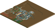
![park_3334 [H2H7 R2] Bermuda: The Lost Colony](https://www.nedesigns.com/uploads/parks/3334/aerialt2938.png)
![park_3410 [H2H7 Finals] Asteroid Fields](https://www.nedesigns.com/uploads/parks/3410/aerialt3040.png)
![park_3341 [H2H7 R2] Carreira da Índia](https://www.nedesigns.com/uploads/parks/3341/aerialt2950.png)
![park_3367 [H2H7 R4] The Wild West](https://www.nedesigns.com/uploads/parks/3367/aerialt3772.png)
I'm so excited to check this out! This might be better than my design
before making a more detailed review, that dam is one of the most useless ever, it's overflowing!
Cramped but all fits together so well, in particular I'm a fan of the water tower structure at the top of the water ride! All very nice to look at.
Best steel coaster - 2015
I think you suffered a lot from crampedness in this park. The details were phenomenal; from the abandoned railway track [one of my favourite touches in a park...ever] to Mr. Fish and the dam. The mine area was really well constructed in my opinion and the touches of colour from the TNT really added a lot.
Architecture for the most part was really well done I think. The restaurant by the splashdown was very well positioned, while the ACME Explosives transfer building was up there with my favourites in the entire park. I think that the main problem was that the station building ended up being a little lost in with all the other buildings, not sure if this was intentional but I feel that the station for such an important ride should have more prominence than I feel it had here.
Unfortunately, the main street area [where Drunky Mac's was] was probably the worst in the park. I felt that the colours and forms of the buildings really didn't fit with anything else that was happening. The problem was that with such a large amount of brown [which plenty of people have spoken to you about I'm sure :p] the requirement for adding in colour was seemingly done in this area but you sacrificed the great form that the rest of the buildings had. The lack of colour was made worse because you used a lot of the same brown [especially by Splashdown] and as such things blended together when they shouldn't have. In that supports [done in this quite dense manner] and buildings in such close proximity should be distinguishable, or at least more so than what you'd done here.
Still, the coaster was very good for the most part. I only really disliked the really long incline into the immelmann as I felt it would have looked a little better extending a longer straight piece out of the loop and going with the steeper incline for a nicer aesthetic look.
Nonetheless, I actually really loved this to be honest. My only gripe relates to the colouring of certain things - I think tackling a theme that doesn't revolve so heavily around earthy colours would help in future.
85% from me.
I loved this. I don't mind crampt parks at all and I thought everything was phenomenal.
Splashdown was excellent, the theming blew me away as did the queue area. Even little details like the support work and water pipe really helped make this attraction a home run.
Goldrush Carousel and Minecart Madness were great as well as they were just standard flats but the theming you put around them made them really stand out.
Then we get to Goldrush which was really a sight to behold. The theming along the ride course and the queue were great (you even made those awful TNT objects look good). The transfer building was so good that I actually thought it was the station for a minute and the real station is great as well. No matter where you look along the ride area you see great little details like the mine carts over the ride entrance, the dynamite, abandoned train and various abandoned mine carts along the course, the steeplechase crane, the wood shack that's about to collapse, the collapsing bridge and that final helix which interacts with a ton of theming. The layout and pacing are of course great too but the theming makes this.
Since it's a review I guess I should come up with something minor to bitch about which is tough because this is amazing but here goes...those lamp objects around Splashdown are horrid (Sorry K0ng) and the transfer track on Goldrush wouldn't work because the train is too long to fit on the transfer table. Those are really, really minor things though that don't take away from this at all.
Amazing job with this guys... this was my favorite design in a long, long time. Every nook and cranny had more little details to discover (Mr Fish (RIP) lol).
it actually got finished! I'm impressed to say the least
Congrats!
Fastest accolade in history?... well I've only been here a year, but that was pretty darn quick. I never thought I'd see a design with 400 years of work in it, but it shows. Incredible work! A pleasure to look at. I'd be nit picky, but I don't have anything to gripe over. Very well done!
This is fuckin' awesome.
bsg, Starpointe was faster, and Thorpe probably too.
I think what held this back was the sheer cramped-ness of everything (and the brown enhanced that a lot) and the pacing of the coaster generally being on the slow side. Also, if you examine the overall structure of the path through the area, it's sort of one long string with the majority of interaction with the rides taking place with ride queues and exits. The architecture quality is amazing, though.
one of the best designs i've seen on here to be honest, don't know why it only got 80.63%. architecture was great, though really really brown, it could've used a touch of washed out blue or green at points. layout was really cool though, same for the landscaping and the waterride.
85%
also the dam is useless, it's even fueling a giant river behind it...
ahh i've missed the messiness of what is k0ng and what seems to now be k0ng jr.
it's actually cleaner and more cohesive that a lot of his (and consequently, your) works, and that layout is really nice. nothing spectacular, but i voted 85% due to the atmosphere mainly.
This was incredible. This might be my favorite design coaster of all time. The layout was good enough, but it was the atmosphere conveyed by the surroundings that made it incredible to me. Less peeps would have been nice but no big deal. Truly incredible. 90%.
Wow man.. So many positive comments. It has been a long fuckin' time since this design was started. It actually started during h2h6 when belgianguy(part of reservoir dogs and me being the rookie) tried to help me out. He gave me a map and a layout(Not this layout, Completely changed) and said practice on this lol. Alot of you would have seen it grow even on NE4 Its that old.
It got rebuilt about 3 times or at least alot of it did. Hence the nearly 400 years game time.
It was after h2h6 that building on this really began. Although as I said above progress was made but mostly was rebuilt. Then the 'ole man' K0NG came along. Initially with hacks because I couldn't hack my way out of a paper bag.
Then out of nowhere it just became a duo, Had the whole "ohh look its kong jnr" stuff going on which I always laughed at, Because at the time alot of people didn't know/thought KONG was involved.
So many ideas about frozen peeps.... with Shotguns "stealing a minecart full of robbies ideas" and Kumba "outside D-MaC's harrasing girls" All that sadly never came to fruition...
But its done now and i'm glad you all seem to like it.
If anything I and the ole man should be nominated next years award for "Longest design ever to not be completed"
Ohh and Thanks RCT2day "best steel coaster 2015"
Cheers everybody. Its been fun
sex
now give me monies
edet: i a fangril nao