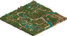
Park / Fabritius Delta
-
 21-August 15
-
Fabritius Delta
- Views 6,198
- Downloads 755
- Fans 3
- Comments 24
-

-
 73.13%(required: 70%) Gold
5dave 80% Poke 80% ][ntamin22 80% Cocoa 75% inthemanual 75% posix 75% chorkiel 70% Louis! 65% Roomie 65% pierrot 55% 73.13% -
Description
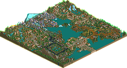
Welcome to Fabritius Delta, another humble homage to the great LL-players of days gone by, like Evil WME, Fatha' and posix. Every area is another experiment, either in imitating a style or finding my own. Some areas were designed with great care, some were intentionally rushed in attempt to create atmospheric chaos. Richie contributed with a wonderful B&M layout, and csw co-built the science fiction area.
Enjoy. -
3 fans Fans of this park
-
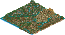
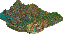
Full-Size Map
-
Download Park
755
-
Tags
Similar Parks
-
EverQuest: Waters of the Past
-
The Island
-
[H2H8 Grand Finals] Heaven's End
![park_4178 [H2H8 Grand Finals] Heaven's End](https://www.nedesigns.com/uploads/parks/4178/aerialt3929.png)
-
The Conquests of Quinlan Quinto
-
Tambora Lagoon Resort
-
Tropico Horizons
Not sure if this is better than Escapist or not, however I do like it more than Thoughts. I'll post a longer review soon I think, but I wouldn't be surprised if this got a couple spotlight nods, the strongest areas of the park a definitely at spotlight level.
Another fantastic, weird park from you Liampie. I have to say, for all your inspiration from other people, this park still felt very you. With the exception of the Mexico area (great fatha work) and maybe the industrial area, it all was very Liampie, which is great because I'm a big fan of your LL. Your eye for dramatic and interesting landscaping really pulls this park together. Especially the asian area is fantastic, really an area that would fit into a top-of-all-time LL park. The only area that let it down was the future area, I get that you were going for some old-school chaos but I never really liked that style, and I'm not sure you really pulled it off. Just seemed lackluster. Otherwise though, great work. Not as cohesive as your others, perhaps, but still an incredibly enjoyable LL romp. I'll be sure to keep checking this park out... you really have a solid LL catalogue going. Keep em coming!
I'll review the areas one by one.
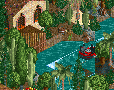
Entrance
This was a really strong area with quirky features that made it refreshing. The odd flower types and bold fences really worked well together. The architecture was done really well, great textures. I think that the flowers by the coaster could have done with a frame but that's just a nitpick. Speaking of the coaster, it was nice to see a underused coaster type. I really liked the way it dived under the queue. Its colours and the ferris wheel colours were perfect.
Japan
Solid area and I thought the Japan gates are so simple yet looked really good. My only real main criticism is that maybe you could have used another texture on the architecture instead of just that iron fence.
Rashomon was lovely, perfect colours, and great interaction with the path below. The station was a bit underwhelming though. I really liked the simple yet effective trick of the wooden jungle fence and the wooden frame of the path. The foliage and landscaping was alright. Overall it's refreshing to see an Asian area that doesn't rely on trackitecture.
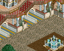
Antioch
My favourite area of the park. The teal of the windows with the bright red flowers with all the reds and browns of the architecture was masterful. Crusader had a cute layout and it was framed really nicely with the architecture. I've grown fond the foliage although I think that some of it is a bit too sparse and loose. The compactness of all the planters was refreshing. I was a big fan of, as Cocoa said, the dramatic landscaping that complimented Aquatecture and it was original to see the red rock texture used in such an unconventional way. Really beautiful.
Rougpelt
I still liked this area although compared to the other areas of the park, it definitely felt a bit weaker. it was definitely an interesting 'fantasy' theme with the use of the roman temples. I just think that some colour unity could have come a long away, like not having every window a different colour. I didn't really like foliage all too much, a bit too sparse and I thought you really needed some bigger trees. I did like the big tree with the pink flowers, I think that you could have even had more more of them. Coaster was solid and I thought the wooden track supports complimented it well. I really liked how spaced out it was.
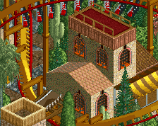
Mexico
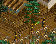
This area was definitely Fathatastic. Beautiful combination of browns, reds, oranges and yellows to create that really warm atmosphere. I think to really sell the Mexican theme, you need a lot more stuff on the paths like markets, stalls, overhangs like chairlifts. I really loved the quarter tile foliage and I think that it suited the Mexican theme really well. Layout of Treasure of the Sierra Madre was great and I enjoyed the way it went over the rapids. The rapids definitely looked a bit unrefined with the water not being zero clearanced however I understand why you didn't do it and it doesn't matter too much. The truck ride was so cute and it was great to see the car ride used twice in this park, you don't see it used all to much.
Labouria
Another great area. The contrast between the dark paths and the bright red flowers created a rich atmosphere. One of my favourite things about this area was the free-fall towers (the colour change was definitely a good idea!) and watching them go up and down rhythmically was great to watch. I always really like industrial architecture in LL and yours is no exception. The use of the tenement building was very innovative. A thing I disliked about this area was the pathing that went over the little lake. What was that? I just thought it didn't look good. Union was a great woodie, very big and powerful. I thought all the theming around it was great and all the different details with the transport belts was creative.
Overall, a fantastic park that should win gold in my opinion. My advice for next time would be to build bigger. Maybe it's just the way I build but coaster stations are a great way to build really big structures to give your work that wow factor.
I wish there was a full scale map of the park. I don't have LL rolling on my computer. Based on your screenshots, it looks awesome.
I love the shit out of this but I've been waiting for a full aerial to write a full review. For some reason switching from LL to anything else (even though it's a window) screws with the cursor so it's easier to view it in game and then refer to the aerial while writing a review.
So basically I owe you a full review and I promise I'll write one but for now 80% from me (though I see this as a gold).
If you're using the GoG version of LL you have to right click once outside the RCT window to switch out of the window, took me a while to realize this.
Labouria - 8/10
Union looks great nestled in the surroundings. It does a good job of not looking like it got squished in at the map edge, and it makes for some really nice views. Really just a great giant wooden coaster that has a lot of variety, looks good, and wraps up just when it should right when the momentum runs out.
Not sure I really follow the story of the area. The feel is dark and a little grungy, but not outright dystopian - except for maybe the green goo puddles? (aside - it has been forever since I've seen somebody use them and they look great) Is the Union good or bad, and what about a labor union merits a rollercoaster? That's like naming a ride "Ballpoint Pen." Even something like "Union Uprising" or "Union Dues" would have told a better story.
I love the glass fence throughout the area; you did a commendable job crafting the "look" here with the red flowers tenements and riffing on it. It is always cool to see subtle new variations on things and it has been quite a while since somebody's brought a new feel on the industrial wasteland look in LL.
Old Mexico - 8/10
Great classic feel to this area. Just the right amount of color to accent without straying out of the palette, neat little touches with the maze and awnings, nice interaction between the coaster and rapids. The back half of the invert meanders in a way that's appealingly non-standard - takes me back to when we weren't afraid to build layouts that B&M hadn't already built. I love the tableau in the back corner with the little mining shack, and I wish the rapids told a little more of a story - banners, crashed boat or two, something. Some people may be bothered by the open corners on the rapids but it fits well enough with the old-school aesthetic that I barely noticed. The trucks are probably my favorite part of the whole area; lovely use of the gas station prop.
Antioch - 9/10
Magnificent. Everything feels like a complete package here. The buildings are all formulaic, yes, but whenever things are in danger of blending together there's always a deftly placed awning or tent or some unique variation to draw the eye and the signs help create identities for things.
There's a lot of great staging at work in Antioch - extremely easy to imagine guest sightlines and such. Really cool how all the rides have great visibility from the main path, which manages to feel just wide enough to make the space open and grand without becoming overbearing. We should all be so bold as to let our buildings breathe this much and have really nice tree features like this.
The jagged rocks and treespam only feel outdated when they're the dominant feature on the screen; this is one area where I think dialing things back and leaving some bare earth like you did in Babylon for EE would have been a better route to take.
Japan - 6/10
Japan has grown on me, but I still feel it is on the weak side. Rashomon is a great ride despite a few clunky transitions (hey, it IS an arrow) and the path interaction is stupendous.
I appreciate that this goes somewhere different than the expected LL wooden roofs asian architecture, but I'm not sure it is really working. You don't leave yourself a lot of room for character and detail when the buildings all have to follow the pattern, and there's no real special unique things to find in any of the buildings. They're all empty, samey shells. The sand under the paths is a nice reflection of a kind of medieval palace or temple environment, and I like the little areas of interest:
the tiny village under Rashomon, the path overlook near the lilypads, and the path leading out to the tower near the unnamed restaurant at the area entry.
ITALIA - 8/10
The entry is definitely pleasant, and does the job of introducing the park very nicely. I love that the marathon mouse is used as a kind of appetizer, and it feels very comfortable set into the seemingly impossible combination of grand entry promenade and cute bite-sized family area. I would have loved to see it stretched into some more distinct Italian villa vs. Italian seaside visuals, but maybe that would ruin the fun compact nature of things.
Rougpelt - 6/10
I don't really get it, even after looking into what I assume is the reference. Wish the first turnaround for Phert were taller so it could maintain a little more speed and that the mid-course turnaround were more like Magnum's to avoid the awkward hump in the middle there, but overall it is - once again - settled very nicely in the surroundings and does a good job setting the tone for things and being an integral part of the area. You see it from almost everywhere, it defines at least one of the area entries, lots of path interaction, and I love how the ending tucks itself neatly in under the lift supports. The alien trees/cherry trees is a great trick. I also like the consistency that the piping under the path brings to the look - which is good, because everything else is a jumbled mess. Some things are solid, but for the vast majority of the area it is busy textures set against busy foliage on busy landscape in the busiest colors possible. Again, I'm maybe missing the references here that tie it together, but a judicious reduction in the amount of variety on screen would really help pull this from a kaleidoscopic tumult into a clear picture.
Overall Impressions -
That last bit about just too much busy-ness is a good summary for my feelings on the Delta as a whole. I admire the effort to stage a throwback park and the idea of a master study, but in places this feels like it was too closely held to those ideas and disregarded your otherwise excellent sense of when to put down the brush and call it finished. The jagged rocks are surprisingly well done - the jaggy coastline still works fantastically as an LL tool - but the foliage isn't handled as deftly as it should have been. Too much and too busy, and sometimes carelessly applied just to get the "look."
Still, I don't want to let that overshadow the many positive aspects of the park. The big attractions are all handled extraordinarily well, with solid layouts and excellent stations across the park. Rashomon and Phert all do fantastic jobs of "living" in the area and setting the tone for things rather than just being attached or kind of plopped next to things. Union, Treasure, and the entry mouse all do very well at establishing the tone for their areas - overpowering big dark woodie, bright backwoods adventure, little zippy appetizer.
Architecturally you know where to put buildings and what kind of variety and staging they need to feel cohesive in the "Classic Spotlight" sense - a few snack buildings, a few just for show around the centerpiece rides, and an iconic station. The traditional pattern of the center lake also works really well for you here, giving the whole park a feel of a complete multi-course meal. We've seen a little of everything - bright areas, dark areas, high tech, low-tech, terrain-hugging rides and towering rides.
It is really remarkable how well a lot of the old styles still hold up - flowers edging the path, 2x2 and ghost train windows, one pre-selected frozen vegetable mix dumped over an entire area. The consistency of these techniques leads to areas having strong, singular identities. There's no "well, I guess this is sort of X themed" mish-mash, which does a lot to build atmosphere. The scattering of statues and entertainers referencing your inspiration is a very neat touch, and I sort of wonder if I should be judging the park on how well it it does as a park vs. how well it has recreated these selected master's styles, smudges and all.
On that note, though - Something that's missing from Fabritius Delta that doesn't follow the old-school pattern is a kind of concept-first building style that lead to parkmakers trying to tell stories through their banners, shops, and ride names. Stuff like the Aviator/Ozone parks that are desperately trying to get you to follow their biblical narratives, or even Atomkraftwerk or Slime Meridian. There's such a wealth of imagination behind all the aspects of the park that they have to name everything so you can try to catch up with how rich the picture they have in their head is. In a lot of places the Delta feels like it has the kind of cursory "well, I guess there ought to be a restaurant here" feeling with no heart behind it. Fatha and nate are just as guilty of creating an empty-feeling park when they were just following their patterns and filling out an area, but at their best everything has a little piece of story behind it to help suck you in. I think that's a major part of why Disney parks did so well for years of classic LL work. Everybody expects a Disney property to have life and story baked into even the trash bins, so parkmakers are much more likely to give every building some personality. It isn't just a Disney thing though - its clear Nate had almost every single structure in Ouest pegged to a particular place or story or purpose, and that's what led to the ridiculous density and detail there. Maybe that's the difference between just copying a Rembrandt and being the pupil who takes on their own vision? I can't help but think you're aware of this angle I'm taking, considering the same is true in your own works. The stuff you really put some creative energy behind - Tenochtitlan, Leijang, Thoughts, hell even the Inspiration Well - all show a stronger sense of artistic vision that drives them to grab the viewer instead of just sit there looking pretty.
There's no debating that Fabritius Delta is a good park and a neat idea that does what you set out to do in playing off the Old Masters to see how far it would get you. I don't think it quite reaches the goal of transcending them to become its own masterpiece, but maybe that was never the point.
edit: as usual, posix has said it best and with far fewer words in the two days I've had this post sitting half-typed. Heartwarming, but missing a little heart.
Can people just vote on this? It's getting a bit ridiculous now.
It only needs 1 more vote.
That's the problem with LL collabs, they take out several potential accolade voters
I really want to open this and vote the living daylight out of it. But I can't.
Do you need the drexler patch or something Faas? this thread might be helpful - http://www.nedesigns...og&fromsearch=1
Well done on the gold Liam!
I have tried several times alex but nothing works. Last time I tried I lost all my save files.
Edit: Congrats on the gold Liam!