Park / KINDRED
-
 01-February 07
- Views 5,317
- Downloads 655
- Fans 0
- Comments 17
-

-
 77.50%(required: none) Design
5dave 80% inthemanual 80% Liampie 80% MCI 80% Stoksy 80% Cocoa 75% Fisch 75% Poke 75% Xeccah 75% csw 70% 77.50% -
No fans of this park
-
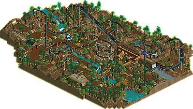
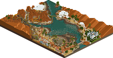
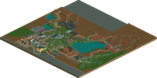
Full-Size Map
-
Download Park
655
-
Tags
Similar Parks
-
Congo
-
Fränkisches Abenteuerland
-
Mamba Kilima
-
Ombezi Basin National Preserve
-
Busch Gardens - The Dark Continent (Unfinished)
-
The Good Earth
Great Work geewhzz and Congrats on the NE Design!
I'll comment later about the rest. Those are just the first things I noticed.
BTW, if you put trees in first then zero-clearance the bushes you won't get "ghost" trees.
*The Layout was pretty slick and i don't think it needed an MCBR.
*The on-ride photo counter was nicely done
*River(s) were also nicely done
*The buildings that are there are well presented and located.
*Station area was very well done, love the queue looking down to the loading platform, reminds me of the Black Hole queue at Alton Towers in that respect.
*Realisitc details such as catwalk cross bracing, disabled access, HVAC, employee access.
The bad:
*I think it could have used a 'thicker' foliage, dense.
*Although the realistic touches were great, they were let down by some other details such as a moving sign saying 'employee's only', for example i find that using the 1/4 historic sign (i think thats the name) is better for 'warning' and notice signs becuase of its proportion to the guests, something i tried in Kukuana. No entry sign isn't really needed becuase people generally don't hang around the exits anyway becuase they want to move onto other attractions.
*The tower wasn't needed.
In-between
*The lamposts work but i think another design could ahve helped the theme a bit better.
Hope that's good critism and i'll talk to you later about it no doubt.
RFan
What's wrong with the 4.5 g loop?? Firstly, its rct so G's are hardly accurate. (RCT has a horrid physics system) Secondly, the Batman clone's hit 4 g's and SLC's hit somewhere in the mid-high 4 range, so 4.5 is totally reasonable.
You already know my thoughts on this Gee, all I have to say is congrats on the well-deserved design.
Edited by eman, 01 February 2007 - 09:03 PM.
Though that could just be Linux being a bitch.
Help?
-ACE
Loved it... one of the best station's I've ever seen.
That can happen if you try and open it right out of the .zip file, make sure you make it to the desktop or someplace else first.
I really liked the design, the only thing I think I disliked was the roof types on the station, awesome otherwise.
The layout is really good, I love that helix after the cobra roll. I think the loop looks a little too fast, regardless of G's or whatever cos I don't understand those. I also thought that everything looked a little too "spread out", can't really put my finger on it thought. The foliage could have helped to create that feeling, the whole thing could have been denser.
Very well done on everything, it's a great piece of work and most people seem to love it. It certainly is very good, and I only see better things in your future.
The best of this design is the coaster layout and the landscape. I thought the foliage and architecture kind of weak, as Turtle said, it could have been much more thicker. I didn't like the architecture of the coaster station, the roof work didn't work for me, it was so plain.
Anyway, nice design there, but that could have been much more better...
Fixed it -- had to open from inside the game.
I have only one major quip -- your transfer track wouldn't work.
Other than that, brilliant. Make him a fucking parkmaker already.
-ACE
Edited by ACEfanatic02, 03 February 2007 - 02:07 AM.
Thanks for the comments all. I put a good amount of work into this and finished it in about two weeks time. I think the layout is one of the better ones I've seen in RCT2 since I've been playing it. There will always be arguments over the pacing, but for me, this is spot on with how I view RCT.
The foilage could have been thicker, yes, but it was a pain to work with those MT trees anyways. There are no ghost trees unless you see through scenery and it just isn't a big deal to me that they're there unless they are there when you don't have see through scenery on.
I really didn't feel like doing much else with this design after I finished the coaster layout, so I don't think it's safe to say that this is realistic in the sense that it could go into a section of a real park, I just wanted to show that I can do good layouts.
ekimmel - if the inline twist rotated the other direction then it wouldn't be a realistic immelmann.
ace - the transfer works fine, I don't think you took a good enough look at how it was setup.
Thanks again.
Edited by geewhzz, 04 February 2007 - 12:44 AM.
You're right about the direction of the rotation. Not sure what I was thinking when I first looked at it. Probably because every B&M Inverted I know rotates the other direction. Anyways, it's still not a very realistic Immelmann. Take a look at pics of Montu, Top Gun, or Alpengeist. Immelmanns scrub off a ton of speed so they need to immediately go into a dive to regain speed.
But, whatever. Everyone's reality is different and it's still a great design.
-JDP
My favorite part of the design was the lift hill and brake run. The amont of work put into this area alone was very impressive.
I liked the attempt at the various ramps but the color really through it off for me. It made them stand out too much and I think a more traditional gray would have look better. I also agree with Turtle in that the foliage could have been thicker in spots but the open areas worked well.
Again, great job as this will be one I keep fo review at times.
James - rctnw