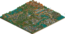
Park / Jötunn
-
 06-October 16
- Views 4,495
- Downloads 621
- Fans 4
- Comments 17
-
 76.88%(required: 65%) Design
bigshootergill 80% Cocoa 80% Dimi 80% Faas 80% Stoksy 80% G Force 75% Louis! 75% trav 75% Liampie 70% posix 70% 76.88% -
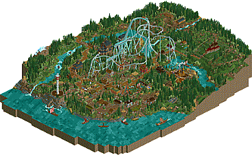
Description
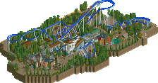
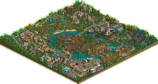
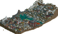
Jötunn is the Ancient Norse term for a Giant. This design follows a B&M Dive Machine through a Scandinavian themed land.
Inspired by a trip I took to Scandinavia and my love for the history of all things Vikings.
It also features 3 custom flat rides:
Njörðr - The Norse God of the wind
Hringhorni - The legendary Viking ship
Mjölnir - The mighty hammer used by Thor in battle. This ride depicts the battle undertaken by Thor in his attempt to defeat the mighty sea serpent; Jörmungandr.
Hope you enjoy -- Kieran
AKA Goliath123 -
4 fans Fans of this park
-
Full-Size Map
-
Download Park
621
-
Objects
1
-
Tags
Similar Parks
-
Fenrir
-
NE's Sandwich Springs
-
Tromsø's Nordlysfestivalen
-
Legacies Themepark - Europe
-
Five Minutes to Twelve
-
valhalla
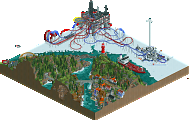
Wow, huge map. Looking forward to checking it out in game, definitely appears design worthy from the overview.
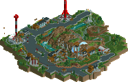
Absolutely wonderful. The coaster, the other rides, the architecture and scenery, everything is great. Definitely deserves some sort of accolade.
Amazing. I love the huge scale of the ride, it gives it an incredible presence. The layout flows pretty nicely too and it interacts nicely with the queue.
Great stuff!
That's one tall drop machine. Nicely done, but I think the main attraction here is the theming which is really great, never seen such a convincing take on norse architecture! Maybe a little heavy on the stave church-type halls, but it's forgiveable since it's in a theme park setting, and the many little turf houses more than makes up for it! The lighthouse swing looks good but really doesn't fit with the norse theme, though. Yggdrasil would've been a better choice of theme, I think. But that's a minor thing in an otherwise very well done design(?)!
Yeah I feel torn on the lighthouse. There are many of them in Scandinavia, and they allude to a nautical theme. Gives a feeling its a viking themed park built were an older lighthouse is.
As for the viking village, I love it. Reminds me of the viking themed area they had in my local park as a kid.
Beautiful landscaping. Love the meandering river and the creek coming in from the top. The foilage is super nice too.
I really enjoyed this. dense, full of atmosphere, really detailed buildings. I think the flowery foliage occasionally was a bit distracting but overall made a really fun, 'romantic' scandinavian sort of atmosphere. the layout was massive but fit really well into the landscape and design. good work all around, love seeing releases from you!
A really well thought out layout but the lighthouse does seem out of place, my immediate thought was the huge potential for it to be something similar to Odin's Tower in Age of Mythology which you could probably better (see circa 1:15:49 here: youtube.com/watch?v=WuM46OLjyd8) and working with that mythology. Or otherwise it perhaps needs to lose its modern look to be in harmony with the rest of the park.
The coaster flows perfectly with the water of the landscape, the small image highlights this and the river becomes the giant so you've blended them well.
Overall really nice work though. Definitely a design in my book.
That's one crazy coaster, it took guts to build something that big. Considering I don't know a ton about drop coasters, I can't fully imagine being on this particular ride, but it seems like a rush for sure. For me, the selling point is the setting and atmosphere you constructed. There is so much thought, care and detail in this park, it really brings it to life. The landscape is so well done IMHO, the use of various flowers, different land textures, good mix of trees, shrubs, rocks, even making the flow of the river worth watching. Just great work. Archy fits great into this setting too, from the larger buildings, to even the pre-made huts tucked throughout the park.
When I think of some of the higher design accolades, while the coasters themselves are great (yours could have been better), they also need to have a strong atmosphere and map, which I think you nailed! Design for sure, 80%.
Congrats on design!
Excellent map. Voted 70%. The atmosphere and landscaping and everything was very well done, and it is refreshing to see a dive coaster on this scale and in this setting! Please build more, I would love to see it.
Thank you everyone
Feels good to get a release out these days
Very good! Lovely atmosphere, nice achitecture, and beauitful foliage. I thought the coaster was a bit too big, but still good.
Good job, and congrats on the design!
I thought this was amazing. I loved the density of it, there were so many nice details to pour over. I also really liked how you stuck with very earthy colours and textures in the architecture and the way everything blended together (except the coaster of course). It had a very different aesthetic to most parks. I agree with others that the coaster was too big and I think due to the size many elements looked stretched out and lacking flow. Still, the theming was amazing.
This is probably my favorite design ever. So underated. Everything is just perfect, unique and beautiful. I don't mind the lighthouse, I would even say that's a good choice in term of realism, real parks are never perfect and fail their theming lol (the ride itself is very welld one btw).
The only thing that made me rate this 85 instead of 90 is the dragon near the swing ride, too messy in my opinion.
Hey thanks man :~) That warmed my heart