Park / The Poltergeist
-
 11-November 17
- Views 2,199
- Downloads 472
- Fans 0
- Comments 11
-
-
 57.50%(required: 65%)
Design Submission
57.50%(required: 65%)
Design Submission
Fisch 70% Cocoa 65% Coasterbill 60% Poke 60% ][ntamin22 60% bigshootergill 55% CoasterCreator9 55% Liampie 55% G Force 50% nin 50% 57.50% -
Description
Just a little thing I threw together in roughly nine days for another contest. Nothing super special, but I hope ya like!
-
No fans of this park
-
Full-Size Map
-
Download Park
472
-
Objects
1
-
Tags
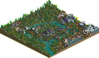
![park_4090 [H2H8 R2] Feira do Flamengo](https://www.nedesigns.com/uploads/parks/4090/aerialt3829.png)
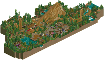
Pretty solid work, definitely an shows improvement. All the large structures worked pretty well here and the color choice made it pretty atmospheric.
Foliage was definitely the weak link here, which is surprising considering its usually one of your strengths. Maybe that's just due to the short deadline though.
For me there was too much grey roof. I would even say grey shouldn't have been a colour to put on this map.
Otherwise, in my opinion you should really make things more simple, some things were clearly overdetailed and chaotic sometimes (archy, roof forms, rocks in the river, too much supports for the roller coaster).
Foliage was nice but a bit too innocent, didn't do much for me...
On the other hand I liked Poltergeist, it had a nice layout.
Would love to see you try something simpler next time. This entry was interesting but maybe a bit too much rushed.
I liked this for example
Can't believe this was only at 55% before I voted. Such great atmosphere and an incredibly fun submission all around. I really wanted to delve into this. It was full of life. It's interesting because your teaser screens were far less cool, than the actual park. So I was VERY surprised when I opened this. Great interactions all around, cool ideas and great theme choice. The only thing that I hope you can really improve for next time would be your queues. They're all short and hidden and have none of that interaction. Look at Poke's newest release Callisto and the queue of the coaster there. Get inspired by how he did it. Everything else in your park works together really well and is honestly quite stunning work!
- I did enjoy the architecture, nice forms altho perhaps a bit too much reliance on trackitecture which i find can make things messy.
- I would have kept with one path type throughout, having the crazy paving sprinkled throughout again made things a bit messy.
- I did enjoy the mood of the park; it was spooky yet also quite warm and cheerful which made it overall charming.
- The foliage was quite weak; you need to clump your trees into patches instead of having it all sparse and spread.
- Of course, it was quite fun; lots of interactions between rides, paths and landscaping which is always good.
Overall, keep it up! I don't know if it's design worthy but you put a lot of effort into it which made an enjoyable piece of work. Definitely have a lot of potential!
Very nice submission, very atmospheric and nailed the contest theme very well. The archy was a bit random in places; I felt like there was stuff added where there didn't need to be, and some trackitecture that could've been done better with scenery. The coaster layout was pretty good, but I felt it dragged on a bit and could've used a MCBR somewhere (or been cut shorter).
Very cool stuff, and a nice park to look at!
This was a lot of fun. Solid layout (not amazing butsolid), I'm not sold on the weird support colors but I admire you for trying something different. The architecture and uniqueness are really the highlights for me. Cool stuff!
Cute little park you have here! Brimming with atmosphere!
- Interaction is on point, good job.
-Colours are great as well. Even though its supposed to be all dark and mysterious you managed to add some accents and that's always positive.
-tracktitecture was good too. IMO it worked, but I'm glad you didn't add any extra as it was on the edge of becoming too much.
-I LOVED the bridges, good job on making those interesting.
-I agree with Poke that the foliage was a weak spot. If this was done to modern standards, this would've been fantastic.
-I really like how you made standard flat rides look so atmospheric with just path and planters. The twister Jackal is a great example of this. The plaza it's on, the decoration, the colours, the tranquil yet mysterious feel... I value all this stuff highly. I might be trying to emulate this in my own NCSO park....
Overall a great little submission worth checking out. Good work!
pretty good! there is some good archy and vibes throughout, and the layout is pretty great. nice detailing. I think some stuff was a bit strange- the rocks under water, top spin hidden behind a building but still in the open, and some of the buildings felt a bit 'too much' and hard to figure out what was going on. you have a clean, detailed ncso style but some of the buildings were a bit chaotic and lost some aesthetic appeal because of it. anyway, borderline design for me, will have to think. great year for ncso though!
Every new design shows improvement in your architectural skills. Colors like dark purple and blood red are sprinkled well against the brown and black buildings to keep the spooky atmosphere lively. Classic orange makes a few cameo appearances as well. The best building on the map is the haunted mansion ride, especially the roof with the monster truck overlay.
There are some other clever ideas that were executed well, like the carousel on an island with the rapids running around it, the wooden cross above a ride entrance, and even something as simple yet so perfect for the theme as cauldron planters.
The weakest link with this coaster, I believe, is not the foliage, but rather the supports. Olive green goes well with black track, and they would have popped a bit more had they all been painted that color instead of black. There are also way too many of them, which is especially noticeable with the ones that "land" in the water. The Poltergeist has some great interaction with the rapids ride, but its supports do not (or rather, they're a bit too friendly with it). I would suggest spacing the supports a bit further apart, painting them a different color from the track, adding more footers especially on water, and keeping them out of the river rapids track whenever possible.
Overall, definitely on the right track! You do well when you take the time to refine the details, which may not have been an option this particular time if you only had nine days to build it.
Honestly, I think the foliage was the best thing about the park and maybe even one of the best ones I've seen this year. Not everything has to be super dense by default... If anything I think the sparseness in places helped the theme. You had a great mix of colours and textures, making the map feel dark, but also colourful and warm. Loved it.
The coaster was quite good I thought, except some weird stretched out pieces and inconsistent supports. I like that the supports came in two colours though. Again, a nice deviation from the norm.
Architecture was the weakest link. Often a mess. Sometimes comprehensible, but usually not. Request to everyone: stop putting monorail track on everything, it's hideous. Less is more...
57% is a good score. I still think you're one of the biggest promises for the future, but you need to wrap up your current park so you can take some big leaps forward.