Park / Zula
-
 19-November 17
- Views 4,844
- Downloads 543
- Fans 8
- Comments 25
-
 78.75%(required: 65%) Design
Steve 90% SSSammy 85% trav 85% CoasterCreator9 80% Kumba 80% bigshootergill 75% G Force 75% Liampie 75% Louis! 75% pierrot 70% 78.75% -
Description
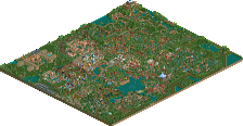
A thrilling launched coaster soaring through an African themed town.
-
8 fans Fans of this park
-
Full-Size Map
-
Download Park
543
-
Objects
1
-
Tags
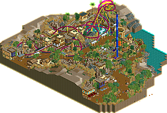
![park_3325 [H2H7 R1] Tenochtitlan](https://www.nedesigns.com/uploads/parks/3325/aerialt2925.png)
To me, this is just a notch below Djinn. The main thing this entry lacked was a larger sense of ride-area integration. What was there did suffice, but making such a compact coaster design like this doesn't leave too much for integrating it into the main area as a whole. The theming was excellent; again, really only a notch below Djinn. Definitely a strong sense of atmosphere and just enough color contrast to really make things stand out.
You're definitely skilled, but you've got some ways to go of course. I think focusing on making rides integrate seamlessly with the park area, and using colors more to ennunciate more important structures rather than at random would bring your work up a level. Again, it's pretty high as it is now considering I'm able to do an analogy to my favorite design of all time.
I can't decide between an 80 or an 85 as of now.
This is awesome.
The highlight for me is definitely the architecture. In small sample sizes it might actually be some of the best I've ever seen in RCT. It's also pretty unique which is refreshing to see.
The coaster itself was also very nice. The layout was solid, the interaction with nearby buildings and streams was cool and it all flowed really nicely.
I guess if I had to critique anything it would be that I wish the tunnels were open at the back since it's right on the map edge and would have added a great extra dimension and the ride did feel very compact and jammed into a corner so it didn't really play with the surroundings too much aside from the little area you built for it.
Overall though, this is superb. 80% from me, the architecture really makes this stand out.
I loved it. Coaster was nice and flowed really well, and the archy was well done and unique. 85% from me. Well done!
This is a design, so the main ride is the focus here. While it doesn’t seem like the true highlight of the map, it’s very well done regardless. Picturesque, flowing, intricately themed...nothing to complain about. It is relatively isolated outside of the queue interaction; having it meander into the bulk of the map could’ve elevated this even more. Still solid.
The surroundings is where the park shines. Great structures and excellent foliage. You’ve really created a great atmosphere and one can tell it was what you put the most care into. The facades built into the rock with the car ride carving through it is some of the best stuff we’ve seen in recent memory. Truly great semi-realism.
Overall this an easy design in my eyes. I’ll save my vote reveal for when the time comes. Really looking forward to your future work Leon. I would be surprised to not see this result in a parkmaker status; you deserve it!
Very nicely themed and foliaged, but the coaster just doesn't really do much to me. Overall pretty solid though as always, you definitely have a nack for theming and color choice. Your archy is also fantastic, though some of your more recent work is a bit better.
A 75% from me, solid but not really special enough to break that 80% mark.
I liked this a lot. It was small but packed with so much content. I think that the drop ride may have been the only eye sore. It didn't mesh as well as the rest of the ride I think if you had colored it dark purple or something softer rather than the dark blue it would have been more cohesive. Aside from that the ride layout is great, archy as said above the archy is top notch. keep up the great work. 75-80% for me
This was solid but I don't find it as impressive as others, not that it matters much. I just found it claustrophobic and wished you gave everything more room to view.
Plus, it wasn't visually clear for where ride entrance/exits esp the monster truck ride, which would make it rather flawed for guests (and me) to find.
The coaster was rather short and not particularly groundbreaking. Not that i'm an expert or anything, but even thematically, the coaster felt a bit too modern compared to the rest of the park.
Everyone else has said what's positive about it, but yeah that's my personal flaws with this. You're obv skilled but I just found this design far too minute/tight in scale. That's just me tho.
Interestingly enough, I'm having the same feelings I had with Adventureland as far as my final decision for voting goes.
The architecture is wonderful. It's unique and really well integrated, almost to the point where I had some difficulty conceiving that this is actually part of a theme park. Is that a bad thing? I don't think so, but it's really interesting to me that this feels like a chunk of Africa rather than a chunk of a theme park with an African theme (I think the foliage and landscaping had a lot to do with this too).
I agree with Poke with respect to the ride entrances and exits. In the grand scheme of things it's perhaps a bit of a minor thing to note, but I would have liked to have seen a bit more of a grand entrance to the ride itself. What you have is fabulous, but I find myself missing the ride name on a sign or something to tell guests "hey, look at me!"
Coaster layout is solid with great interaction, I especially love the water interaction around the falls and the queue. While it's not a super impressive ride itself, I think that what you did with it is nice. Would it have been better with some aspects of what Steve mentioned about spanning the map a bit more? Perhaps.
Overall, the architecture and general feel of the area is what brings me in, and the rides themselves are solid which led me to vote as I did. Very well done, and no doubt a solid design win.
does this remind anyone else of 5dave? especially when looking at how well the ride interacts with the paths surrounding it. im very impressed by this. an obvious design.
So glad you got this finished. And it's a piece of rct you can be proud of.
Lovely and refreshing architecture. Great job on the textures here too. The whole area is themed so immersive yet still very believable. This could easily be an area in a top European theme park like Phantasialand or Port Aventura. The great work on landscape and foliage helps creating this fantastic atmosphere as well of course.
The coaster itself is nice. While it's compact it seems like a very fun ride to ride and it has some great interaction with the environment around it.
This will easily get design. Just as Steve said I wouldn't be surprised if you gained park maker status with this. I really, really want to see more work from you. Because this is so great.
Theming: lovely for the most part. Every building was different, but it still felt a bit shallow because you often attached no specific purpose to each building, and no small recognizable details ('little things') to make them worth exploring. The octagonal thing around the queue entrance was my favourite, brilliant.
Landscaping & foliage: not a huge fan of how many types of rock you used. Either go with land rocks, LOTR rocks, or 1K ruins, or blend them into one visual texture. LOTR rocks tend to blend very poorly with land, and I think that problem definitely surfaced for you. The distinction can make sense if one style represents real landscaping and the other artificial, but I did not know if what I was looking at was a real landscape of something artificial.
Great first RCT2 solo submission. 75%.
Congrats on the design !
I kinda agree with Poke overall.
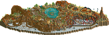
+ The roller coaster area is amazing. The station is beautiful. Too bad it's Cheetah Hunt inspired, I would have preferred to see something more like Taron but that's just personal preference.
+ I love those suspended umbrellas.
- I remember being amazed the first time I saw that screenshot of the roller coaster. Now if you ask me, I'm not particularly a fan of the "additions": the drop tower and monster trucks ride area, it's too cluttered and tiny in my opinion. I also don't like the color of the drop tower, the coaster is already flashy enough. Another flat ride would have been better I think.
- Also, I would have liked to see some variety in the archy, since it's the same kind of architecture everywhere in the park (roof style too). Don't get me wrong, the archy was beautiful, particularly the roller coaster station as I said, but for me, the rest felt a bit too repetitive in terms of textures.
Overall, as I said while you were building, it shows a lot of awesomeness and it shows how talented you are, but I feel like half of the map with the drop tower and 4x4 ride is maybe a bit rushed and not inspired like the other half with the roller coaster, which in my opinion is perfect.
70% for me (roller coaster area is 90%)
that score is exactly what I was hoping for. Congrats
For starters, this little design is just beautiful... and I'm happy to see that it's small (like in times past) but still received a decently high score. I love the african vibe you created, with various pops of color. In an NE world where the 2x2 and 2x3 buildings don't receive as much love as they used, you managed to pull it off very, very well. I think it was the little variations you executed with each building that made it really work. I think the foliage was really fun, perhaps it needs some refinement somewhere along the way, but for what this design is I think it was well done. The 1K ruins along the path, with the bits of organic growth add so much to this atmosphere.
As for the coaster itself, it has it's strengths and weaknesses. The setting of it was really nice, as it plays with the landscape and shoots in and around the queue. And the station is great too. Perhaps it could have explored the area a bit more.
I'm not going to nitpick too much, but I was disappointed to see the queue path selection was the original one from the game, it kills a little bit of the atmosphere you were going for. To me it almost seemed like you forgot to replace it before the release, but maybe you intended it to be that way.
So 75% from me, and congrats on the design accolade, well deserved. I'm looking forward to your next project.
its so much littler than I thought! voting went fast too, didn't even get a chance. ah well, would have given it around 75/80 too. Very high quality work, lovely vibrancy and atmosphere, etc. cool shit all around, I'm looking forward to whatever you churn it in any competitions that may or may not happen soonish, as you've really stepped up in the last year or so.
I would rate this a 85 - 90. Beautiful theming, immersive theme with a lot of beautiful spaces, the layout was compact but lovely. Great use of color, great use of scenery pieces, loved the foliage. Surprised that others didn't find it as great as I did.
Too bad there was a slew of old parks receiving accolades after this was awarded Design. Zula deserves it's time on the home page! Anyway the admins can adjust that?
Beautiful work. I absolutely loved it.
Lovely foliage and architecture, solid design layout as well.
Well done mate