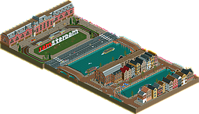
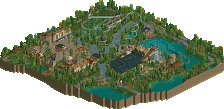
Park / Old Amsterdam
-
 08-February 18
- Views 2,000
- Downloads 433
- Fans 0
- Comments 11
-

-
 48.50%(required: 50%)
Spotlight Submission
48.50%(required: 50%)
Spotlight Submission
CoasterCreator9 55% Liampie 55% Xeccah 55% Louis! 50% Poke 50% trav 50% Coasterbill 45% Cocoa 45% csw 45% G Force 45% nin 45% SSSammy 45% 48.50% -
Description
It's here! My second solo-park already. Although Amsterdam is not my favourite city, I like its typical architecture and I always wanted to make something in this classic style. I learned a lot from this little project but most important is that I've had a lot of fun making this. I hope you like it, enjoy!
-
No fans of this park
-
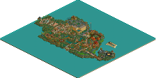
Full-Size Map
-
Download Park
433
-
Objects
313
-
Tags
Similar Parks
-
Park Nehalennia
-
Europa Park World Showcase
-
Attractiepark Gelderwal
-
De Vliegende Hollander/Python
-
VOC Anno 2004
-
Spessart Park
It's alright.
Structures are good, but there is very little variation within those structures. Now since this is a recreation, I can see why the facades are repetitive. But it sometimes just felt like there was something eye-catching missing (apart from the I amsterdam-sign, haha) which made this park less interesting to look at, from time to time.
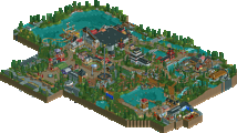
I enjoyed your Rijksmuseum recreation. It was very good and accurate. I only wish there was more content on this map; you clearly have the skill to recreate things, but to keep the park interesting to look at, I think it needed to be bigger.
60%. Keep it up.
I think my biggest critique of this, is that for a city section it didn't feel alive enough. It was missing those little details of life that really bring a city to life. The architecture was repetitive, but that seemed just how the style was. I also wish it had been a little larger to really let the atmosphere shine. Overall though its a nice bit of work and I give it a 50
For a small lighthearted project that's built for the sake of having fun, this is quite cool. I loved all the nice peeps doing various activities! The drowning peep in the water, and that indifferent peep smoking right in front of him: that was hilarious! Oh, and those mannequins in the clothing store, that was awesome. The roller skating gang was sweet, too.
Stuff like that was what made this really interesting to look at, but unfortunately, there was nothing outside that to keep my attention. I did admire your take on Amsterdam architecture, but that was a short trip since the map itself is small, and left me feeling the 'atmosphere' wasn't too immersive. I think a lot of that could be what Iron and Impulse both mention, with the need for more detail as well as perhaps a larger canvas.
I'd go with a 50 too, but that's more for the scale than the skill. Keep doing stuff like this, man! Look forward to what you bring for us to feast our eyes on next.
I like this. There are flashes of brilliance here, but it's light on content. I love the boats, the sign and the waiting areas for the train as well as the back row of buildings though.
I don't really love that middle section as much. It's good, but I feel like it's less detailed and an entirely different scale.
Overall this is nice, but I wish it was larger.
PS: Love the objects by the way!
cool stuff! never been there but its seems relatively legit and the archy is pretty good. I wish you'd gone with bigger trees to make it feel more leafy and vibey and make it come to life a bit with details and shops and things on the streets. also wish you'd let us see into the big building in the back!
who's Sterdam? not me
Enough complaining. There's something excellent about this map too... The peep objects! You really milked those, with great creativity. Peeps with luggage, the group of drunks (I presume English), the street organ, the peeps sitting at the edge of the canal... You may not have nailed the architecture and composition, this was great shit that did remind me of Amsterdam. The drunk peeps were especially creative. Early contender for a Best Idea award.
Next time you're doing a city: make it denser, make it busier.
It was nice and the more I see your stuff the more I like it.
I mostly agree with Liampie about making your stuff busier next times!
This makes me want to go back to Amsterdam ! Good stuff !
You definitely improved some of the detailing compared to my last visit to it, it still didn't catched my eye long enough though. Definitely listen to liam's feedback overhere, a good city release in RCT needs to show life and needs to be as busy as it can get. Try to put thought and effort into every single angle of your release and make people wanna explore and keep looking at it all over the map.
But for a small project this is definitely solid and a good recommendation for captains to pick you as a talented player for h2h. A solid bronze for me. 55%
This park is already outdated. If you take out those filthy I Amsterdam letters, like the real city has done, and resubmit, I'll consider voting 5% higher on this.
I was disappointed this scored so low, but now I get it. Too much focus on archy but I forgot to think about the surroundings. I still think 48% is a bit on the low side but yeah I see what I could've done better.