Park / Jurassic Park - The Flying Dinosaur
-
 27-January 19
- Views 5,081
- Downloads 589
- Fans 2
- Comments 19
-
 75.50%(required: 65%) Design
CedarPoint6 80% G Force 80% Ling 80% posix 80% csw 75% robbie92 75% RWE 75% saxman1089 75% WhosLeon 75% Scoop 70% Sulakke 70% Faas 60% 75.50% -
Description
Enjoy your flight with the Pteranadon!
-
2 fans Fans of this park
-
Full-Size Map
-
Download Park
589
-
Objects
327
-
Tags
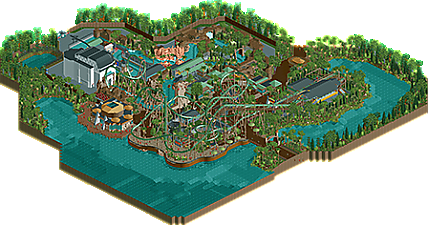
![park_4801 [NEFC] Art Expo 2020](https://www.nedesigns.com/uploads/parks/4801/aerialt4702.png)
Very enjoyable. I did love the layout a lot. Rare people do these huge flyers. Good theming, good execution. Wish you had done more with the main queue line. Also thought the big round hall should've signalled a bit more purpose other than housing restrooms.
This is wonderful. The main hall was probably the weirdest choice here - the shape doesn't quite look right, somehow, and it doesn't look like it belongs with anything else. Flyer's layout is great and superbly paced.
The "Big Round Hall" is the Discovery Center. There are some exhibits inside. Should have probably made this more clear but don't forget to use cut-away view!
I think I enjoyed this less than other people here did. I thought the support colours looked a bit fake, and the brown footers didn't do it for me either. In general the whole coaster didn't stand out enough for me. I also don't understand why you didn't theme the station at all.
I thought there were way too many Liampie palms and the amount of glitching and blank walls in general didn't help either.
I liked the lift hill for the splash boats ride. Creative way to get it up there. Overall I liked the boat ride better then the roller coaster actually, thought that was more interesting. Cool to see a flyer though.
Very pleasant work. Good inspiration, but also great inventiveness and own contribution. Subject. In my opinion, it would allow to spread the wings to everyone. In your case you can see it after the RCT project. It is great - well made. . Ride a boat provides "fresh" and high emotions. A nicely developed elevator.
Not one guest would say, "I'm sick" because of the number of corners, but in the end it's a "Flying Dinosaur". There have never been jokes with dinosaurs
In my opinion, everything looks fine. Dense vegetation deserves a big advantage. There is no lack of buildings in harmony with each other.
In my opinion, they overwhelm the supports. Maybe if "Dinosaur" could better "breathe" over free areas (without sidewalks) it would be better.
Well? Maybe this park could be an additional attraction for monkeys. (Hahaha). <- it was a joke
All the best.
Great work as always mav, and congrats on another accolade.
i think the thing that's hurt you the most jimmy is that youve never really found your niche that highlights your work properly and it tries to be something you're not. when youre making something like this, or using the same frameworks that every other realism builder uses, you're setting yourself up to be compared to them. i cant help but to compare this to both stoksy's and nin's tries at this theme. and while they have better foliage, architecture, and spatial awareness than you do, your ability to create rides is nearly unparalleled. take cues from someone like coasterbill who doesnt even try to compete with the meta because then i think you'll make something truly great.
what saved this for me was the fact that the ride design is unique and integrates itself well into the environment (you're much better at this than you used to be!)
Anyways great design maverix. I do the the coasters pacing is a bit fast but it still looks like a damn good layout. Im interested in that new project you streamed so keep it up.
I mean, i voted it a 70 so it's not barring my ability to enjoy it. I just think maverix hasn't yet found his niche quite yet. it reminds me of a dm i had with alex about "making a reason for your work to exist", and in this frame i think he only has went part of the way into doing that. he's keeping one foot in the meta and another foot into his own aesthetic; when he jumps in fully and accepts his own stuff I will enjoy it more.
I know this pretty well because I do the same thing, which to the people who like the stylistic trajectory rct is going they enjoy but to those who dont i can totally understand why they might think i'm a copout or whatever.
I certainly get what you're trying to say to and extent. I definitely have always loved ride layouts the most and have definitely had more of a nack for that sort of thing. When it comes to the rest of it, I feel like I've always tried to do something different or new. There was a time when I think I had my own 'style' that was more distinct, but as I've gotten better and put more time into the game it has sort of evolved.
That said, I try not to get to caught up in that and just build what I want and because I enjoy it.
It's great to see a new Maverix design! I overall like it a lot but it also has a some larger drawbacks in my opinion.
This is clearly technically advanced RCT but I don't think it had a lot of charm. First of all, you picked the absolute worst colour for the coaster. That alone sucks all life out of the park. Trying to look past that, there's some very nice content. I think the layout is awesome with some lovely path interactions. I like the 'boobs' shape of the path under the first drop, and how the coaster follows the shape of path above it. The coaster is shaped like a bra. But if the coaster is the bra, and the path the boobs, there's a lot of under- and sideboob. I think the pretzel is also beautifully framed. The weird double roll element is kind of cool, but it also has an enormous hideous white shed in the background. Can't say it's technically bad, it's just ugly. That other big building looks subpar from a technical standpoint as well though. I guess that overall the architecture in the park is just not very good or interesting.
I think I would've cut the map a lot closer to the coaster, leaving out most of the 'irrelevant' architecture, and the foliage that I'm also not a huge fan of. The coaster is very good. My vote would've been 70, but luckily for you I was too late. Congrats on the design and the beautiful score!
That is the most fucked up looking Raptor I've ever laid eyes on.
In all seriousness though, awesome layout and great overall design. Congrats! You deserve it.
fuck yeah, this is awesome. Having just been to the real thing, I think you did a good job reinterpreting the layout and composition of the area into something new and original. the archy is detailed and pretty and the landscaping complements everything well. My one qualm is color choice- its incredibly green and dark. Some lighter tan paths would do so many wonders for this park, and little hints of color in umbrellas and building trim would take this to the next level (esp. red steel stuff). Also some colorful bushes would do wonders for the tropical setting. Just stuff to consider for next time in taking "risks" with colors to enhance atmospheres. that said, its a great design and takes me back to h2h
Liam go watch porn after reviewing rct parks please
I really like this design, I don't really understand the bad critics it gets from some people. Everyone entitled to their opinion though. First of all: the lay-out of the coaster is awesome! The kind of rct coaster I'd love to see translated in real life. The cobra-pretzel is phenomenal, please send it to B&M, I want to ride it.
The coaster has a lot of interaction, really worked well into the environment. Something a lot of people seek when it comes to designs and you nailed that The coaster looks interesting from so many view points. My only down point of the coaster is the color. A brighter color would make it pop more. In general the park could use some more color (flowers would've helped).
I also do think a brighter path would've been better. Foliage is really good, I'm a fan of dense foliage. The water ride is cool, making such a huge building but still make it look interesting and not bare/flat is a skill. Kudos for that.
Overall a really nice piece of work to be proud of. Looking forward to more Maverix stuff.
Some quick thoughts here:
Layout = Fantastic, probably among the best flyers we've ever seen. Kind of wish you kept the old station though.
The pathing and integration of the area into the coaster and vice versa is also really strong, definitely inspired by the the real area but as a whole it feels fresh and well done. Visiting this in real life would be a real thrill.
Perhaps wish you could of added a bit more of the tiny details into the park that Universal does that could add a bit more color to the map, Nothing significant, but a few reds, blues, purples etc.. here and there could do a lot of good.
If this were me I'd probably have trimmed the map a bit more, some of the foliage around the outside of the map didn't really add a ton, and felt sort of sloppy. Being a design you probably could have removed it and improved the overall map quality, but perhaps including more context is just a general trend in designs now.
Voted 80%, I think the layout and integration/execution of the coaster and area was enough to get it to that level, and being a design thats really what matters.
Sorry for the late review.. congrats on the design. Always love seeing your work, so it was awesome to be on your team last year and to see you begin on this during H2H8.
The coaster layout is amazing. This would be such a fun ride in person, and some of the elements are great. The cobra roll over the splash zone for the boat ride is overlooked I think. I know Liampie said the white building is a distraction, but as a rider on both rides, I think that's an afterthought. But, I still agree with Liampie to an extent! I also agree with Russ on the station. Maybe some colorful trim here and there would've added a bit extra, but a 75% design score is still great!